
Family Photo Gallery Wall with IKEA Frames
Most people, when they finally decide to put their family photos on the wall, start the same way: pick a wall, buy a pile of frames, slot the photos in. Then the real problem shows up — and it was never about lining the frames up neatly. It’s the photos themselves.
They’re all different sizes (printed old photos, quick phone snaps, one big professional wedding shot), from different years, and their colours are all over the place: the old ones lean yellow, the phone ones lean cool, the professional ones are graded differently again. Put that pile straight on the wall and — however neatly the frames line up — it tends to read as “thrown together” rather than “designed.”
So the real first step for a family photo gallery wall isn’t arranging frames — it’s unifying the photos into something that reads as one family’s wall. And there’s one more thing that sets it apart from other gallery walls: it tends to want to grow — over time you’ll probably add a new baby, a graduation, a wedding, the latest family portrait (though plenty of people just swap the old ones out, or leave it exactly as it is). Choosing the photos, unifying them, and deciding whether to leave room to add more later are what a family photo gallery wall really comes down to.
The one-line answer: do two things first. ① Unify — match your frames, match your mounts, and either convert the photos to black-and-white (or one shared tone) for a crisper, more polished look, or keep them in their original colour and let the frames and mounts do the tidying. ② Pick the right spot — family photos are close-up, walk-past content, so the best places are the routes you pass every day and can look at up close: a hallway or a staircase. Above a sofa is a second choice. For layout, focal (one hero photo in the middle, smaller ones radiating out) and a grid fit best. Don’t count frames yourself — pick a layout and use a ready-made preset.
This guide covers it in one pass: how to choose the photos, how to unify them, where it’s best hung, which layout to use, and how to leave room to keep adding to it later.
The lazy default
Choosing photos → filter by feeling, not by number: pick the people and moments you recognise at a glance, not every photo you own.
Unify → pick one of two routes. For a more unified, higher-end look: convert everything to black-and-white or one shared tone. To keep the colour and warmth: use the original photos and let matching frames + matching mounts pull it together. Both work.
Where → family photos are close-up content, so a hallway or staircase — routes you walk and look at up close — fits best; above a sofa and other view-from-afar spots are second.
Layout → focal (one large photo as the hero, smaller ones radiating out) and an equal-size grid both fit family photos best. Use a ready-made HangPlanner preset for counts and sizes — don’t guess them.
Frames → one series, one colour is the easiest. RÖDALM has the most sizes and colours and a removable mount, which makes it ideal for a mixed photo wall you’ll extend later.
Growing it → if you plan to keep adding, pick a series you can re-buy and leave one direction to extend; if you just want this one version, that’s completely fine too.
First, turn the pile into “one wall”: choose, then unify
This is the step most people skip, and it’s the one that decides whether it works. Whether the frames line up is hand-work; whether the photos read as one family’s wall is decided by which photos you choose and how you unify them.
Step one: filter by feeling, not by number. Don’t start with “how many should I hang.” Pull out the people and the moments you recognise instantly — the ones you actually want to see every day. Padding for numbers is the most common trap: cramming in forgettable photos to fill a wall only dilutes the few that land. Fewer and better wins.
Step two: pick a “unify” route to settle the colour and finish. Real family photos are toned all over the place, and one layer of unity makes the whole wall look more of a set and more worth looking at. There are two routes, both valid — pick by the mood you want:
- For a more unified, higher-end look → convert the photos to black-and-white, or to one shared tone. Going black-and-white erases the colour casts and white-balance differences between eras and cameras in a single move, and the whole wall instantly reads as a set. Want to keep a little warmth? Unify to a single warm-brown / sepia tone instead of pure black-and-white. This is also the core idea behind a black-and-white photography wall (AA0217, link to follow once live).
- To keep the photos’ own colour and warmth → use them as they are, and let matching frames + matching mounts pull it together. Some photos carry their warmth in the colour itself — a sunset, the beach, candlelight on a birthday cake. You don’t have to strip that out: let the content keep its colour and hand the order to the frames — every frame the same series and colour, every mount the same colour and width. The content stays rich, the frames stay tidy, and the wall still holds together.
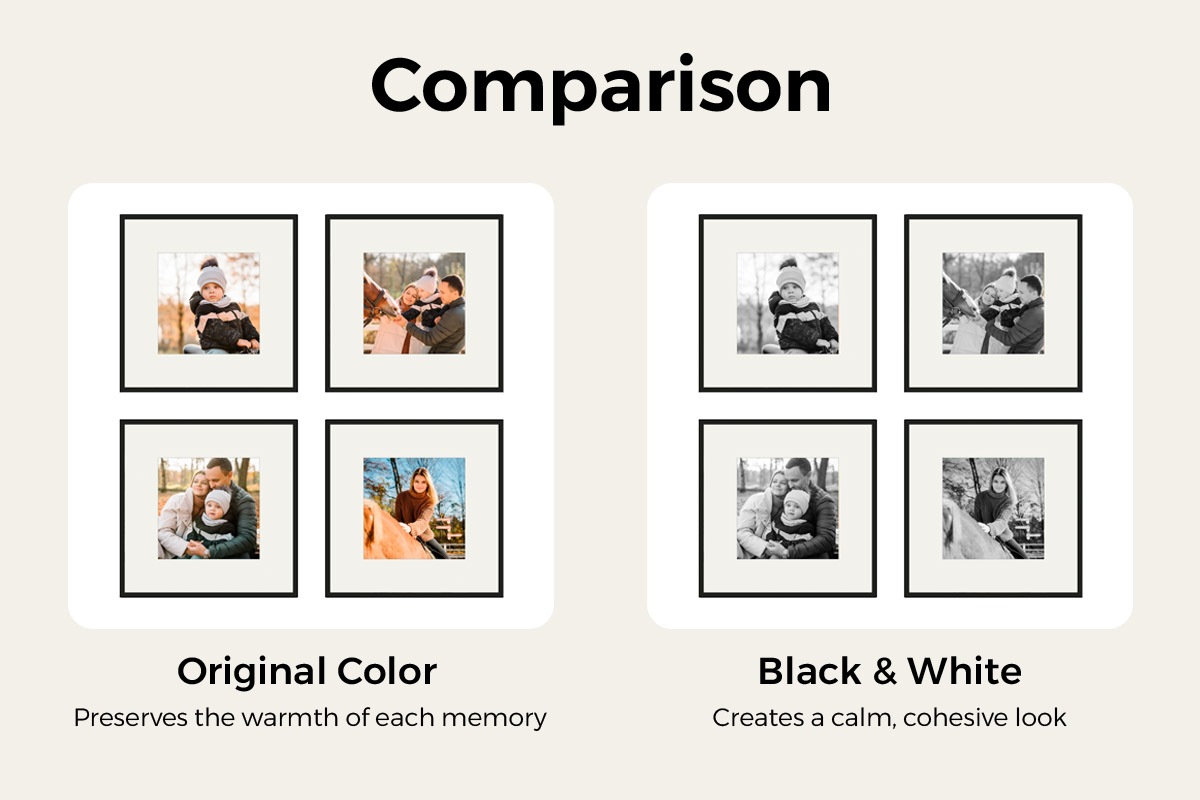
There are three levers, in order of importance: matching frames (same series, same colour — the foundation), matching mounts (a same-colour, same-width mount opening so every photo gets the same breathing room), and an optional treatment (black-and-white or one tone for polish, or original colour for warmth). The first two you almost always do; the third depends on the route you chose.
Where it’s best hung: a hallway or a staircase — because family photos are close-up content
Once the photos are chosen, the next big decision is where to hang them. Here’s the point most inspiration images skip: family photos are content you look at from up close, on the move.
A landscape or an abstract works from a glance across the room; family photos don’t — you have to get close to make out who’s in the shot, which year it was, which kid is laughing. So a family photo wall belongs somewhere you pass every day and can see up close:
- A hallway is the top spot. It’s narrow, the viewing distance is short, and you walk it every day — perfect for scanning face after face, memory after memory as you pass. Photos here get used, not just admired. A hallway is also the freest, anchor-free wall in the house (AA0212 hallway gallery wall, link to follow once live), with no big furniture to pin down your composition.
- A staircase works just as well. Run the photos up the diagonal of the stairs and you’ll see them every time you go up or down — the sense of movement is built in (layout in the next section).
- Above a sofa is a second choice. It’s a view-from-afar spot, better suited to one bold statement piece; family photos can go there, but it reads more like “living-room décor” and loses the up-close, walk-past intimacy of a hallway or staircase.
In one line: don’t default to above the sofa. Think about which route in your home you walk every day and can stop to look at — that’s the wall that deserves your family photos.
Layouts: two ready-made presets
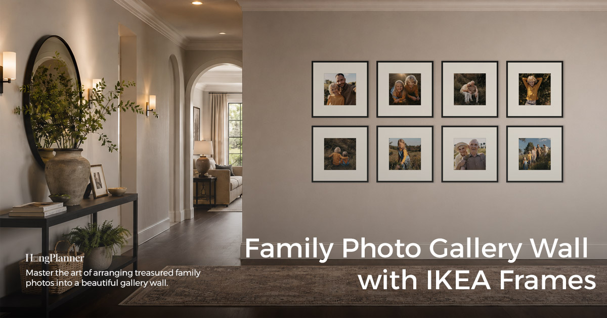
With the spot settled, on to layout. The two most natural for family photos are below, with counts, sizes, and series already worked out — pick the one that matches your photos and your wall, copy it, then nudge for your wall width. (Want the tidiest option of all, an equal-size grid, that always works too — the hallway wall on this page’s cover is exactly that.)
Focal — when you have one photo to feature
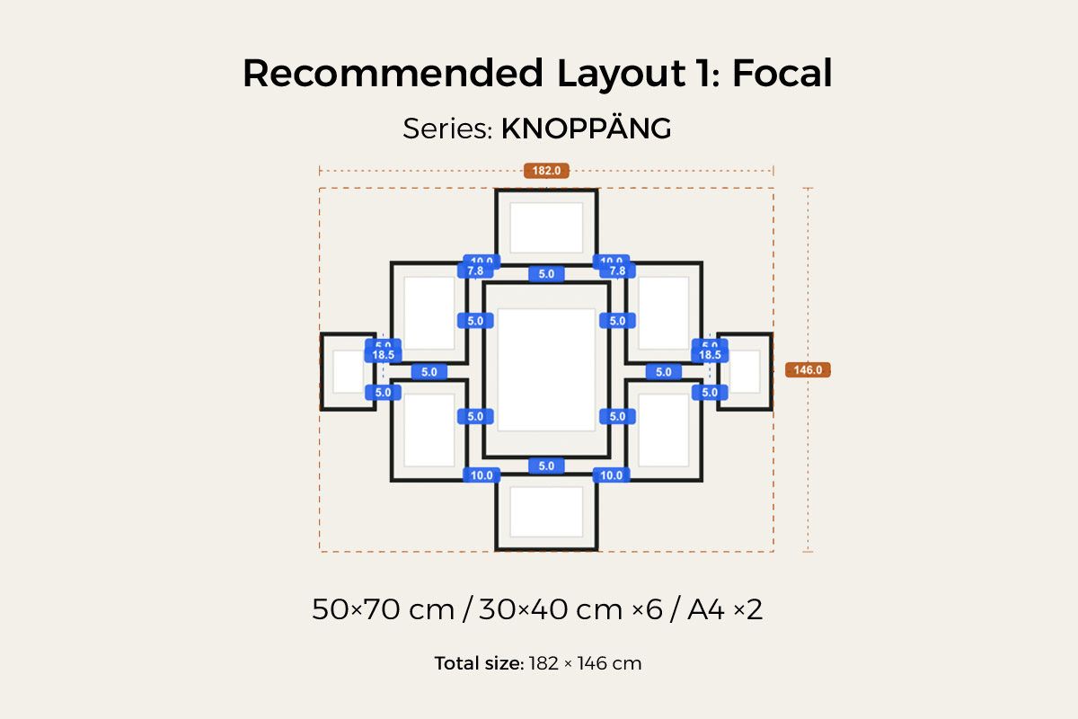
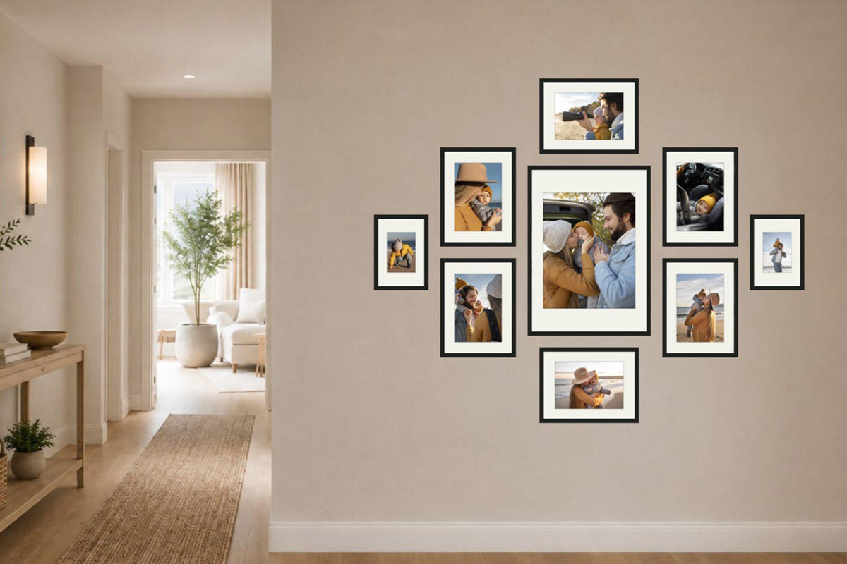
One large photo sits in the middle as the hero, with smaller photos radiating out around it. If you have a family portrait or a milestone shot you want to feature, this is the one. HangPlanner’s ready-made focal preset uses the KNOPPÄNG series: one 50 × 70 cm (≈ 20 × 28 in) in the centre, ringed by 30 × 40 cm (≈ 12 × 16 in) × 6 plus A4 (21 × 29.7 cm) × 2 — 9 frames, about 182 × 146 cm (≈ 72 × 57 in) overall. See the focal gallery wall guide for how it’s built.
On a real wall, it becomes a hallway photo wall built around one family portrait — the big photo catches your eye first, the smaller ones you take in as you pass:
Staircase — for the wall up your stairs
Run the photos up the diagonal of the stairs, one step at a time — the sense of movement is built in, and you pass it every time you go up or down. HangPlanner’s ready-made staircase preset uses the KLOTKÖRSBÄR series: 30 × 40 cm (≈ 12 × 16 in) × 4 + 40 × 50 cm (≈ 16 × 20 in) × 3 — 7 frames staggered along the diagonal, about 235 × 159 cm (≈ 93 × 63 in) overall. The step-by-step diagonal method is covered in the staircase gallery wall guide (AA0205, link to follow once live).
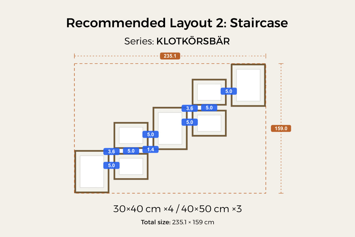
On the stairs, the photos climb along the diagonal — something you pass, and glance at, on every trip up and down:
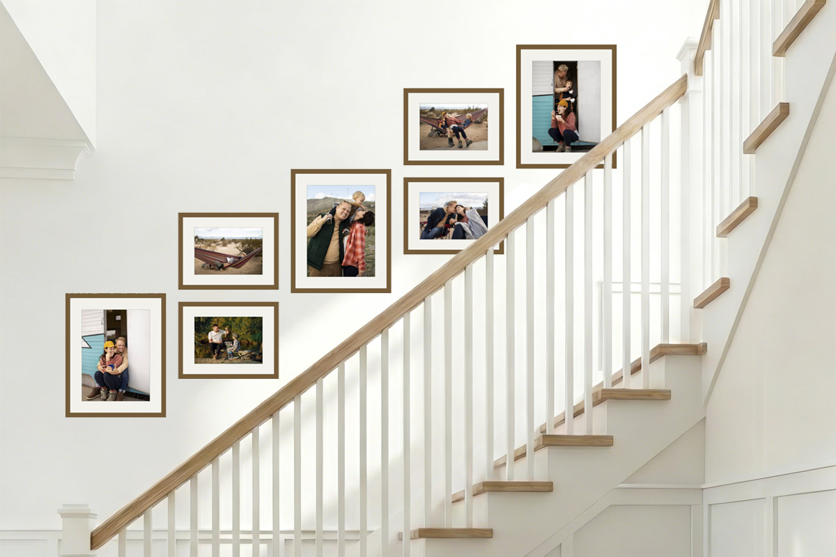
How to choose
- Have one family portrait / milestone shot to feature → focal. Let that big photo be the emotional centre and build around it.
- The wall up your stairs, or you want it to run along a route → staircase. Following the step diagonal is the most natural fit.
- Want the tidiest, easiest-to-extend look → an equal-size grid (like the cover), especially good in a hallway; see the grid gallery wall guide.
- One rule across all of them: don’t sacrifice a photo for the layout. Start from the photos you want to hang, then choose the layout; use a ready-made preset for counts and sizes rather than guessing.
Decide whether this wall will “grow”
Family photo walls have a trait few other gallery walls share: they tend to want to grow. Next year there may be a new family portrait, the year after a graduation or a new baby — plenty of people keep adding. Others swap the old ones out when the time comes, or leave it on one version for good — all fine. The point is to work out early roughly which one you are, so you don’t regret it later.
If you plan to keep adding, two things done now mean adding a photo later is “growing it a little,” not tearing it down and starting over:
Pick a series you can re-buy. Use a series that comes in many sizes and stays in stock for years (RÖDALM is a safe bet — plenty of sizes and colours, and a removable mount), so you can still find the same frame in the same colour later and old and new don’t clash.
Leave one direction to extend. For a grid, leave room for one more column to the side or one more row below; for a focal, leave space around the hero to add smaller photos. Then adding one is a natural extension, not a rebuild.
If you just want this one version, you don’t need to leave room — arrange the photos you’ve chosen to look their best. If you ever want to change it, a full re-hang is a satisfying refresh in its own right.
Before you buy, hang a version in HangPlanner
A family photo wall runs to a fair few frames and has to keep sizes and spacing consistent — hard to get right in one go by eye; and photos are only easy to swap once they’re printed, so the cost of a wrong guess is higher than for ordinary art. Before you commit to the wall or place an order, drag a version on screen first:
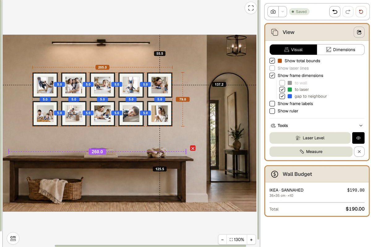
The version above is a hallway grid dragged in HangPlanner: ten SANNAHED 35 × 35 cm (≈ 14 × 14 in) in a 2 × 5 grid, with Wall Budget showing the whole set at $190 in real time. In HangPlanner:
- Upload a photo of the wall you want to use (hallway, staircase, or living room) and calibrate the scale with a known dimension like a door width or the skirting board
- Mark the “obstacles” — switches, wall lights, the stair handrail — so the photos can dodge them
- Drop a preset: pick the grid for a tidy, extendable look, or focal to feature one family portrait — counts and sizes come ready
- Switch to Dimensions and check the total width and height and every gap against a 2–3 inch (5–7 cm) spacing
- Open Wall Budget to compare per-frame prices and the total for different combinations before deciding what to buy and print
- Save it — when you add photos later, come back to this version and extend it in the direction you left open
On screen you can see which version reads clean and which reads cramped — a lot cheaper than drilling the wrong holes in a hallway wall or printing a photo a size too big.