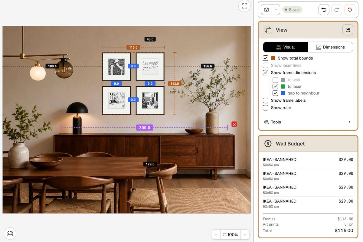
Black-and-White Photography Gallery Wall with IKEA Frames
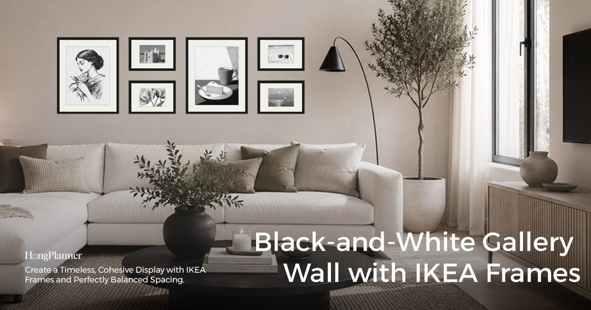
A black-and-white photography gallery wall is almost shorthand for “high-end” — a whole wall with the colour stripped out reads calm, easy on the eye, and doesn’t fight the other colours in the room. But precisely because the colour is gone, it’s easier to get wrong than a colour wall: hang it in the wrong space and the whole thing turns to mud; leave the tones unbalanced, with the dark frames piled to one side, and the group’s centre of gravity “sags.” Neither of those is something that simply turning the photos black-and-white fixes on its own.
The one-line answer: get two things right first — one, hang it where the light is good and the wall is plain; a living-room sofa wall carries a statement, while a study or a small nook trades on black-and-white’s character and design edge; two, spread the dark and light tones by “visual weight” so the dark frames don’t bunch on one side. As for layout, black-and-white works all the way from the tidiest grid to the loosest salon wall; the counts and sizes follow the layout you pick, and the end of this guide walks you through it in HangPlanner.
One thing up front: this guide doesn’t teach you how to turn a photo black-and-white — that’s a job for photo-editing software. It assumes you already have black-and-white photos, or plan to buy black-and-white prints; we only solve “where to hang these mono images and how to arrange them.” And to bust one assumption: going black-and-white doesn’t mean you can hang them any old way. With the colour taken out, the contrast between photos actually gets louder, so arrangement matters more than it does in colour.
This guide covers three things: what space a black-and-white wall belongs in, how to balance the group by tonal weight, and which layout suits black-and-white.
The lazy default
Space → Black-and-white speaks in contrast, so it looks best on a well-lit, plain wall (white / light grey / earthy tones). A living-room sofa wall or TV wall — a viewed-from-across-the-room spot — carries a statement, its high contrast readable from the far side of the room; a study or a small nook is where black-and-white’s character and design edge lift the whole home. Avoid dim rooms, busy wall colours, and heavy dark-wood panelling, where black-and-white turns to a flat grey.
Tonal weight → With the colour gone, a dark, mostly-shadow photo reads “heavier” on the wall, a light, high-key one “lighter.” Whatever layout you use, weave the heavy and the light apart — don’t bunch them on one side — so the wall doesn’t tip.
Layout → Everything works, tidy to loose: grid is the tidiest and steadiest (order × order); outer-aligned is a neat outer rectangle with a free interior, a middle ground; free-form / salon is the loosest (order × freedom), where black-and-white’s single tone pulls the loose wall together — order meeting disorder is what gives it character. You don’t have to count frames yourself — pick a layout and use its ready-made preset in HangPlanner.
Frames → Black-and-white works with a dark slim edge or a light wood frame — your call, by your furniture; skip a glossy, reflective frame face (it breaks the tones). In the IKEA range, RÖDALM (many colours) is the most versatile and LOMVIKEN (aluminium) has the cleanest thin edge.
First thing: what space makes a black-and-white wall work
Start with this: black-and-white speaks in contrast, which makes it fussier about space than colour. A colour photo can still pop on so-so light and a slightly busy wall — colour carries it. Black-and-white has no such fallback; it lives entirely on the blacks, whites, and greys in the frame. Let the surroundings get “noisy” and the contrast gets eaten, and the whole wall goes to a flat grey.
Where it looks best: a well-lit, plain wall. A white, light-grey, or earthy wall gives black-and-white photos the plain “backdrop” their contrast needs, so the deep blacks and bright whites can leap out; the more even and ample the daylight or lighting, the clearer the tonal steps.
The living room is a great stage for black-and-white, especially the sofa wall and the TV wall. These are viewed-from-a-distance spots: you mostly see them from across the room or as you walk in. Black-and-white’s high contrast is exactly the kind of information that reads from far away, so a black-and-white wall above the sofa is more focused — more like a piece — than colour in the same spot. (How wide and how high the group should be above a sofa is covered in its own guide — the method is the same, just in black-and-white.)
Black-and-white has more character and design edge, which suits a study and small nooks especially. A black-and-white photo carries a restrained, considered air — hung in a study, it puts your taste on show; set in a reading corner, beside a desk, or on a small accent wall, it adds a note of design to the whole home. These spots don’t need a big production — one or two pieces, or a small set, is enough.
Where to be careful: dim rooms, busy wall colours, or heavy dark-wood panelling. Low light leaves black-and-white grey and lifeless; a patterned wall or heavy wood grain fights the photo’s tones and eats the contrast. For walls like that, fix the lighting and the backdrop first, or move the black-and-white wall to a plainer surface.
Second thing: the biggest trap is tonal “weight”
This is where a black-and-white wall differs most from a colour one, and where it’s easiest to go wrong.
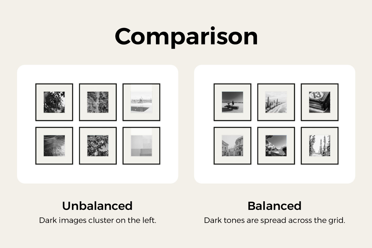
On a colour wall, how much a photo grabs the eye is driven by colour; on a black-and-white wall, tone runs the show — a dark, mostly-shadow, high-contrast photo carries far more visual “weight” on the wall than a light, high-key one with lots of white space, and the eye is pulled to the darkest, heaviest one first.
So going black-and-white doesn’t mean you can arrange them any old way. Pile several dark, heavy shots on one side and the whole wall “sinks” that way while the other side goes empty — off balance. The real work of arranging a black-and-white wall is to spread the tonal weight evenly across the group:
- weave the heavy and the light apart — don’t let the dark ones clump;
- keep the darks and lights roughly balanced left-right and top-bottom, with the group’s weight centred;
- when in doubt, squint at the whole group — with the detail gone and only blocks of light and dark left, it’s easiest to spot which side is too heavy.
Worth stressing: this tonal balancing sits on top of any layout — it isn’t tied to one. Whichever you land on — grid, outer-aligned, or free-form — spread the set by tonal weight first, then drop it into the specific layout.
Third thing: which layout suits black-and-white
With the tones balanced, all that’s left is how it looks. Here’s a way to think about it, not a hard rule: black-and-white works from the tidiest layout to the loosest — pick by whether you want steady or want character.
At one end is “order × order”: the layout is already tidy (equal frames, evenly spaced, in rows and columns), and black-and-white lays a unifying tone on top — steady on steady, the easiest and least likely to go wrong. The grid is the type.
At the other end is “order × freedom”: the layout is deliberately loose, mixed sizes, no rules — and this is where black-and-white becomes the anchor. A loose arrangement is the one most likely to look messy, and black-and-white’s single tone pulls the wall together, gathering frames of different sizes and subjects into one. Order (black-and-white’s tone) meeting disorder (the loose layout) gives you something with character that still holds together. Free-form / salon is the type.
In between sits a transitional option like outer-aligned: a tidy outer frame with a free interior, taking a little of the best of both ends.
Don’t count frames or guess sizes yourself — pick a layout and use its ready-made preset in HangPlanner.
Grid · order × order
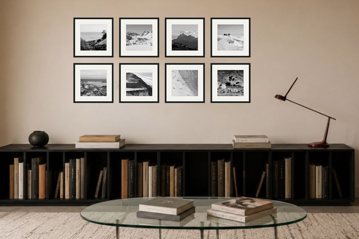
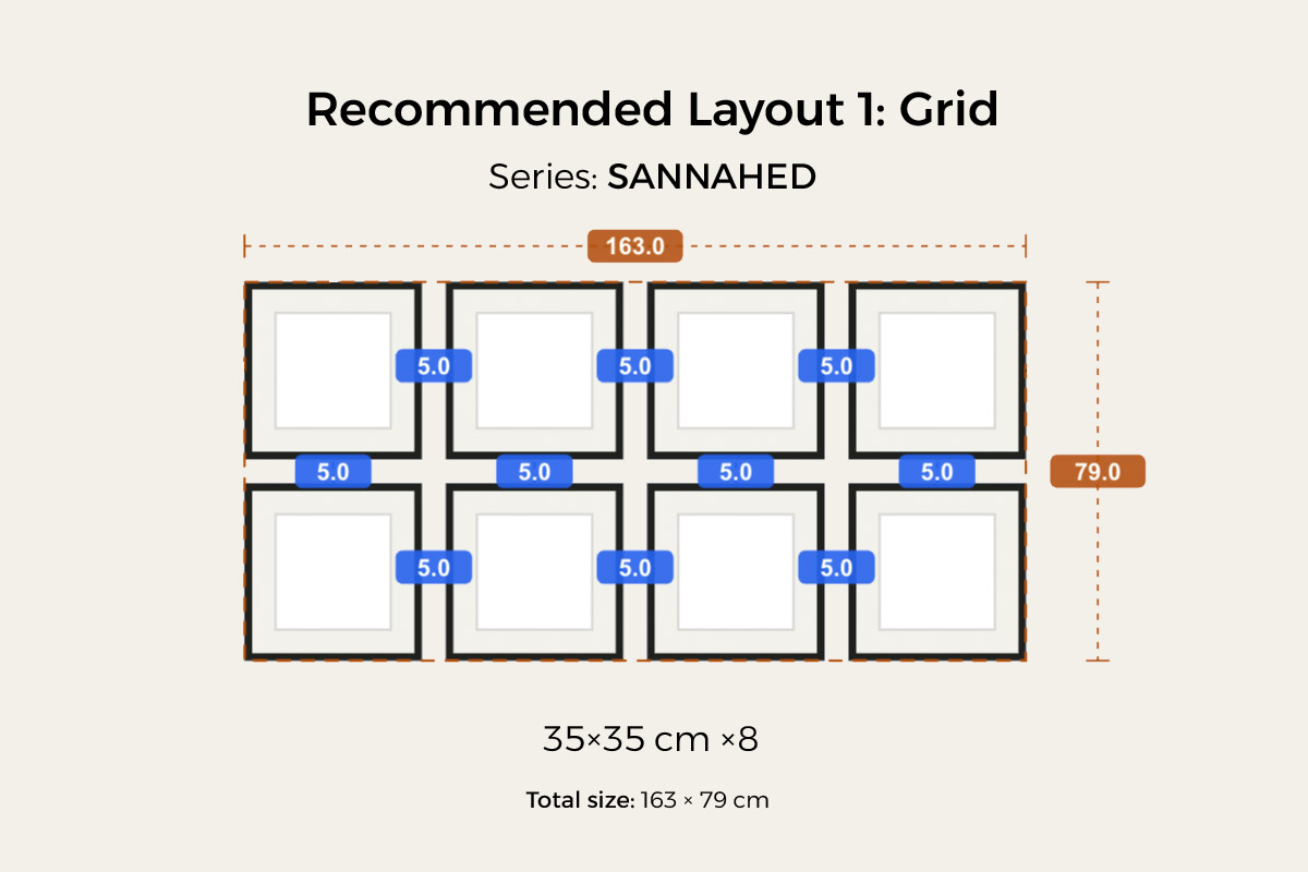
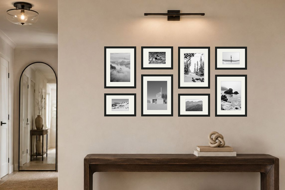
Equal frames, evenly spaced in a block — the tidy structure does the tonal-balancing work for you, and it’s the most easy-on-the-eye, most restrained of the lot. The image above is a ready-made grid preset in HangPlanner — eight SANNAHED 35×35 cm frames, 5 cm gaps, group about 163×79 cm — with counts and sizes already set; hit Insert and it’s on the wall, nothing to tally. See the grid gallery wall guide. Hung in a real space it looks like this:
Outer-aligned · tidy outside × free inside
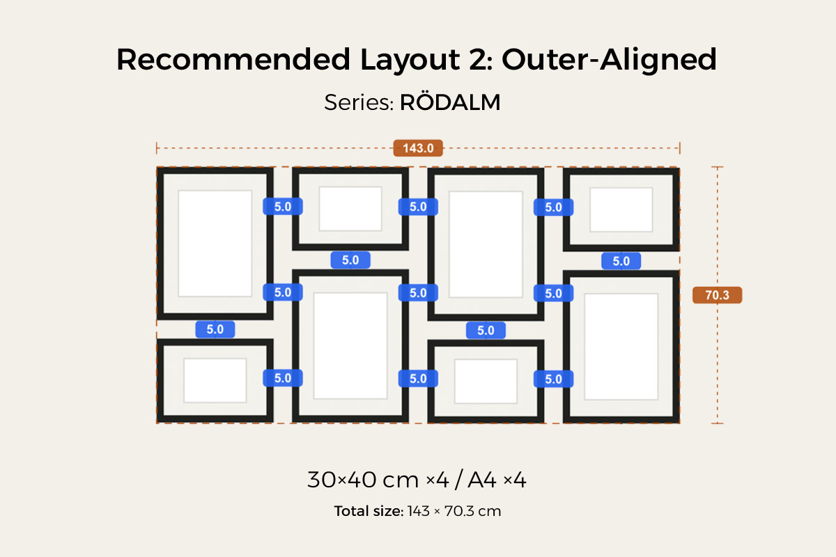
All four outer edges line up into a clean rectangle while the sizes inside stay free — a grid-tidy outer edge, but with room to mix sizes within; black-and-white pulls those interior size differences together too, a tidy shell over a free interior, and it wears well. The preset above is four RÖDALM 30×40 cm plus four A4, group about 143×70.3 cm. See the outer-aligned gallery wall guide. In an entryway it looks like this:
Free-form / salon · order × freedom
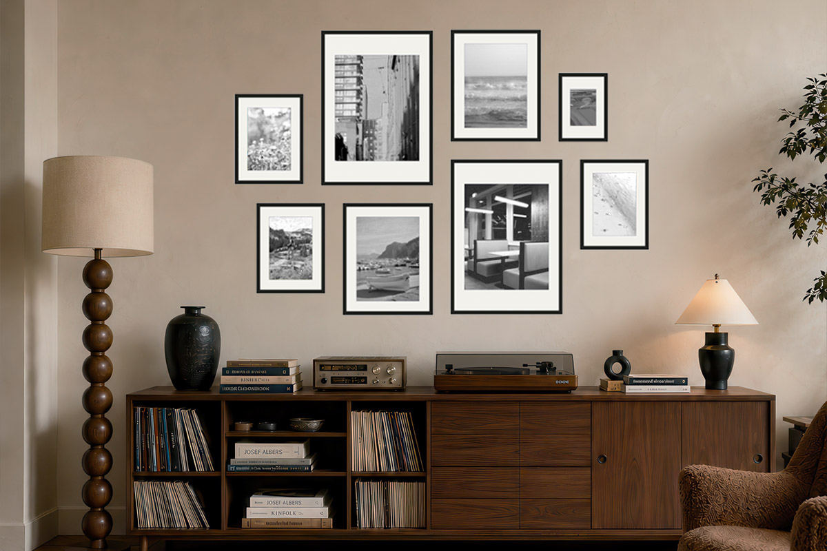
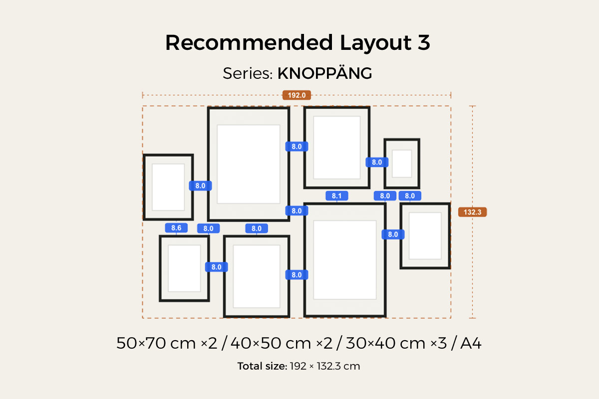
Mixed sizes, an organic spread, no real order to the layout — in colour this is the one most likely to look messy, but switch to black-and-white and the single tone pulls the loose wall together: however mixed the subjects and sizes, the same black-and-white tone gathers them into one group, and order meeting disorder is exactly what gives it the most character. The preset above mixes KNOPPÄNG 50×70 / 40×50 / 30×40 / A4 sizes, group about 192×132.3 cm; playing this one, put your effort into the tones — spread the dark and light evenly across the whole wall (see the section above) so it’s loose but not scattered. In a living room it looks like this:
Don’t worry about mixing subjects. One of black-and-white’s gifts: even if your photos differ in subject, source, and era (phone street shots, old photos, portraits, landscapes all mixed together), the single tone makes them one family, and they sit together without clashing. So you don’t have to cull photos for the sake of “matching” — the real work is still the two things above: pick the right space, and balance the tones. (As for turning them all black-and-white, that’s photo editing, not part of this guide.)
Two more things to watch
Keep the gaps from spreading. Leave 2–3 inches (5–7 cm) between frames, measured frame-edge to frame-edge. Too tight (under 1.5 in) reads busy; too wide (over 4 in) reads sparse. (See gallery wall spacing.)
Frames: non-reflective and matched across the set is all it takes. Black-and-white with a dark slim edge reads classic, with a light wood frame reads softer — your call by your furniture, no single right answer; what matters is to skip a glossy, reflective frame face (the glare breaks black-and-white’s tonal steps) and to keep the whole set’s frames matched so the wall stays quiet. In the IKEA range, RÖDALM has the most sizes and colours and is the most versatile, and LOMVIKEN (aluminium) has the cleanest thin edge; for the sizes in each series see the IKEA picture frame sizes chart. Set the height by the space: above furniture like a desk or a sofa, anchor to the furniture and leave a gap above its top edge rather than forcing the 57-inch centre rule; on an empty wall (an entryway corner, a small accent wall) put the group’s visual centre at standing eye level (57 inches / 150 cm is the average starting point).
Try it in HangPlanner before you buy
The hard part of a black-and-white wall isn’t “picturing something good” — it’s balancing the tones and landing the group’s size on your own wall: which photo is too heavy and where to move it, how wide the group has to be to hold this wall, what it becomes in a different layout. Shuffling a tape measure and paper on the wall usually takes three or four rounds and still isn’t quite right.
In HangPlanner:
- Set the wall’s dimensions, or just upload a real photo of the wall to calibrate the scale
- Load your black-and-white images into My Images and drop them straight into the frames to preview — note that HangPlanner doesn’t convert colour to black-and-white for you; do that in your editing tool first, or use ready-made black-and-white prints, before you upload
- Drop in a ready-made layout preset — grid, outer-aligned, and free-form are all there — or drag your own frames
- Weave the dark and light tones on screen and check the group’s balance holds
- Switch to Dimensions to see the group’s width and height and every gap, and check it against 2–3 inches of spacing
- Compare a few layouts and sizes to see which best fits this wall
- Open Wall Budget to compare the cost of different combinations
On screen you can see which version holds and which tips, far cheaper than drilling the wrong hole and patching and repainting. Don’t even want to design the layout from scratch? Start from a ready-made layout in gallery wall frames and swap in your own black-and-white images.