Which Walls Should Have Art (and Which to Leave Empty)
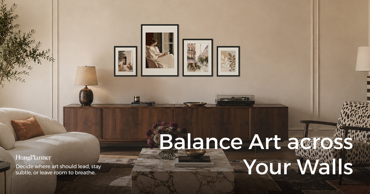
Almost all art advice tells you how to fill a wall — which pieces to pick, which frames, how to arrange them. But before any of that, there’s an earlier question few people ask: out of all the walls in your home, which ones should have art, and which are better left empty?
The short answer: not every wall needs art. Sort your home’s walls into a priority order first — which are the focal art walls that catch the eye first, which are supporting walls that can go either way, and which are best left intentionally blank — then decide each one. Hanging art isn’t a wall-by-wall decision; it’s one hierarchy you set across the whole home at once.
Here’s the point most people miss: an empty wall isn’t “unfinished” — it’s a deliberate design decision. A blank wall gives the eye room to breathe and gives the wall you actually want remembered more weight. Fill every wall and nothing stands out. This has nothing to do with whether you prefer a full, layered look or a clean, spare one — a warm, busy home and a calm, minimal one are both valid. The only real difference is whether there’s a hierarchy and intent, not “more” versus “less.”
This guide covers three things: which walls are worth evaluating first, which are best left blank, and how to sort your walls into focal, supporting, and blank tiers.
The lazy default
Don’t start by picking art. Take a floor plan, or walk through your home, and sort every wall into three tiers:
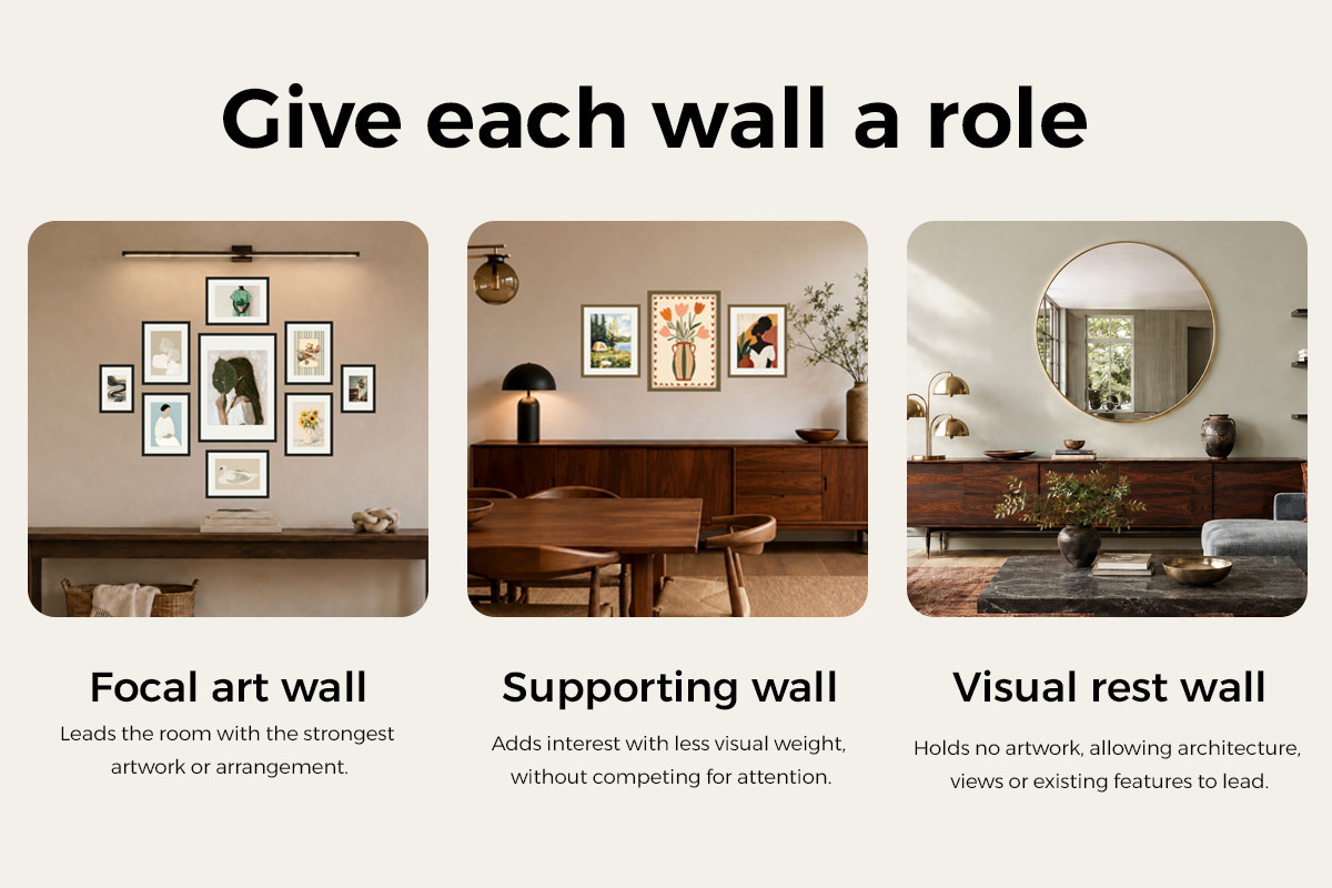
Focal art walls (invest here first) → the wall you hit first walking in or entering a room, the wall above major furniture or a clear architectural anchor (sofa, bed, sideboard, mantel), and the end of a hallway or sightline. These are where the eye naturally rests, so art pays off most.
Supporting art walls (art, but not competing) → transition walls between spaces, and the private corners where you linger. Add art if you have the appetite, but keep the size, contrast, or density below the focal wall.
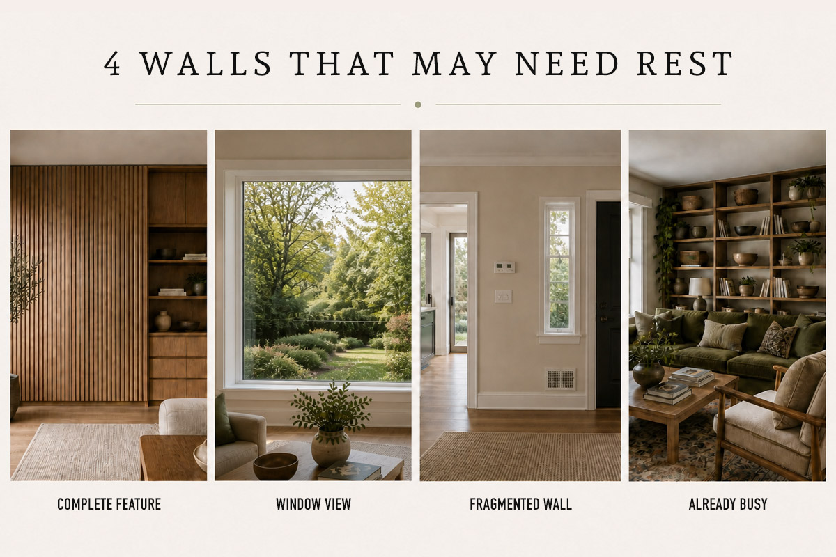
Intentionally blank walls (deliberately left empty) → walls whose architecture is already complete with no clear spot for art (a full sculptural-stone face, a complete panelled wall, floor-to-ceiling storage), walls facing a strong view, walls chopped up by doors, windows, and switches, and walls in an already-busy sightline. A fireplace wall doesn’t automatically count as blank — see the exception below.
The three tiers are a hierarchy, not a “one wall per room” quota; different zones can each have their own focus.
Start with a different question: not “what goes on this wall” but “which walls are worth it”
Most people hang art in this order: see an empty wall → feel it’s bare → find something to fill it. The problem is that very first step — treating “empty” itself as the problem to solve.
A better question: not “what goes on this wall,” but “across the whole home, which walls are worth art and which should stay blank.” The first version has you filling wall by wall, ending up with art everywhere and nothing memorable; the second has you look at the whole picture first and spend your limited attention on the walls that actually earn it.
Leaving a wall blank is an active move here, not laziness. A clean wall works like a pause in a sentence: it lets the wall of art beside it be seen. If every wall is talking, none of them is heard.
To be clear, this isn’t “less is more,” and it certainly isn’t saying a full look is wrong. A rich, layered home and a restrained, mostly-blank one are both valid styles. The real dividing line isn’t quantity — it’s whether there’s a hierarchy: whether every wall is filled indiscriminately, or you’ve consciously decided which walls stand out and which give way. This guide is about how to make that decision.
The walls worth prioritising: five kinds
Some walls earn art naturally — because the eye stops there anyway. In rough order of payoff, prioritise these five:
| Wall worth prioritising | Why it earns art | Typical location |
|---|---|---|
| First-view wall | The first place your eye lands walking in or entering a room; sets the tone for the whole space | The wall facing the entry, or the one you see straight on when a door opens |
| Above an anchor | A sofa, bed, sideboard, or mantel already fixes a center or a baseline; art above it forms one focus with the anchor | Sofa wall, above the bed, above a sideboard, above a mantel |
| Sightline endpoint | The end of a hallway, stairway, or passage, where the eye naturally gathers | End of a hallway, the wall you face from a stair landing |
| Transition wall | The wall between one space and the next, tying the rhythm together | The pass-through wall from living room to dining |
| Personal viewing spot | A corner where you sit and look for a long time; close-up content is worth the care | A reading nook, the wall your desk faces, the side of the bed |
Of these five, the first-view wall and the wall above major furniture or an anchor are usually the best candidates to become focal art walls — they take the most attention, so evaluate them first. Sightline endpoints and transition walls often make good supporting art walls. A personal viewing spot depends on how much you care about that corner.
Note one difference in anchoring: a wall above furniture or a mantel is anchored to what’s already below it — the art has to “grow out of” the sofa, bed, sideboard, or mantel, following its width and center. Walls with no clear anchor, like a hallway or entry wall, have far more freedom: no fixed layout to follow, just whatever feels right.

The walls best left blank: four kinds
The other way round, some walls look worse with art on them. Either they already have their own focus, or they’re just not built to carry a picture. When you hit these four, consider leaving them blank:
| Wall best left blank | Why blank is better |
|---|---|
| A wall whose composition is already complete | A full sculptural-stone face, a complete panelled wall, or floor-to-ceiling storage already forms a finished picture with no clear spot for art; adding a piece tends to break the existing composition |
| A wall facing a good view | The view out the window is this wall’s real “artwork” — hanging something competes with it |
| A chopped-up wall | A wall cut into small pieces by doors, windows, switches, air-con, and passages leaves no complete, settled area for a picture |
| An already-busy wall | From where you usually look, this direction already holds a sofa, TV, plants, storage — one more piece only crowds it |
Leaving these blank isn’t “giving up” — it’s handing them over to the focus that’s already there. A wall with a good view left empty lets the view be the star; force a picture onto it and both are weakened.
Of course, these four are defaults, not hard rules — and don’t read “has an architectural feature” as “you can’t hang art above a fireplace.” A fireplace wall is often the living room’s natural focal point, and art can anchor on the mantel to form a single focus with the fireplace rather than two competing ones. A purely decorative or disused fireplace can usually be treated as an ordinary wall; any wood-burning, gas, or electric fireplace that gives off heat should first be checked against its specific model’s manual for vent direction, clearance above, and the heat tolerance of the artwork’s materials — and for a wood-burner, soot too. For specific widths, heights, and layouts, see the guide to art above a fireplace. The test is always the same line: does adding art to this wall make the existing focal point more complete, or create a second, competing one?
Sort the whole home into tiers: focal → supporting → blank
Once you’ve separated the candidate walls from the blank ones, there’s one step left: make it clear what role each wall plays across the whole home.
- Focal art wall: carries the main attention — the most important piece or the most complete arrangement.
- Supporting art wall: can hold art, but stays quiet through smaller scale, lower contrast, or looser density.
- Intentionally blank wall: deliberately left empty, giving the architecture, the view, or the neighbouring art wall room to breathe.
This isn’t a hard “one focus per room” rule. A large room, an open-plan space, or several zones can absolutely have more than one spot worth looking at — the point is not to let walls seen at the same time all speak with the same force.
Finally, run one “same-sightline check.” Stand at a doorway, a corner, or an adjacent space and find the walls that enter your view at once; if they’re all competing for attention, pick one dominant focus and drop the rest to supporting or intentionally blank. Walls that can’t see each other, belonging to different zones, don’t have to give way just to force “one focus per home.”
(Once you’ve settled which walls, two finer questions follow: how to spread themes and scale across those walls without repeating yourself, and exactly how big and how high each piece should go — that’s the territory of whole-home planning and the sizing guides, and outside this piece.)
The two most common mistakes
Turn the points above around and you get the two most common ways it goes wrong:
One: “no wall is allowed to be empty.” A blank wall feels unfinished, so every wall gets something, and the result is art everywhere, evenly spread, with nowhere for the eye to stop. The fix is intentional blank space: strip the unnecessary pieces and give the attention back to the focal art wall.
Two: treating “worth evaluating” as “must have art.” The first-view wall, the wall above furniture, and the sightline endpoint are just high-potential spots — not a to-do list. If a wall is already chopped up by doors and windows, has a complete architectural composition, or simply has no suitable spot for art, it should drop down a tier or stay blank.
Both mistakes come from the same trap: equating “the wall exists” or “the wall is well placed” with “it must have art.” A candidate wall still has to pass a check of its real usable area and existing composition.
Not sure? Lay your whole home’s walls out in HangPlanner
Deciding “which wall gets art and which stays blank” is hard to do purely in your head, and standing in an empty room and eyeballing it isn’t always reliable either. Laying it out makes it much clearer.
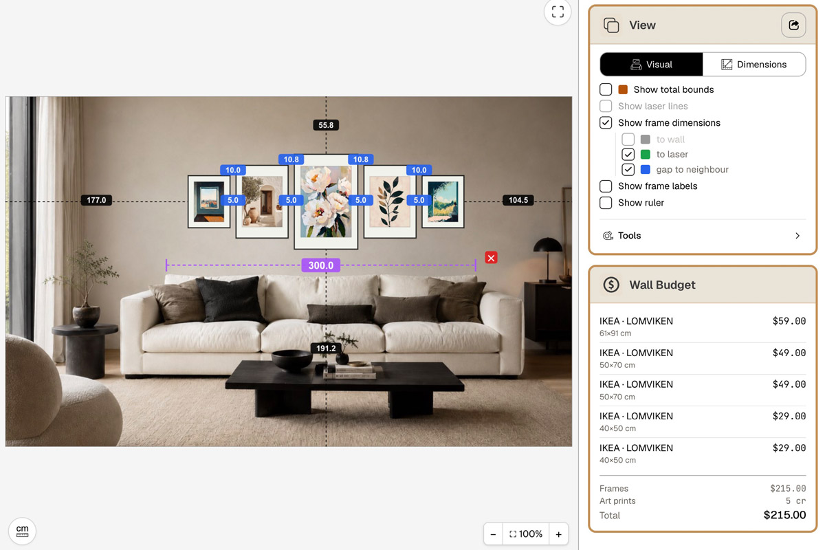
In HangPlanner, you can walk the whole home through like this:
- Use Add Wall to build out your home’s main walls one by one, each with its real dimensions.
- Tag each wall by room with Tags, then mark it
main-art,supporting-art, orintentional-blank. - For a wall you’re unsure about, drop a real photo of it in with Background Image and judge it on your actual wall (Background Image is a Plus feature).
- Put a placeholder piece on the focal and supporting candidates and compare it against the furniture, the mantel, the doors and windows, and the usable wall area.
- Adjust the tags based on what you see; a candidate that doesn’t work can go straight to
intentional-blank.
Want to try the feel first without signing up? Use the Demo wall (no signup, all features unlocked) to play on a single wall; to lay several walls of a whole home out together and keep them saved, the multi-wall workspace is a Plus feature.
The payoff of laying it out: before you drill a single hole, you can see which walls “earn” art and which are better left blank — instead of finding out after they’re already up.