
Outer-Aligned Gallery Wall with IKEA Frames
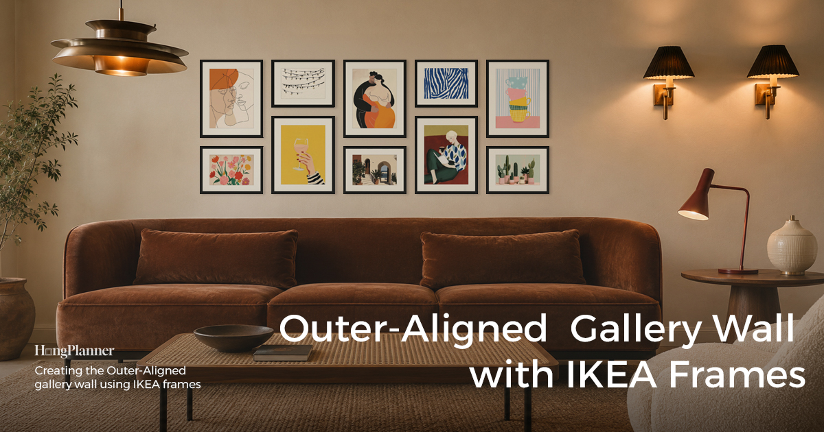
An outer-aligned gallery wall follows just one rule: all four outermost edges of the arrangement — top, bottom, left, and right — line up into a clean rectangle, while the frame sizes and positions inside that rectangle are free. In other words, it governs the outside, not the inside: the outer four edges form a tidy rectangle, and you can mix things up however you like within it. A strict grid aligns the interior too and demands identical frames; a bottom-aligned wall only lines up one edge along the bottom and grows upward; outer-aligned governs the outer ring — all four edges flush. That’s the biggest difference between it and every other layout.
It gives you a feeling no other layout does: crisp, contained, tidy as if it’s been neatly put away — yet alive on the inside. The point is not simply that the frames can be different sizes; it is that outer-aligned combines order and content freedom. The outside stays disciplined — four edges forming a clean rectangle — while the inside can hold richer image formats: portrait photos, landscape prints, certificates, posters, and artwork in different proportions. Let the larger frames hold down the corners and edges of the rectangle and fill the middle with smaller ones; as long as the outer four edges are flush, the whole thing reads clean and crisp.
One line to remember where it belongs: a rectangular outline wants a rectangular space. Above a sofa or console, the stretch of wall between two windows, the full wall beside a bookshelf — these spots are already rectangles, so a rectangular gallery wall set into them echoes the shape and looks the steadiest and crispest. What it doesn’t suit is a staircase, a tall narrow vertical wall, or anywhere you want a loose, salon-style feel.
This guide covers three things: how to arrange an outer-aligned wall, which series to pick on HangPlanner, and exactly how it differs from a grid and a bottom-aligned wall.
The lazy default
Above a sofa or console · between two windows · beside a bookshelf → set a rectangular boundary (roughly 2/3 to 3/4 of the width of the furniture below) and line up all four outermost edges to that rectangle. On HangPlanner this is a ready-made 8-frame layout — pick a series and size, hit Insert, and it’s arranged (8 frames is a starting point; you can add or drop a few). The trick (and the logic behind that preset): put the larger frames in the four corners and along the four edges first, then fill the middle with smaller ones — the corners are the easiest to miss, so make sure they reach the boundary. Frames: one series in one color is easiest; swap the series to change the whole mood (RÖDALM black / HÄCKHAGTORN pine / LOMVIKEN aluminium …), and let size variation do the work inside.
Hanging height: we usually suggest putting the visual center of the whole rectangle at 57 inches (150 cm), but the more accurate move is to base it on the average height of the people in your home — the most comfortable spot is when that center sits at eye level.
Alignment reminder: an outer-aligned wall lives or dies on whether the four outer edges and four corners are truly flush — one frame that doesn’t reach the edge and the “crisp” collapses. Use HangPlanner to see the whole arrangement’s bounding box; the distance from each outer edge to the wall edges tells you at a glance whether they line up.
Outer-aligned on HangPlanner: one 8-frame layout, pick the series and size
On HangPlanner, outer-aligned is one ready-made 8-frame layout — that “four outer edges in a rectangle, mixed sizes inside” composition is already arranged for you, ready to go on the wall. 8 frames is just the easiest starting point; the count is flexible — 6, 8, 10, 12, or 14 all work, depending on your wall space, taste, and budget. What you also choose is which IKEA series (which decides color and material) and which size tier. The same composition takes on a different character with each series:
- Crisp black / metal look → RÖDALM (black, fibreboard) or LOMVIKEN (IKEA’s only aluminium frame, a narrow metal profile that looks like it floats)
- Real wood tone → HÄCKHAGTORN (solid pine, sizes up to 40 × 50 cm)
- Tightest budget → FISKBO (the cheapest entry option, goes up to 30 × 40 cm only)
- Bigger, more of a statement → KLOTKÖRSBÄR or EDSBRUK (both reach 50 × 70 cm)
- Classic gold → SILVERHÖJDEN (gold decorative edge)
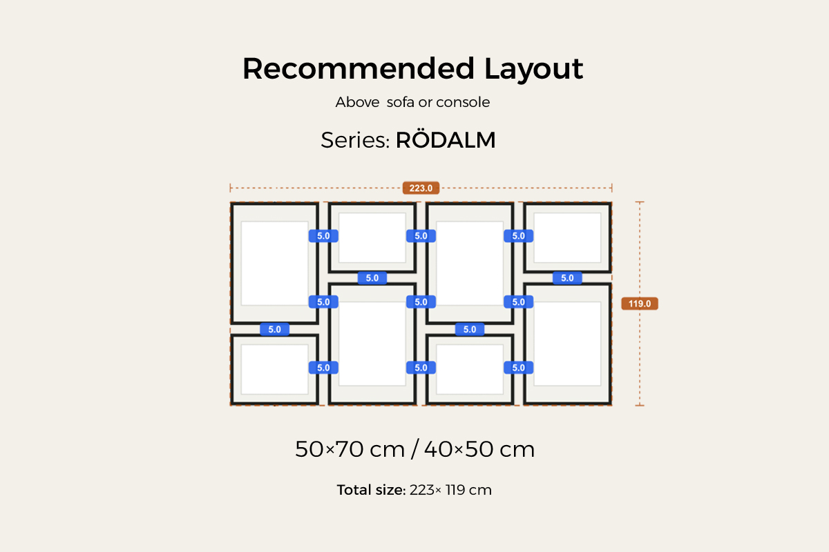
The width depends mostly on the size tier. At the recommended 50 × 70 / 40 × 50 cm sizes — like the RÖDALM layout above — the whole set is about 223 × 119 cm (about 88 × 47 in); step down to 30 × 40 cm frames and it comes to about 140 cm (about 55 in) wide. So across series and sizes the set runs from roughly 140 cm to 225 cm (about 55–89 in) wide, wider still with more frames. Choosing is simple — measure your wall or furniture first, aim for the set to land at 2/3 to 3/4 of the furniture’s width, then pick a series and size that fit and hit Insert to drop the whole set on the wall.
Why choose outer-aligned
First, it combines a tidy outer shape with content freedom inside. You want that “orderly, contained” clean look, but you don’t want the whole wall limited to one image format — outer-aligned sits right in between. The outer four edges lock in the order, while the inside can hold portraits, landscapes, posters, certificates, small photos, and larger artwork in the same arrangement. A strict grid works best when the images share the same proportion and size; outer-aligned only requires the four outer edges to line up. HangPlanner’s outer-aligned preset, for example, combines portrait and landscape frames within one clean rectangle: big frames hold the corners, smaller frames fill the gaps, and as long as the outer ring forms a rectangle, the whole thing stays crisp.
Second, one rectangular outline echoes the rectangles already in the room. A sofa is a rectangle, the wall between two windows is a rectangle, the wall beside a bookshelf is a rectangle — set a rectangular gallery wall into these spaces and the edges run parallel, so it reads as “fitted, deliberately placed.” This is where outer-aligned looks more polished than a loose arrangement: it doesn’t scatter art across the wall, it marks out a tidy display zone.
Third, it brings “order” and “content freedom” together. A grid is “uniform form, with the content often constrained by size and proportion too”; outer-aligned is “a uniform outer outline, with freedom inside.” You can mix portrait and landscape, big art and small photos, certificates and posters — as long as the outer ring is flush, the variety inside feels intentional instead of chaotic.
If what you want is exactly that — a clean outside shape with freer content inside — outer-aligned is made for you. But if you want the inside to be that cell-by-cell, fully uniform look as well, a [strict grid gallery wall →] suits you better (every frame equal, rows and columns all aligned); and if you only want the bottom edge of a row to line up with the tops free to vary, that’s a [bottom-aligned gallery wall →].
How an outer-aligned wall is built (and the logic behind that preset)
With HangPlanner’s 8-frame preset, the three steps below are already done for you — but once you understand the logic, you can judge whether it suits your wall and whether to fine-tune (add or drop a few frames). If you’re arranging it from scratch yourself, it’s these same three steps.
Step 1: Set the rectangular boundary first
Outer-aligned is arranged from the outside in — draw the frame first, then fill the content. Decide how big the rectangle is and where it sits: above a sofa or console, let the rectangle’s width land at 2/3 to 3/4 of the furniture’s width and leave 15–25 cm (6–10 in) between the bottom of the rectangle and the top of the furniture; between two windows or beside a bookshelf, take the edges of that space as the edges of the rectangle and leave an even margin all around; on an empty wall, put the center of the rectangle at eye level (57 inches / 150 cm by default, adjusted to the average height of your household). This step draws the rectangle in your head (or in HangPlanner) first, and every frame after this lines up to its four edges.
Step 2: Use large frames to hold the four corners and edges
This is the most important and most easily missed step of an outer-aligned wall. The rectangle’s outline comes from the outermost frames — place the larger frames in the four corners first, then add frames along the four edges so their outer edges all reach the boundary line. The four corners especially must be filled: one empty corner, or a frame on an edge that doesn’t reach the line, and the rectangle instantly falls apart. Remember one line: an outer-aligned wall is made or broken at the four corners.
Step 3: Fill the interior with smaller frames
Once the four edges and corners stand, the middle is free — use smaller frames (30 × 40 cm, 21 × 30 cm, even squares) to fill the center evenly, without leaving a big gap. This step is the most open: mix portrait and landscape, alternate big and small — because the outer ring has already locked in the order. To keep it simple, just use HangPlanner’s ready-made 8-frame preset and hit Insert; the four edges and the interior are all set.
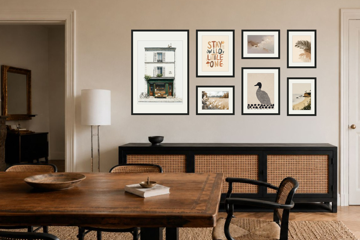
The walls outer-aligned suits best
The key to this layout is having a rectangular space that already exists, or that you can mark out — a rectangular outline needs a rectangular place to echo, to look crisp.
Above a sofa or console. The most classic stage. The furniture itself is a long rectangle; set an outer-aligned rectangle above it and the two long edges run parallel, so the whole wall looks “arranged” and steady. Landing the set at 2/3 to 3/4 of the furniture’s width looks the most natural.
Between two windows, beside a bookshelf. These spots already have straight edges around them; line the gallery wall’s four outer edges up with those straight edges and you turn a blank wall into a tidy display cell — the crispest look there is.
Orderly spaces that want a sense of structure. An entryway, a study, a more formal living room — when you want that “cared-for, squared-away” look, outer-aligned suits it better than a loose arrangement.
Walls to watch out for:
Staircases and tall, narrow vertical walls. The line of sight travels on a slant or vertically, so a tidy rectangle feels awkward and fights the space — a [staircase gallery wall →] or a vertical single column suits it better.
Anywhere you want a relaxed, lived-in feel. If what you’re after is that gradually-collected, slightly casual salon vibe, outer-aligned will feel too “deliberate, too tight” — that mood suits a layout that lets the outer outline go.
Common ways an outer-aligned gallery wall goes wrong
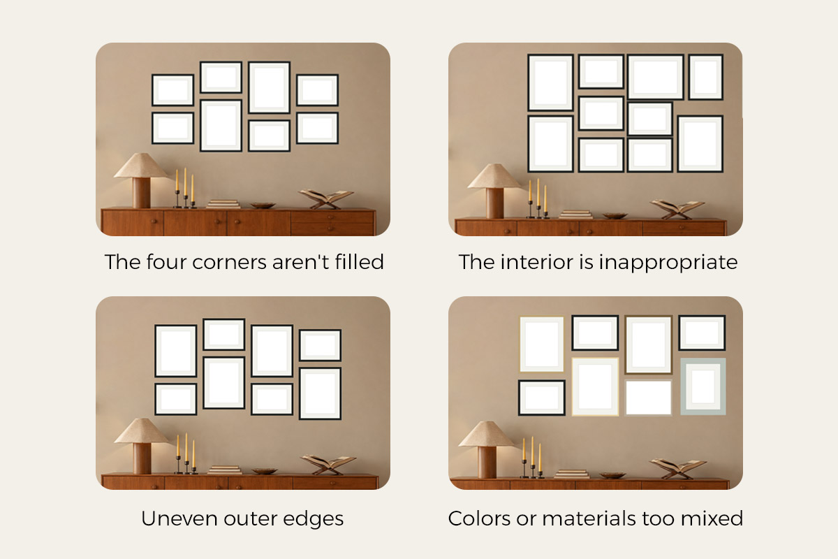
The four corners aren’t filled. The deadliest mistake: frames along the middle of each edge but the four corners left empty, so the rectangular outline has gaps and the whole thing looks like “a pile thrown up at random.” Fix — place the four corners first, then everything else, so each corner has a frame whose outer edge reaches the boundary.
Uneven outer edges. Along one edge, some frames reach the line and some fall short, so the edge turns into a sawtooth. Fix — before hanging, snap the rectangle’s four edges with a laser level and get every outermost frame’s outer edge to sit on the line; don’t eyeball it.
The interior is too tight or too empty. The outer frame stands, but the middle is either crammed solid or leaves a big blank. Fix — keep an even 5–7 cm (2–3 in) between interior frames; if the middle is too empty add a small frame, if it’s too tight remove one.
Colors or materials too mixed. Outer-aligned allows any sizes, but that doesn’t mean any colors — mix the frame colors and the outer outline can be perfectly flush and still look messy. Fix — keep the frame color and material consistent (all RÖDALM black, say, or all HÄCKHAGTORN pine) and let size, not color, do the variety.
The catch with a crisp rectangle is “filling all four edges” — and that’s easy now
People fall for outer-aligned at first sight: crisp, orderly, tidy as if it’s been put away. But start arranging and you hit it — “filling a rectangle whose four edges are all flush, using a pile of different-sized frames, is a real puzzle”: where the big frames go, where the small ones fill in, how the four corners just reach the boundary, whether the middle leaves a gap — with a tape measure and your eye alone, you’ll redo it over and over. That’s why this crisp look is common in professionally styled spaces yet always falls a little short in ordinary homes — what’s missing is exactly the patience and precision to fill the rectangle with all four edges flush.
Now, with HangPlanner, that hurdle is basically gone — outer-aligned is built as a ready-made 8-frame layout: pick an IKEA series and size, hit Insert, and all four outer edges and four corners are aligned for you. You don’t have to solve that “fill the rectangle” puzzle yourself (want a couple more or a couple fewer? adding and dropping both work). Want to fine-tune? That’s fine too: the whole arrangement’s bounding box is drawn right on screen, and the distance from each outer edge to the wall edges — plus whether every frame reaches the boundary — is visible at a glance. Don’t even want to choose? Filter for outer-aligned in gallery wall frames and start from any of the 7 series — the difficulty drops to the floor and a wall like this is easy to have.
You don’t calculate the sizes, spacing, or the position of each frame yourself — HangPlanner uses the real Frame width / Frame height to work out the whole bounding box, every gap, and the distance from each outer edge to the wall, and shows it to you. That matters especially for outer-aligned: the moment one frame falls a few millimeters short of the boundary, the rectangular outline isn’t clean anymore, and measuring by hand is exactly where that small error creeps in.
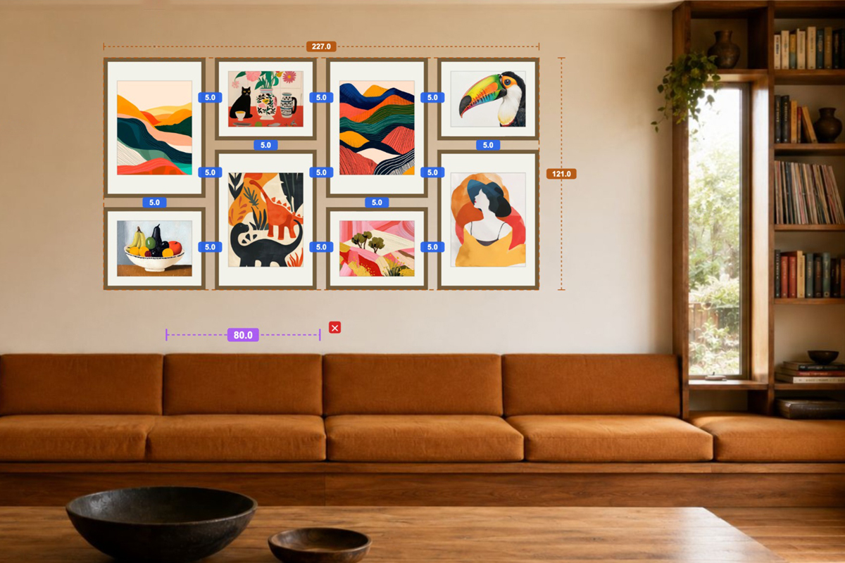
In HangPlanner, set your wall dimensions first, or upload a photo of the real wall and calibrate the scale against something of known size like a sofa or a window, then:
- Drop in the 8-frame preset from the outer-aligned layouts
- Pick an IKEA series (RÖDALM black / HÄCKHAGTORN pine / LOMVIKEN aluminium …) to set the color and material
- Adjust the size tier to your wall width (30 × 40 / 40 × 50 / 50 × 70), and add or drop a few frames as needed, so the set lands at 2/3 to 3/4 of the furniture’s width
- Switch to Dimensions and check the whole bounding box and the distance from each outer edge to the wall — whether all four edges line up is clear at a glance
- Swap the series to change the mood, or open Wall Budget to compare series on cost
- Mark each frame’s position on the wall from the plan, so even mixed sizes line up all four outer edges in one go
You can see on screen whether all four edges are flush — a lot cheaper than drilling the wrong holes, then filling and repainting.
FAQ
What is an outer-aligned gallery wall?
What's the difference between outer-aligned, a strict grid, and bottom-aligned?
Where does an outer-aligned gallery wall work best?
How many frames should an outer-aligned gallery wall have?
Can I use different series or different colored frames?
What's the hardest part of an outer-aligned wall?
Can I mix portrait and landscape frames in an outer-aligned gallery wall?
How high should I hang an outer-aligned gallery wall?
Sizing facts follow IKEA’s official Measurements fields — Frame width / height, Frame depth, Mount opening, Picture with mount, Picture without mount — where the name-size is the Picture without mount, not the outer frame. Frame series shown are current IKEA lines; confirm size, colour and availability on your local IKEA product page before buying. All sizes are given in cm and inches.