
Grid Gallery Wall with IKEA Frames
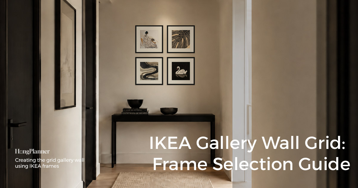
A grid gallery wall is several same-size frames arranged into a clean rectangle — 2 × 2, 3 × 2, 4 × 2, 3 × 3, 4 × 4. It’s the cleanest, most modern kind of gallery wall, and it looks best built from square frames: every side of a square is equal, so rows and columns line up on sight, giving you more order than rectangles do.
It’s also the least forgiving kind. In a loose gallery wall a 1 cm difference disappears; in a strict grid, one gap that’s too wide or one frame that’s slightly crooked makes the whole wall look off.
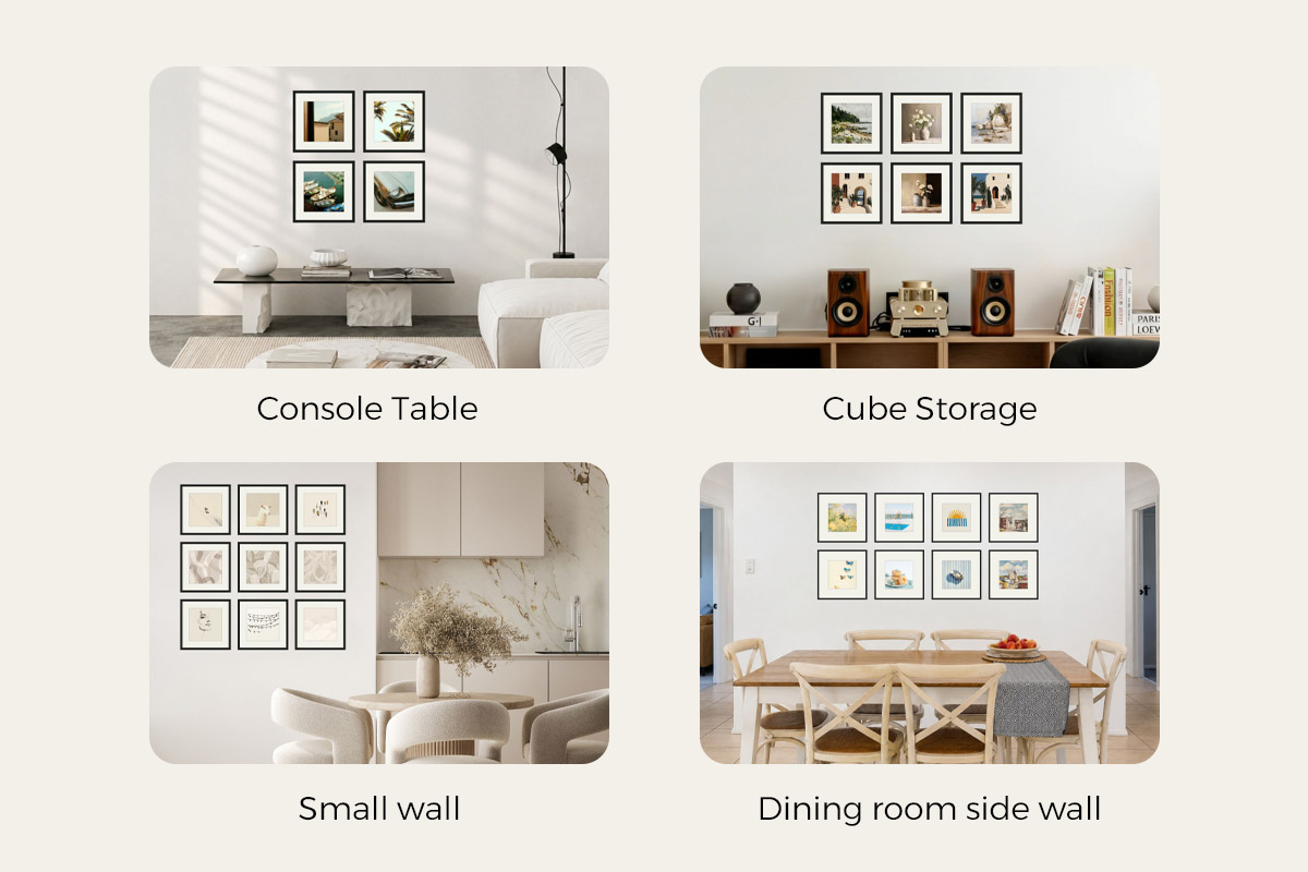
The one-line answer: use 4 frames on small walls, entryways, and the end of a hallway; 6 or 8 above a sofa or long console; 9 or 16 on a big empty wall. Hang the group so its visual center sits at 57 inches (150 cm).
This piece solves three things: how many frames, which square size, and exactly which ones to buy (all from what IKEA currently sells).
Lazy defaults
Small wall / entryway / end of a hallway → 4 frames (2 × 2), around SANNAHED 25 × 25 cm. Sofa / sideboard / console / wide horizontal wall → 6 frames (3 × 2) or 8 frames (4 × 2, two long rows). Big empty wall / family photo wall → 9 frames (3 × 3) with mid-size frames; 16 frames (4 × 4) stacks tall, so it actually needs small frames (25–35 cm).
Hanging height: as a rule of thumb we suggest putting the group’s visual center at 57 inches (150 cm), but ideally you’d base it on your household’s average height — the most comfortable height is when the center of the artwork sits level with your eyes.
How many frames, which wall, what size
Start with the rule: let the count and the size follow the wall and the furniture — not “how many squares I feel like.” A strict grid earns its look through repetition — same size, same color, same mount, same gap — so any error gets amplified: a frame off by 5 mm reads far more clearly than it would in a loose gallery wall. Ask three questions first:
- How wide is the wall?
- Is there furniture below it — a sofa, console table, or sideboard?
- Do you want a small accent, a focal point above furniture, or a full statement wall?
Here’s the layout menu you’ll use most. Squares are simpler to work with because there’s no “portrait or landscape” decision — they’re symmetric in all four directions.
| Layout | Shape | Best for |
|---|---|---|
| 4 frames | 2 × 2 | Small walls, entryways, end of a hallway |
| 6 frames | 3 × 2 | Above a sofa or console table |
| 8 frames | 4 × 2 (two rows) | Long sofas, long sideboards, wide walls |
| 9 frames | 3 × 3 | Big empty walls, family photo walls, offices |
| 16 frames | 4 × 4 | Big statement walls, stair landings, dining side walls |
When you work out how much wall the group takes up, here’s the easiest thing to get wrong: the “50 × 50 cm” in an IKEA product name is usually the Picture without mount (the print size that fits once the mount is removed), not the outer frame size. To judge how much wall the group covers, look at Frame width and Frame height under IKEA’s Measurements — but you don’t have to add anything up yourself. HangPlanner has all this data; drag the group onto the wall and the outer footprint and every gap are already calculated from the real Frame width.
Recommended setups
Small walls, entryways, end of a hallway → 4 frames (2 × 2). A 2 × 2 in SANNAHED 35 × 35 cm keeps the cost low, the content easy to prep, and the wall pressure light. Want more presence? Step up to 50 × 50 cm. The weakness is width: it’s too narrow to carry a big wall — hung above a sofa wider than 200 cm it looks like a small cluster of photos stranded in the middle.
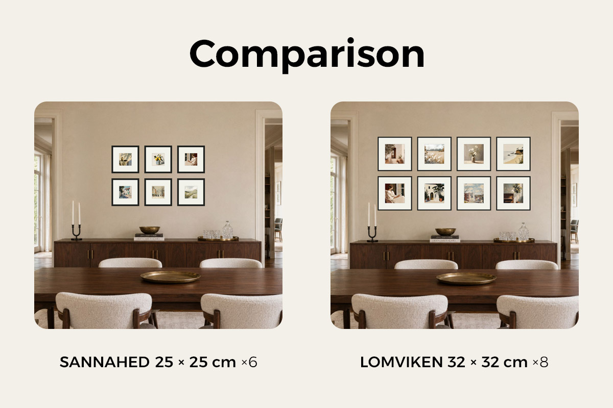
Above a sofa or console table → 6 frames (3 × 2) or 8 frames (4 × 2). A 3 × 2 suits a standard two- or three-seat sofa; if what’s below is a very long sofa, a long sideboard, or a whole wide wall, a 4 × 2 in two long rows spreads out and holds down the furniture width better. Two rows stay short, not tall, so this is the tier where you can go big without worry — 50 × 50, or even 60 × 60 cm for the strongest effect (a 4 × 2 alone runs a bit over 2 m wide, so you need a genuinely long wall). IKEA’s squares stop at 50 × 50; for 60 × 60, use VeeArt’s 60 × 60.
Hallway side walls: two rows of small squares work well, and you can extend the run to match the length of the hallway.
Big empty walls, family photo walls → 9 frames (3 × 3) or 16 frames (4 × 4). Save 3 × 3 and 4 × 4 for a stair landing, a dining side wall, an office wall — somewhere genuinely open. This tier has the most impact and suits family photos, black-and-white photography, or a plant or travel theme especially well. Pick the size in reverse: the more rows, the smaller each frame. A 3 × 3 can go 35–50 cm; but a 4 × 4 has four rows and needs small frames (SANNAHED 25 × 25 or 35 × 35 cm) — build it from 60 × 60 squares and the frames alone stack to 2.4 m tall, past a normal ceiling, so unless it’s a double-height space, don’t. Want the weight of big frames? Do the two-row 4 × 2 above instead — not a 4 × 4.
One reliable proportion: let the group’s width land at two-thirds to three-quarters of the furniture below it — that reads more naturally than matching the furniture exactly. Whether it truly lands is fastest to check by dragging a version in HangPlanner.
Setups to watch out for
Above the bed → be careful. A bed is usually a good bit narrower than the whole wall, and the headboard is limited in width too. Force a full grid above it and it either overhangs the headboard on both sides and looks scattered, or shrinks to fit and looks stingy. A headboard suits a larger, more unified arrangement — or just move the grid to a fuller wall. And because you can’t stand close to a bed, you usually view it from around 2.5 m away, so small frames don’t read (you can’t see them) while big frames won’t fit three across — so skip the multi-frame grid above a bed.
Size and row count that don’t match. It goes wrong in both directions: a 4 × 4 in 60 × 60 frames stacks to 2.4 m tall and overpowers the ceiling; the other way, a scatter of small frames spread thin across a wide wall just looks small. The principle: want big frames, do the two-row 4 × 2; want a full wall in a 4 × 4, use small frames — don’t stack big frames four rows high.
If you want a loose, mixed look, don’t force a grid. A strict grid is for people who want order, repetition, and minimalism; if what you want is varied sizes and a relaxed mix, a loose gallery wall suits you better and forgives more.
Shopping recipes: IKEA square-frame grids you can buy right now
The shopping rule in one line: buy one set of same-series, same-size square frames — it’s the least fuss, the best look, and the easiest to arrange. IKEA’s current squares are mainly SANNAHED (25 × 25 / 35 × 35 / 50 × 50 cm, with mount, deep and modern) and LOMVIKEN (a single 20 × 20 cm aluminum thin-edge square). Every recipe below uses a currently sold series; re-check size, color, and price on the live product page before you order.
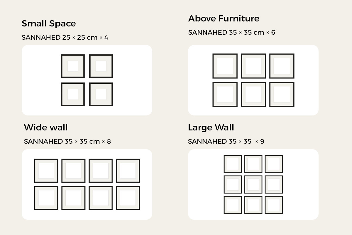
Small wall · 4 frames (2 × 2): SANNAHED 25 × 25 cm (about 10 × 10 in) × 4. The cheapest way to start — enough for an entryway, the end of a hallway, or a small empty wall; step up to 35 × 35 if you want more.
Above furniture · 6 frames (3 × 2) or 8 frames (4 × 2): SANNAHED 35 × 35 cm (about 14 × 14 in) × 6; for a very long sofa or sideboard, go big with a 4 × 2 in two long rows × 8 — 50 × 50 cm, or 60 × 60 for extra impact (IKEA stops at 50 × 50; use VeeArt for 60 × 60). Two rows don’t add height, which makes this the go-to tier above a sofa or long console.
Statement wall · 9 frames (3 × 3) or 16 frames (4 × 4): a 3 × 3 in SANNAHED 35 × 35 or 50 × 50 cm × 9; a 4 × 4 actually needs small frames — SANNAHED 25 × 25 or 35 × 35 cm × 16 — so four rows don’t stack too tall. Want the weight of 60 × 60 frames? Do the two-row 4 × 2 above instead of a 4 × 4. For black-and-white photography with a cooler, sharper thin edge, LOMVIKEN 20 × 20 cm makes a denser small grid.
Prefer rectangular frames? That works too — but keep them all one way
Squares are the cleanest, but rectangular frames can build a beautiful strict grid too — the one iron rule is that every frame faces the same way: all portrait or all landscape. Mix orientations and the grid falls apart instantly. Orientation also sets the group’s shape: portrait makes the grid read taller, good for narrow, tall walls and the space between two doors; landscape reads wider, good above a sofa or long console.
A few ready-made rectangular recipes (all current IKEA series):
- Classic portrait · 6 frames (3 × 2) or 9 frames (3 × 3): RÖDALM or KNOPPÄNG 30 × 40 cm (about 12 × 16 in) all portrait — the go-to for family photos and art prints.
- A bit grander · 6 frames (3 × 2) above a sofa: RÖDALM / KNOPPÄNG 40 × 50 cm (about 16 × 20 in), with more weight than 30 × 40.
- Low budget, many frames: FISKBO 30 × 40 cm in a 3 × 3 or 4 × 3 — no mount, a fuller look, lower cost.
To add variety within a set, you don’t need to change size or orientation — let the content create the rhythm (photos in the corners, a word or line-art piece in the middle). Changing frame size or orientation only breaks the grid’s order.
| Series | Shape & character | Best grid use |
|---|---|---|
| SANNAHED | Square, 25 / 35 / 50 cm, with mount, deep and modern | First choice for grids, especially big 3 × 3 and 4 × 4 walls |
| LOMVIKEN | Square 20 × 20 cm, aluminum thin edge, cool tone | Small, dense grids; black-and-white photography |
| RÖDALM / KNOPPÄNG | Mostly rectangular, wide choice of colors/lines, with mount | When you want a rectangular grid |
| FISKBO | Rectangular, entry price, no mount | Low budget, high frame count |
A few details for getting it on the wall
Spacing: how much gap to leave between frames in the grid has no single right answer — it mostly comes down to the size of the wall and the furniture around it. Narrower gaps make it read more like one continuous image; wider gaps feel airier and more relaxed. The only hard requirement: every gap in the group is the same width. 5 mm on the top row and 8 mm on the bottom, and your eye catches it immediately. Don’t measure it out with a ruler — drag it in HangPlanner and set it where it looks comfortable.
Hanging height: as a rule of thumb we suggest putting the group’s visual center at 57 inches (150 cm), but ideally you’d base it on your household’s average height — the most comfortable height is when the center of the artwork sits level with your eyes.
Don’t mix series: different series vary in outer frame width, thickness, edge line, and hook position, and mixing them in one grid makes the “strict” stop being strict. Want variety? Change the content, not the frame.
Try it in HangPlanner before you buy
A strict grid is the most worth previewing, because it isn’t a “close enough” layout. You don’t have to calculate any of the sizes or gaps — HangPlanner computes the group’s total width and height and every gap for you, from the real Frame width.
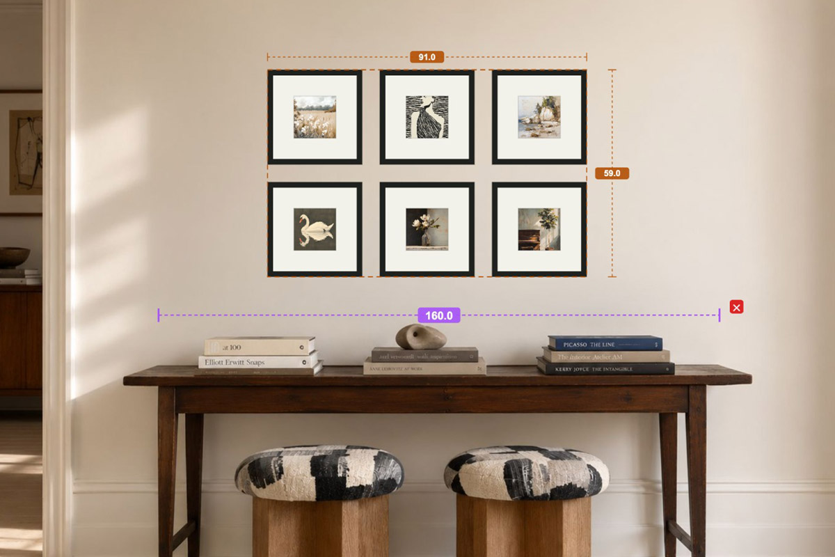
In HangPlanner, set your wall size first — or upload a real photo of your wall and calibrate the scale against something of known size, like a sofa, table, or door frame — then:
- Place the furniture below first, such as a sofa or console table
- Drag in a set of squares and try 4, 6, 8, 9, and 16 in different layouts
- Turn on Show total bounds to see whether the group’s outer footprint holds the wall
- Switch to Dimensions to read the group’s total width and height, every gap, and the distance to the wall edges — all calculated
- Nudge the spacing until you find the version that looks most comfortable
- Open Wall Budget to compare the cost across different frame counts
If 4 frames already look small on screen, they’ll only look smaller on a real wall; conversely, if 16 frames already crowd the furniture or hug the wall edges in the preview, the real install will feel cramped too. The goal of this preview round isn’t a pretty screenshot — it’s ruling out the wrong size before you drill. Buying one fewer wrong set of frames, or drilling a few fewer needless holes, is far cheaper than filling and repainting later.