
Center-Aligned Gallery Wall with IKEA Frames

A center-aligned gallery wall has just one rule: the whole group is built around one horizontal centre line, mirroring up and down — what sits above the line echoes what sits below. The purest version is a single row, with every frame’s vertical midpoint sitting on that centre line; add more frames and it becomes two rows, the top row and the bottom row balancing each other across the line. A bottom-aligned wall only cares about the bottom edge and grows upward; center-aligned cares about the line through the middle and grows both ways, mirrored — which is what sets it apart from the other layouts.
It gives you something no other layout does: tidy, steady and composed, but also lively and full of life. A strict grid is tidy too, but it forces you to buy frames all the same size; center-aligned only needs the halves to balance across the line, so frames of different heights still hold together. When the frames spread out both above and below the line, the group feels especially alive and shows a lot at once — which is why it’s often called the tidiest of the eight layouts without being the stiffest.
Here’s where it belongs in one line: the frames need room to spread above and below the line, so it wants a wall with space below — a bare wall, or one with fairly low furniture (roughly 80 cm / 31 in or under, like a low-backed sofa). Family games rooms, bars and relaxed offices suit it best; a headboard or a tall cabinet (tall furniture, little room above) doesn’t.
This piece sorts out three things: how to arrange center-aligned, which ready-made layout to pick, and exactly how it differs from a grid and from bottom-aligned.
The lazy default
Empty wall / above a low-backed sofa / games room · bar · relaxed office → fix one horizontal centre line and let the whole group mirror and balance around it (a single row puts each midpoint on the line; more frames go in two rows, top and bottom echoing each other), 4 to 7 frames. The lower the furniture below (roughly 80 cm / 31 in or under), the better — that’s what leaves room below the line. Frames: one series in one colour is easiest, but you can also mix heights (HangPlanner lets you combine any frames and preview first). Rhythm: keep the visual weight above and below the line roughly even — don’t let one side get top-heavy and tip the line.
Height: we usually suggest the group’s visual centre — this centre line — at 57 inches (150 cm), but it’s more accurate to base it on the average height of the people who live there — the most comfortable spot is with that centre line at eye level.
One alignment note: when you mix frame heights, each frame’s hook sits a different distance from its edge, so a hook nailed even slightly off throws the two sides of the line out of balance — let HangPlanner work out how high each hook goes instead of eyeballing it.
Pick the count by wall width: 4, 5, or 6–7 frames
The number of frames follows your wall width, not “how many I feel like.” The method is simple — measure the wall first, then set the count. All three tiers follow the same idea: balance around one horizontal centre line. HangPlanner has ready-made layouts for each, so you can hit Insert and drop one on the wall.
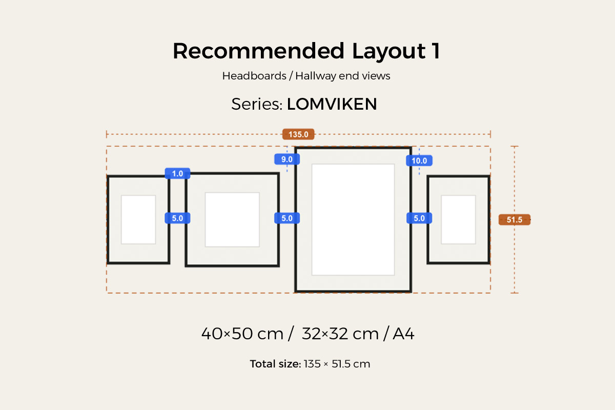
4 frames (group ≈ 135 cm / 53 in wide) — the smallest option, for a small-to-medium bare wall or the end of a hallway. Four frames in a single row with every midpoint on the line, which shows off the “one centre line” look best. Slim frames like LOMVIKEN (aluminium) make the cleanest single row.
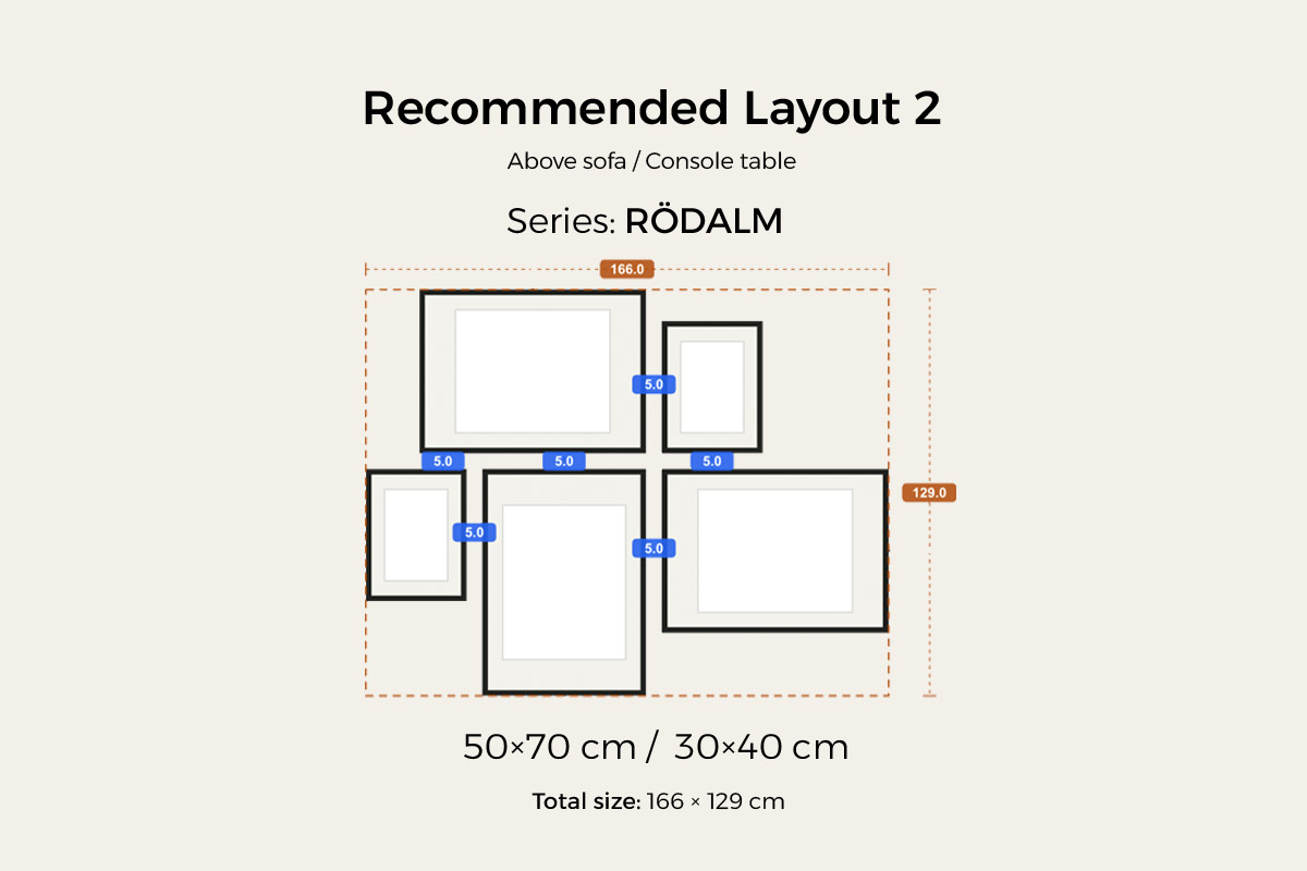
5 frames (group ≈ 140–166 cm / 55–65 in wide) — the most versatile, for above a low-backed sofa or on a bare wall. Either a single row with one big frame centred and two on each side, or two rows mirroring across the line. A single series in several sizes — RÖDALM or KNOPPÄNG, say — is the easiest to work with.
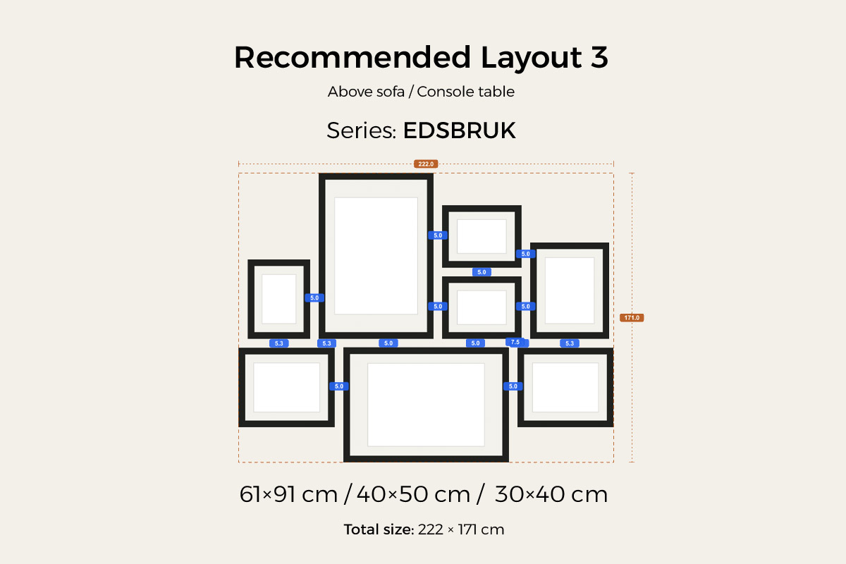
6–7 frames (group ≈ 165–187 cm / 65–74 in wide) — the spread-out option, for a wide bare wall, above a low long sofa, or a statement wall. Almost always two rows, with two or three bigger frames carrying the rhythm and medium and small frames weaving above and below the line — this tier is the liveliest and fills a whole wall. A 6-frame EDSBRUK or a 7-frame Mix set both land here.
A handy ratio: keep the group’s width at about 2/3 to 3/4 of the furniture below it — more natural than matching the furniture exactly. Whether it actually sits right is fastest to check by dragging a version in HangPlanner.
Why choose center-aligned
First, it’s tidy but also lively. You want that “composed, steady” feel, but you don’t want the whole wall as rigid as tiling — center-aligned sits right in between: one centre line locks in the order, while the frames can still vary in height and rise and fall. The eye runs along the line comfortably, with variety along the way.
Second, it doesn’t force you to buy identical frames. A strict grid demands every frame be the same size; center-aligned only asks the two sides to balance across the line. Got a few prints, photos or certificates in different sizes? No need to crop them all to one size — big frames carry the weight, small ones fill in to the sides or above and below, and as long as it balances around the line, the group holds. A single IKEA series (RÖDALM, for instance) already runs 21 × 30 cm (~8 × 12 in), 30 × 40 cm (~12 × 16 in) and 40 × 50 cm (~16 × 20 in) in matching colours, so they mix naturally.
Third, it’s lively and full of life — great for playful spaces. When the frames spread above and below the line, the group moves — more atmosphere than a row of equal-height frames, and it shows a lot of pieces at once. Family games rooms, bars and relaxed offices — anywhere you want some life on the wall — suit it best. The one condition: there has to be room below the line (a bare wall, or furniture low enough, roughly 80 cm / 31 in or under) for the frames to spread.
If what you want is tidy but not stiff, steady with a bit of energy — center-aligned is for you. But if the wall below is a headboard or a tall cabinet, with little room above, a bottom-aligned gallery wall → is a better fit (the group grows up off the top of the furniture).
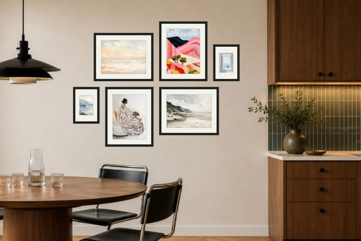
Three steps to a center-aligned gallery wall
Step 1: Set the horizontal centre line
Decide where the centre line falls. An empty wall is ideal — treat the group as one big rectangle and put its centre (the centre line) at eye level (57 inches / 150 cm by default, nudged to the household’s average height), so the frames can spread freely above and below. A wall with low furniture (a low-backed sofa or low cabinet, roughly 80 cm / 31 in or under) — put the centre line at eye level the same way; the furniture is low, so there’s still room below the line for the bottom row of frames. The taller the furniture, the less room is left below — and the less this layout suits the wall.
Step 2: Balance the two halves
Once the centre line is set, the visual weight above and below it makes or breaks the group. The trick is to mirror the two halves and keep them roughly even, rather than top-heavy:
- ✅ Balanced up and down: in a single row, sit every frame’s midpoint on the line; in two rows, let the top and bottom mirror each other across the line — where one side gains a little, make it up on the other. The group looks like it “breathes” symmetrically along the line, and holds steady.
- ❌ Top-heavy: pile the big frames all above the line and the small ones below, and the line looks tipped upward, the whole group off-balance.
Not sure which version balances best? Dragging two in HangPlanner to compare is the fastest way to decide.
Step 3: Choose the frames
The easiest route — pick one of the ready-made layouts in HangPlanner and hit Insert, and the sizes, series and colours are all set for you. Prefer to build your own? You have plenty of freedom: one series in one colour is the simplest, but you can also mix heights — HangPlanner lets you combine frames across any series and size. A mix looks just as good; drop it on the wall, and if it balances around the line, go for it.
The walls center-aligned suits best
The key to this layout is room below the centre line — the frames need to spread both above and below it to feel lively and full of life. So it wants a wall that’s either bare or has low furniture below.
A bare wall. The ideal stage. With nothing in the way, the frames grow symmetrically on both sides of the line, showing a lot at once — lively and orderly at the same time.
Above low furniture (roughly 80 cm / 31 in or under). A low-backed sofa, a low TV unit, a low side cabinet — low furniture leaves room below the line for the bottom row of frames. Keep the group’s width at about 2/3 to 3/4 of the furniture below.
Relaxed, playful spaces. Family games rooms, bars, casual offices — exactly the places that want this lively, full-of-life kind of wall, with more atmosphere than a row of neat, equal-height frames.
Walls to be careful with:
Above a headboard or a tall cabinet — too little room above. A headboard is usually 1.1 m (about 43 in) or taller, and cabinets take up height too, so the space between the top of the furniture and the ceiling gets narrow — the frames can’t spread below the line, and the liveliness is lost. Above tall furniture, a bottom-aligned gallery wall → works better, with the group growing up off the top of the furniture.
Stairwells and tall, narrow vertical walls. The eye travels diagonally or vertically there, so a horizontal centre line has nothing to work with — a staircase layout → suits those better.
A few ways center-aligned goes wrong
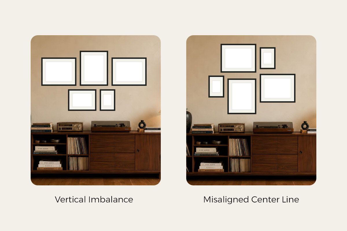
Top-heavy imbalance. The most common mistake: piling the big frames all above the line and the small ones below, so the group is top-heavy and the line looks tipped. Fix — keep the visual weight above and below the line roughly even; where one side gains, make it up on the other.
A centre line that isn’t actually level. The hard rule of center-aligned is that the group balances around one horizontal line; if it tilts, the whole group collapses. Fix — always strike that line with a laser level before you hang, never by eye.
Top and bottom rows that aren’t symmetric. In a two-row layout, if the top and bottom rows don’t echo each other in count, size and weight (three big frames on top, two small below), the line stops working as an axis and the group leans to one side. Fix — mirror the two rows across the line, so the count and visual weight on each side answer one another.
Gaps that jump around. Center-aligned wins on tidiness, so the moment the gaps between frames — and between the two rows — aren’t consistent, that composed look slips. Fix — settle on one gap (a common range is about 5–8 cm / 2–3 in) and use it across the board; if you’re unsure, let HangPlanner set an even gap and label every one for you.
Want it lively? The hard part is hanging — not anymore
Plenty of people fall for this spread-out look at first sight: lively, playful, full of life, showing lots at once. But the moment you try it, you find out — the more irregular the layout and the more you mix frame sizes, the harder hanging gets, fast: each frame’s hook sits a different distance from its edge, and getting them all to balance around one line at once is easy to get wrong with a tape measure and a good eye. So in real life this wall is uncommon in homes and shows up more in restaurants, bars and hotels — because that’s where a professional installer hung it.
HangPlanner basically flattens that hurdle: every nail position is worked out for you, so all that’s left for you to do is design the layout. And if you’d rather not design one from scratch, you can go straight to gallery wall frames, filter to center-aligned, and pick a ready-made one to start — the difficulty drops to almost nothing, and a wall like this is easy to have.
If you do arrange your own, three things are hard to picture in your head — whether the two halves balance, how high the centre line sits, and how high each hook goes when you mix heights. Dragging a version is the fastest way through. You don’t have to calculate the sizes, the gaps or the hook heights — HangPlanner uses the real Frame width / Frame height to give you the group’s overall size, every gap, and the position of each nail. That last part matters for center-aligned in particular: mix the heights and the hook positions are all different, and working them out by hand is exactly where a frame ends up nailed off and the two sides fall out of balance.
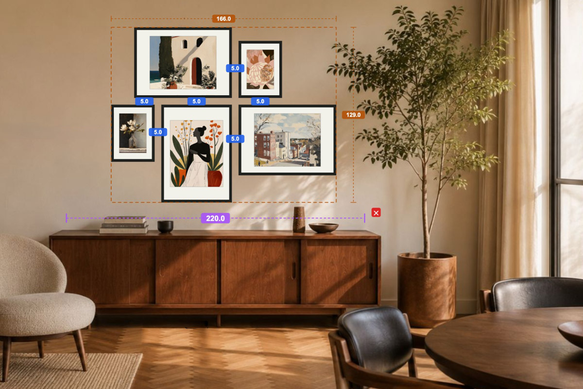
In HangPlanner, set your wall size, or upload a photo of the real wall and calibrate the scale against something of known size — a low-backed sofa or low cabinet — then:
- If there’s low furniture below the wall (a low-backed sofa or low console), place it first; skip this on a bare wall
- Drop in a ready-made set, or drag in a few frames in different heights (4 to 7)
- Balance the whole group around one horizontal centre line (a single row puts the midpoints on the line; two rows mirror above and below)
- Adjust the split above and below — keep the visual weight on each side even — and try a few rhythms
- Switch to Dimensions for the group’s width and height, every gap, and the distance to the wall edges — all worked out
- Mark each frame’s hook position on the wall, so even mixed heights line up to the centre line in one go
- Open Wall Budget to compare the cost of different combinations
You can see on screen which version sits best — a lot cheaper than drilling the wrong holes and then filling and repainting.
FAQ
What is a center-aligned gallery wall?
How is center-aligned different from a strict grid and from bottom-aligned?
Where does a center-aligned gallery wall work best?
Can a center-aligned gallery wall go above a headboard or a tall cabinet?
Why is this spread-out kind of gallery wall uncommon in homes?
Can a center-aligned gallery wall mix different frame sizes?
When you mix frame heights, how do you keep the group actually on the centre line?
How high should a center-aligned gallery wall hang?
How many frames should a center-aligned gallery wall have?
Is the "30 × 40 cm" in an IKEA product name the outer frame size?
Sizing facts follow IKEA’s official Measurements fields — Frame width / height, Frame depth, Mount opening, Picture with mount, Picture without mount — where the name-size is the Picture without mount, not the outer frame. Frame series shown are current IKEA lines; confirm size, colour and availability on your local IKEA product page before buying. All sizes are given in cm and inches.