
Symmetrical Gallery Wall with IKEA Frames
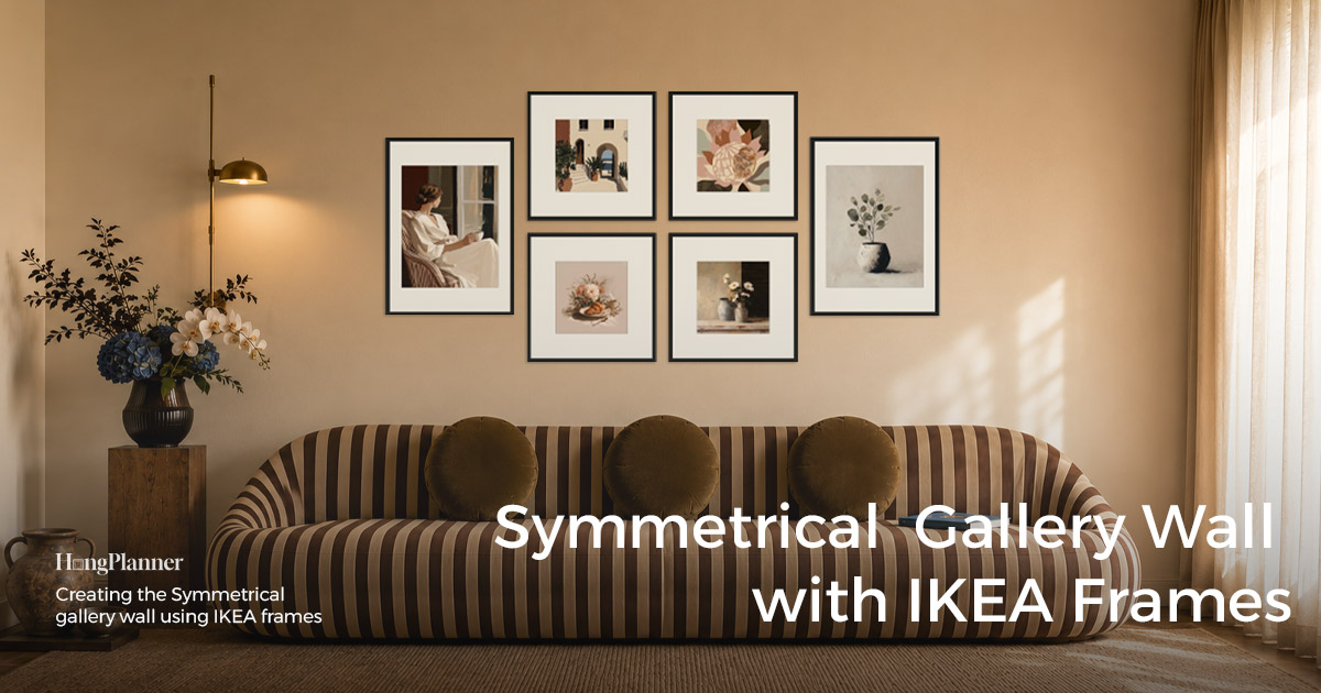
A symmetrical gallery wall comes down to one thing: one half is the mirror of the other. There are two ways to do it. Side-to-side symmetry sets a vertical centre line and mirrors left to right — whatever you put on the left, you put an identical piece the same distance out on the right. It suits wide walls that spread out horizontally, like the space above a sofa or a fireplace, and it’s the more common of the two. Top-to-bottom symmetry sets a horizontal centre line and mirrors up and down — it suits tall, narrow walls like the end of a hallway or the strip between two doors. Either way, the mirrored pairs sit an equal distance from the axis and line up position-for-position. Sizes can vary (a big pair at the ends, smaller frames in the middle) as long as the two halves still mirror. Side-to-side is more common, so it’s the main thread here; we’ll switch to top-to-bottom when we get to tall, narrow walls.
Symmetry gives you something no other layout does: it looks composed, steady, and instantly “right.” That’s why it’s the classic choice above a sofa or down a hallway — a sofa is already a symmetrical piece of furniture (centred, with matching arms), and a hallway is a symmetrical passage you face head-on, its two walls mirroring each other. Line the gallery wall’s centre up with that axis and the whole wall settles into place, upright and formal. If you want a wall that “can’t go wrong” and reads as put-together, symmetry is the first pick.
But don’t fall for “symmetrical = easiest.” It’s actually the least forgiving layout of them all. Because every frame has a mirror twin to compare against, if one piece sits a little high, a little low, or a little too far from the centre, your eye catches it immediately. That “steady” look is measured in before you hang, not handed to you for free.
This guide covers three things: how to arrange a symmetrical wall, whether to buy an even or odd number of frames, and exactly how it differs from a grid.
The lazy default
Above a sofa, fireplace, or low console; down a hallway (especially the end wall you face head-on); a formal entry → set one vertical centre line and mirror the whole arrangement left to right: one frame on the left, an identical one the same distance out on the right. For an even count (4 or 6), use pure pairs with the centre line running through the middle gap. For an odd count (3, 5, or 7), sit one frame — usually the largest — on the centre line and flank it with mirrored pairs.
Frames: buying in matching pairs is easiest (same series, same size, same colour, two at a time), so the two sides are identical.
Placement: when there’s centred furniture, line the wall’s centre up with the furniture’s centre (sofa or console); on a hallway or bare wall, put the centre on the middle of the wall, with equal margins on each side.
Tall, narrow wall (hallway end, between two doors) → switch to top-to-bottom symmetry: use a horizontal centre line and stack the mirrored pairs one above the other. Same idea, axis turned 90°.
Hanging height: we usually suggest putting the visual centre of the whole arrangement at 57 inches (150 cm), but it’s more accurate to base it on the average height of the people who live there — the most comfortable spot is where that centre sits at eye level. Above a sofa, drop the rule and leave 6–10 inches (15–25 cm) between the bottom of the arrangement and the top of the sofa back.
Alignment note: symmetry hides nothing — if one frame in a pair sits higher, or one side is wider off the axis than the other, the whole wall looks crooked. Let HangPlanner work out each frame’s left–right position and height from the centre line; it beats eyeballing.
Two grammars: even pairs, or an odd centred anchor
First, tell symmetry apart from a grid: a grid is identical frames laid out in a regular block (all the same size, all four edges aligned); symmetry is one axis turning two halves into mirror images, and the sizes can vary. The test is “is it mirrored, and do the sizes change?” — not how many rows and columns you count. The purest and easiest-to-hang symmetry is a single row (side-to-side) or a single column (top-to-bottom); on a big wall with more frames, it can also open out as “a large frame at each end around a cluster of smaller ones,” still mirrored left to right.
Then decide: even or odd? The count follows the wall — side-to-side looks at wall width, top-to-bottom at wall height, so measure first. HangPlanner has ready-made layouts for all of these; drop one in with Insert. The examples below are side-to-side; for top-to-bottom, just turn the direction 90°.
Even · pure pairs (centre line through the middle gap). There’s no centred piece — the centre line runs through the gap in the middle, and the two halves mirror each other.
- 4 frames (a row about 150–190 cm / 59–75 in wide) — a single row [ A B | B A ], with the centre line through the middle gap. Medium-to-large bare walls, above a sofa, a long hallway wall.
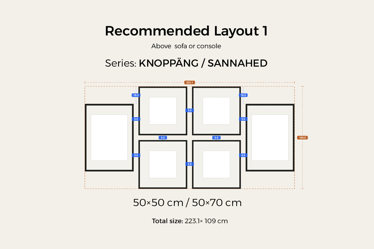
- 6 frames (about 222.9 cm / 88 in wide × 109 cm / 43 in tall) — a 50 × 70 cm (about 20 × 28 in) portrait frame at each end, with four 50 × 50 cm (about 20 × 20 in) square frames in the middle as two mirrored pairs; the whole thing mirrors left to right. The mix of sizes adds depth, it’s more compact than six frames in one straight row, and it fills a sofa wall or a wide bare wall. (Square frames like KNOPPÄNG or SANNAHED in the middle, a larger frame at each end.)
Odd · centred anchor (one frame on the centre line). One frame — usually the largest — sits right on the centre line as the anchor, with the rest flanking it in mirrored pairs. This gives the arrangement a built-in focal point: more formal, with clearer hierarchy.
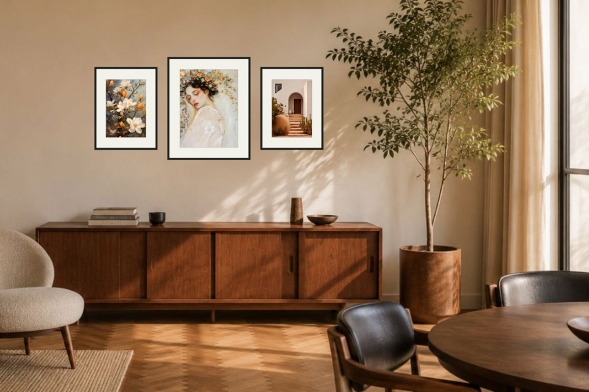
- 3 frames (a row about 110–150 cm / 43–59 in wide) — one centred, one on each side; the classic three-frame symmetry. Rock-solid above a sofa or on a hallway end wall.
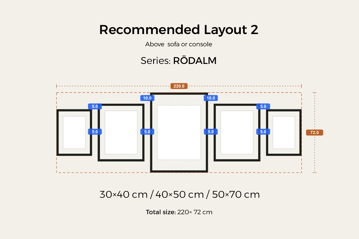
- 5 frames (a row about 220 cm / 87 in wide × 72 cm / 28 in tall) — a 50 × 70 cm frame centred on the axis, flanked by 40 × 50 cm then 30 × 40 cm out to the ends, so the sizes step down symmetrically from the middle. A workhorse for wide walls and wide sofas — RÖDALM covers all three sizes in one colour.
Bigger walls can go to 7 frames (odd: one centred, three on each side) or more — but always by mirroring, never by laying a block of identical frames in a regular grid.
A handy proportion: the whole arrangement should land at two-thirds to three-quarters of the width of the furniture below it (for top-to-bottom symmetry, look at height instead), which reads more naturally than matching the furniture’s full width. Whether it lands right is fastest to check by dragging a version in HangPlanner.
Why choose symmetry
First, it’s the most composed and steady — it looks “right” at a glance. You want that upright, put-together, can’t-go-wrong feeling — that’s exactly what symmetry delivers. Side-to-side mirroring is the order used in faces, architecture, and classic framing; the eye reads it as “stable.” In a living room or a more formal space, it’s the layout least likely to draw criticism.
Second, it’s a natural fit for sofas and hallways. A sofa has two arms and a centre line — it’s a symmetrical piece of furniture; a hallway is a symmetrical passage you face head-on, its two walls mirroring each other. Line the gallery wall’s centre up with the sofa’s centre, or put it on the middle of the hallway wall, and the arrangement sits firmly, as if it grew there. That’s why symmetry has long been the classic choice above a sofa and on a hallway wall.
Third, the frames don’t have to be identical across the whole wall — matched in pairs is enough. Symmetry only asks for mirrored pairs across the centre line: you can put a big one in the middle and smaller ones on the sides, and as long as each pair matches, the sizes can vary and carry a sense of hierarchy. A single IKEA series like RÖDALM comes in 21 × 30 cm (about 8 × 12 in), 30 × 40 cm (about 12 × 16 in), and 40 × 50 cm (about 16 × 20 in), all in one colour, so pairing them up looks natural.
“Wait — isn’t a grid also symmetrical?” Good question to ask. A strict grid, or an even triptych, does look symmetrical too — symmetry is a visual property lots of layouts share; it isn’t unique to this one. The way to tell them apart is to look at what’s organizing the wall: a grid runs on “every frame identical + all edges aligned,” and symmetry is just a side effect — you’re thinking “grid,” not “mirror.” Symmetry, as a layout, is organized by exactly this rule: one half is the mirror of the other (side-to-side or top-to-bottom), and the sizes are allowed to differ. One quick test: a grid is identical frames in a regular block; symmetry is mirroring plus varied sizes. Put four identical frames in a 2×2 and that’s just a grid; symmetry would set those four in a row [ A B | B A ] (different sizes left and right), or make it a big frame at each end around a cluster of smaller ones, mirrored left to right. So: identical + all edges aligned → grid; varied sizes mirrored across one axis (side-to-side or top-to-bottom) → symmetry. A grid gets its symmetry from sameness; symmetry gets it from mirroring.
If what you want is composed, upright, and instantly steady, symmetry is built for you: side-to-side on a wide wall, top-to-bottom on a tall narrow wall (a hallway end, between two doors). But if your wall itself isn’t symmetrical, or one side is cut off by a window or door, forcing a mirror will look awkward — take a look at a focal gallery wall instead (one large anchor with smaller pieces radiating out, no matching sides required).
Three steps to a symmetrical gallery wall
Step 1: Set the vertical centre line
Decide where that vertical line falls. On a wall with centred furniture (sofa, fireplace, low console, entry table) — easiest: line the centre up with the middle of the furniture, and the whole wall follows the furniture’s axis. On a hallway or a bare wall — put the centre on the middle of the wall, or line it up with a visual centre in the room (a centred window, a pendant light, the head-on sightline down a hallway). Then snap the line onto the wall with a laser level or a plumb line — everything in a symmetrical wall is measured from this one line.
Step 2: Mirror the pairs
With the centre line set, make the two halves mirror each other. The trick is that every pair shares three things: same size, same height, same distance from the centre line.
- ✅ Mirrored: if a frame on the left sits 20 cm out from the centre with its bottom edge at a certain height, the one on the right sits 20 cm out with its bottom edge at the same height. Match them pair by pair and the wall balances itself.
- ❌ Uneven sides: hang one side higher than the other, or set one side wider off the axis than the other — because there’s a mirror twin to compare against, the mismatch shows at a glance and the whole wall looks crooked.
For odd counts, don’t forget the centred anchor: set the middle piece (usually the largest) square on the centre line first, then add the mirrored pairs out to the sides.
Step 3: Pick the frames
Easiest of all — pick a ready-made symmetrical layout in HangPlanner and hit Insert, and the sizes, series, and colours of the pairs are all set for you. Prefer to build your own? It’s simple: buy in matching pairs — two identical frames at a time, made for mirroring. Same series and same colour is the least fuss (a pair of RÖDALM 30 × 40, say, or a pair of LOMVIKEN aluminium frames); for an odd count, add one larger frame as the centred anchor. The slim-profile LOMVIKEN (IKEA’s aluminium frame) looks cleanest for symmetry, and RÖDALM, with its range of sizes and colours, is the most versatile.
The walls symmetry suits best
The key to this layout is that the wall or the furniture needs a clear centre line for the gallery wall to mirror, so it can sit steady and upright. It’s after “centred, symmetrical” walls.
Above a sofa. The classic stage. The sofa is centred with matching sides; line the gallery wall’s centre up with the sofa’s centre and the arrangement sits above it, upright and composed. Landing the width at two-thirds to three-quarters of the sofa’s width looks most natural.
Down a hallway, and the entry. A hallway is a naturally symmetrical passage that’s best seen head-on; the end wall of a hallway, an entry, or the wall above a centred entry table takes symmetry beautifully — upright and composed. With no furniture below, just centre the arrangement on the middle of the wall. All of these use side-to-side symmetry.
Fireplaces and centred consoles. Above a fireplace or a centred dresser — furniture that’s already centred — symmetry looks “right,” and it’s at its most composed in a more formal space.
Tall, narrow walls — use top-to-bottom symmetry. The end of a hallway, the strip between two doors, the wall beside a stair landing — narrow-but-tall walls where you can’t spread out sideways. Turn the direction instead: use a horizontal centre line and stack the mirrored pairs one above the other (one on top, its mirror below, or one centred piece with pairs above and below). Just as upright and steady, only growing in height.
Walls to watch out for:
Above a bed — not recommended. A bed is a symmetrical piece of furniture, but symmetry doesn’t really suit it here: for one, having several frames hanging right over where you sleep makes most people uneasy; for another, a bedroom wants a soft, relaxed feel, and formal symmetry reads as “hard” and upright, out of step with the room. Leave the space above a bed to a softer, more relaxed layout.
Asymmetrical walls, or one side cut off by a window or door. If one side of the wall is interrupted by a window, door, or furniture, forcing a mirror gets blocked and looks awkward. That wall is better suited to a focal gallery wall (one large anchor with smaller pieces radiating out, no matching sides required).
Stairwell walls. A staircase runs on a diagonal, so neither a horizontal nor a vertical axis of symmetry has much to work with — a staircase gallery wall that follows the slope is the better fit.
Common ways a symmetrical gallery wall goes wrong
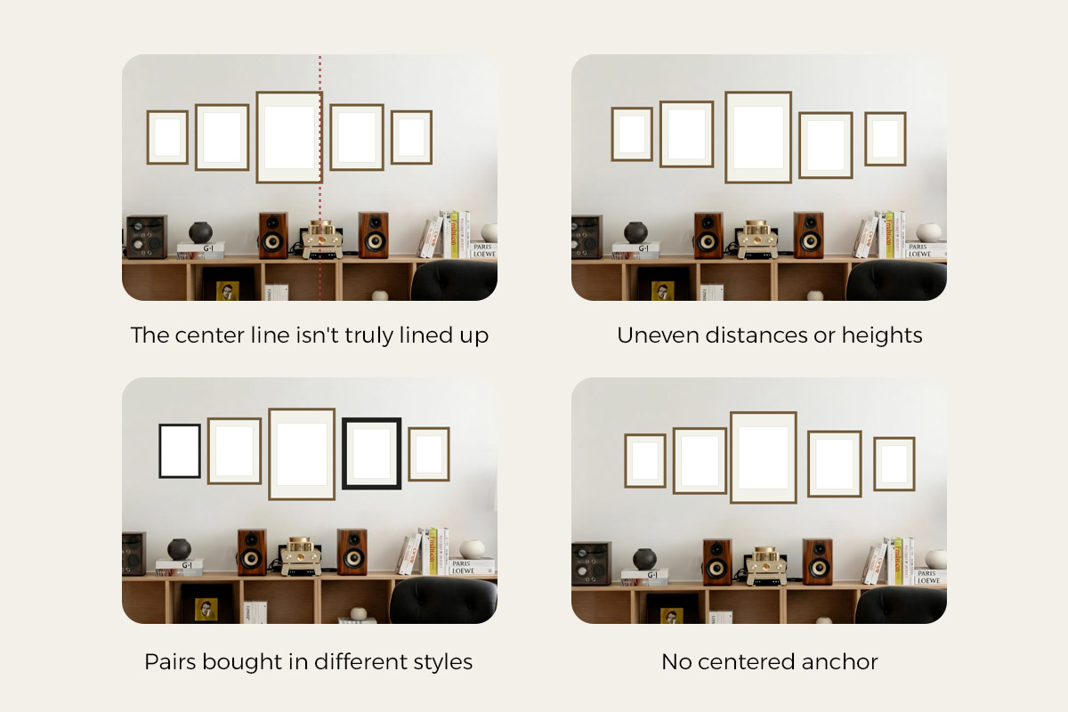
The centre line isn’t truly lined up. The hard rule of symmetry is that the whole arrangement mirrors across one vertical centre line; if that line is off, or doesn’t line up with the centre of the furniture below, the wall falls apart. The fix — always snap the centre line with a laser level or plumb line before you hang, and line it up with the middle of the sofa or furniture (on a hallway or bare wall, with the middle of the wall). Don’t eyeball it.
Uneven distances or heights. The most common miss: one pair sits wider off the axis on the left than the right, or a pair hangs high on one side and low on the other. Because there’s a mirror twin to compare against, it really shows. The fix — measure each pair’s “distance from the centre line” and “bottom-edge height,” and use the same numbers on both sides.
Pairs bought in different styles. Aiming for a clean mirror but using different sizes or different series left and right breaks the effect. The fix — buy in matching pairs so the two sides of the centre line are identical; if you want variety, change a whole pair at once.
An odd count with no centred anchor. Trying to hang 3 or 5 without sitting one piece on the centre line leaves the axis running through the side of a frame, and the whole wall shifts off-centre. The fix — an odd count must have one piece anchoring the centre, with the rest in mirrored pairs.
Symmetry looks great; the hard part is hanging both sides identically — not anymore
Plenty of people love symmetry: composed, upright, instantly steady. But the moment you start, you find that the hard part isn’t the idea — it’s hanging the two sides identically. Every pair has to sit an equal distance from the centre line with matching bottom edges, and the slightest difference shows because there’s a mirror twin right there to compare against. Measuring frame by frame with a tape and checking left against right, it’s easy to drift more crooked with each one.
With HangPlanner, that hurdle is mostly gone: each frame’s left–right position and height are calculated from the centre line for you, so the two sides mirror automatically and the only thing left to do is design the layout. When you use matching frames in a pair, the two hooks are already at the same height; HangPlanner nails “how far out from the centre” as well, so both sides line up exactly. And if you’d rather not design a layout from scratch, filter the gallery wall frames for symmetrical and start from a ready-made one.
If you do lay it out yourself, three things are hard to picture in your head: where the centre line should fall, how far out each side should sit to stay symmetrical, and where the centred anchor goes for an odd count — dragging a version is fastest. You don’t have to work out the sizes, gaps, or positions yourself; HangPlanner uses the real Frame width and Frame height to calculate the overall width and height, every gap, and each frame’s distance from the centre line. That matters most for symmetry: the smallest difference between sides reads as “crooked,” and by hand it’s easiest to end up wider on one side than the other.
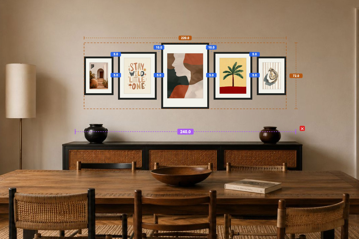
In HangPlanner, set the wall size first — or upload a photo of the real wall and calibrate the scale against something of known size, like a sofa or entry table — then:
- If there’s centred furniture below (a sofa, a low console), place it first and note its centre; on a hallway or bare wall, set the centre on the middle of the wall.
- Drop in a ready-made symmetrical preset, or drag your own frames in pairs (even for pure pairs, or odd with one centred anchor).
- Line the arrangement’s vertical centre line up with the furniture’s centre.
- Mirror pair by pair — equal distance from the axis, matching bottom edges — and try a few counts (3 / 4 / 5 / 6 / 7).
- Switch to Dimensions to see the overall width and height, every gap, and each side’s distance to the wall edge — all calculated, symmetrical by construction.
- Mark each frame’s calculated position on the wall, and both sides line up in one pass, no measuring back and forth.
- Open Wall Budget to compare the cost of different combinations.
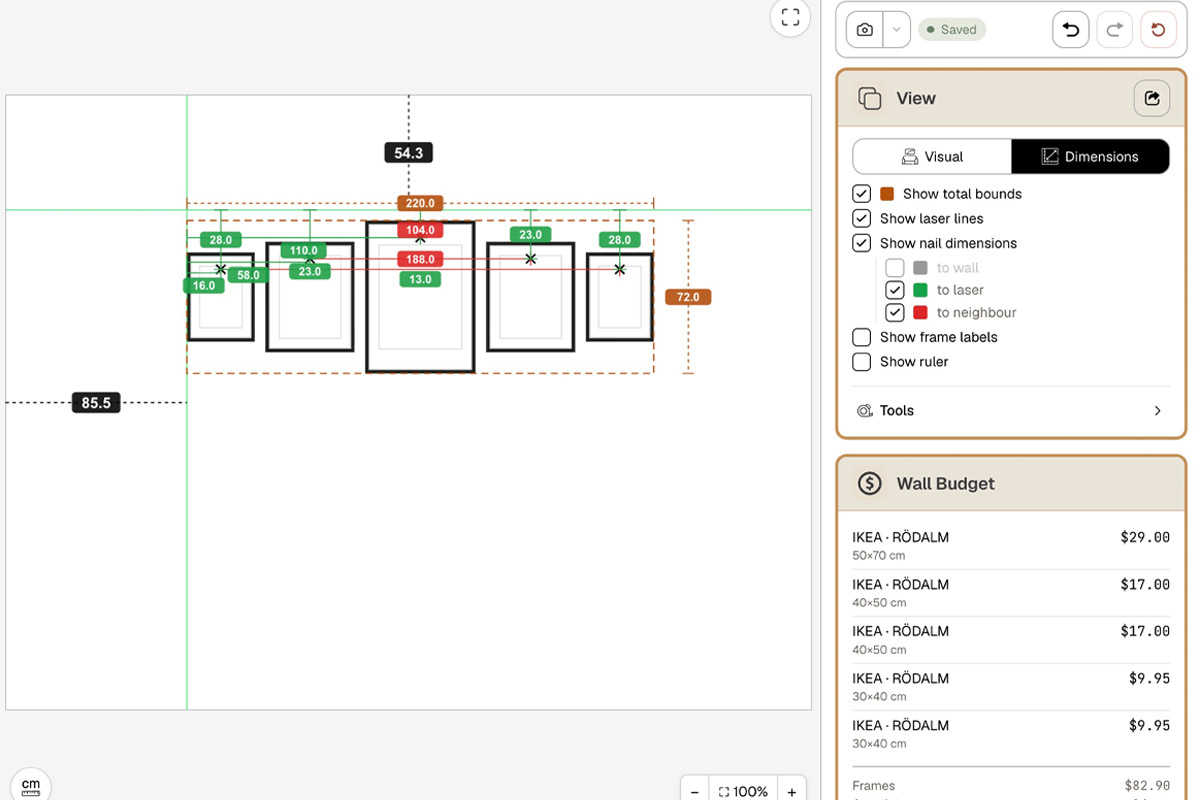
You can see which version sits steadiest and most upright right on screen — a lot cheaper than drilling the wrong holes, then filling and repainting.
FAQ
What is a symmetrical gallery wall?
How is a symmetrical gallery wall different from a grid? Isn't a grid symmetrical too?
Side-to-side or top-to-bottom symmetry — which should I use?
Where does a symmetrical gallery wall work best?
Should a symmetrical gallery wall use an even or odd number of frames?
Do the frames on a symmetrical gallery wall have to be identical?
How high and how wide should a symmetrical gallery wall be above a sofa?
How do I make sure both sides of a symmetrical wall really match?
Last reviewed: 2026-07