How to Arrange Art Throughout Your Home
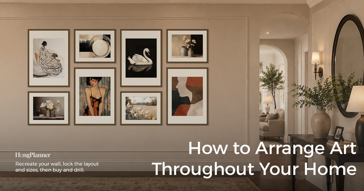
When people set out to hang art through a whole home, most do it one room at a time: finish and buy the living room wall, then think about the bedroom, then the hallway. By the end you often notice that each room looks fine on its own, but together they don’t read as one home — some walls compete, a few look too alike, and all the good pieces and the budget landed in the first room.
The problem isn’t taste. It’s the order you work in. Planning a whole home isn’t the same as planning one wall: a single wall only has to look good by itself, but inside a home it also has to get along with the walls before and after it — and with the two or three walls you catch in one glance from a doorway.
The short answer: start at the front door, and in the order you actually walk through your home, build every wall you plan to decorate. Give them all a rough plan first, then walk the route from the top — checking which walls should lead, which should pull back, and whether neighbours look too alike — and buy in batches at the end. Which walls to decorate and which to leave bare is an earlier step (more below); this guide is about taking the walls you’ve chosen and planning them as one set.
That’s also the difference between this and the usual “whole house wall art ideas”: instead of telling you how to hang the living room, the bedroom and the hallway separately, this rough-ins every wall first, then has you walk the home from the front door to see whether those walls work together.
The lazy default
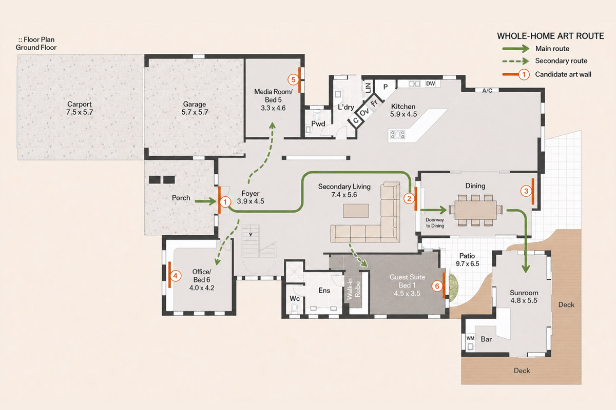
Don’t finish and buy the living room first and only then think about the other rooms. Start at the front door and, in the order you actually walk through your home, build every wall you plan to decorate — for example 01 Entry → 02 Living → 03 Dining → 04 Hallway → 05 Bedroom.
Give each wall a rough plan (single piece or a group, roughly how big, whether this one should be eye-catching or quiet), get a first version on all of them, then walk the route from the top. There should be loud spots and quiet ones — say entry moderate → living room eye-catching → dining moderate → hallway quiet → a small accent in the main bedroom — not every wall shouting at once.
Which walls to decorate and which to leave bare comes first (that’s its own guide); what to actually hang in each room is another.
One thing to set straight before the steps: this guide picks up after you’ve chosen your candidate walls. Deciding which walls deserve art and which should stay empty is a separate question, with its own guide. Everything below starts from “these walls are all getting art.”
Start at the front door and build every wall in walking order
Before you pick a single picture or buy a single frame, do just one thing: put the walls you’re decorating on screen, in the order you actually walk through your home.
Start at the front door and follow your main route: entry, living room, dining, hallway, then the bedrooms. Give each wall a name with its place in the order — 01 Entry, 02 Living, 03 Dining, 04 Hallway, 05 Bedroom — and mark the walls that branch off the main route (into a bedroom, up the stairs) as side routes. That way, when you review later, you’re going wall by wall in the real order a person moves through the home, not staring at a pile of unrelated walls.
In HangPlanner: create a Wall for each one with Add Wall, and fill in the real Width × Height (switchable cm / inch). If you have a photo of the wall, use Background Image to drop it behind the canvas and drag the four corners to correct the perspective; if you don’t, use the Furniture library to place real-size pieces — sofa, dining table, bed — and rebuild the scene from their proportions. Label each wall with Tags for its room or main / side route — but note that Tags are for filtering; they don’t sort your walls into walking order for you, so keep the order in the wall names (01, 02, 03…).
Heads-up: managing several real walls in one workspace is a Plus (10 walls) or Pro (50 walls) feature. A free account manages one real wall, and the Demo wall is there to try the single-wall features. This guide is about the whole-home, multi-wall way of working, so the steps below assume you’re in a multi-wall workspace.
Give every wall a first version before you settle on the art
Once the walls are built, rough in a plan for each one instead of stopping to perfect the living room. This first pass only answers a few broad questions: single piece or a group? Roughly how wide? And in the home as a whole, should this wall be eye-catching, moderate, or quiet?
You can do a first version with no art at all: drop a ready-made layout with Gallery Wall Frames, or pull real, currently-sold IKEA frame sizes with Standard Frames to lock size and arrangement, then use images from the built-in Art Prints library as temporary stand-ins to judge colour and overall feel. Take the count and sizes straight from the ready-made presets — don’t guess a number out of the air.
Size each wall to its own wall and furniture: a group that spans 2/3 to 3/4 of the furniture or usable wall width below it is usually the safe range; a bare wall on its own you judge by its size and how far away you usually see it. Height works the same way — the common single-wall eye-level reference is 57 inches (150 cm), but that’s an average for one wall on its own, and you shouldn’t turn it into one baseline for the whole home: the dining room is seen sitting down, the hallway on the move, and a headboard or a sofa each has its own anchor, so forcing every wall onto the same line looks off. How big and how high for any one wall is covered in its own size-and-placement guide.
The goal of this step isn’t to perfect any single wall — it’s to get a first version on every wall so you can look at them together.
Walk all the walls in order: where’s it too busy, where’s it too weak?
With a first version on every wall, switch through the Walls in walking order and look at just one thing: as you move through, are there eye-catching spots and quiet ones?
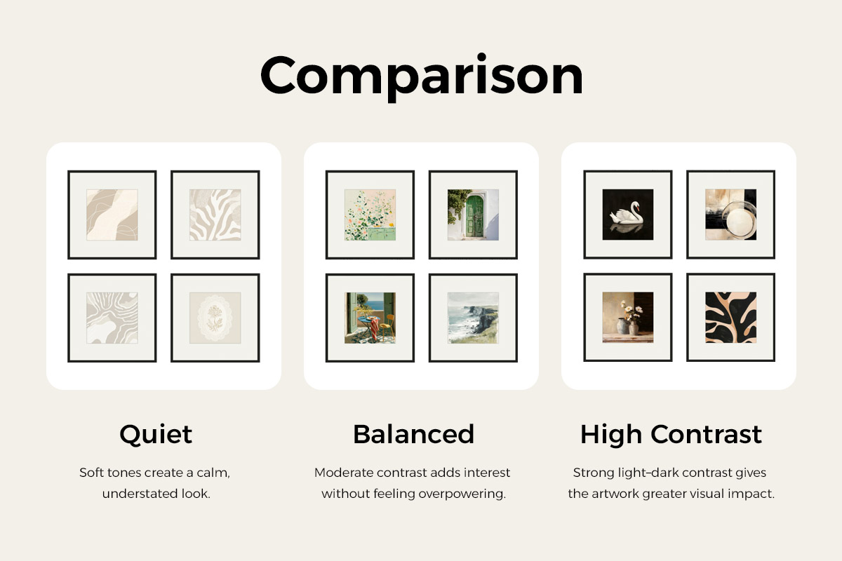
First, what “eye-catching” means. How much a wall grabs you comes down to four concrete things: ① how big the piece or group is, ② how strong the colour contrast is, ③ how many frames there are and how densely they’re packed, and ④ how attention-grabbing the image itself is. The more of these stack up, the louder the wall; the fewer, the quieter. “Quiet” here still means a wall with art — just a lighter plan. Whether to leave a wall bare altogether is a separate question (its own guide on which walls to decorate).
Two problems show up most on the walk: several walls in a row that are all too busy — big, dark, densely packed the whole way, tiring to move past, with nowhere for the eye to rest — or a home that’s all too flat — small, pale pieces everywhere, nothing wrong but nothing memorable either. A good whole home alternates eye-catching, moderate, and quiet, leaving a wall to breathe between the loud ones.
Worth stressing: eye-catching / moderate / quiet aren’t fixed size tiers, and they aren’t a score the software gives you. They’re only relative within the same home, along the same route — this wall is louder than the one next to it, that’s all. To judge, come back to the four concrete things above; there’s no universal standard to look up.
Look again from the doorway and the corner: will two walls compete? Are they too alike?
Looking at each wall alone isn’t enough — you also have to look at the walls you see at the same time. Standing at the front door, in each room’s doorway, at a hallway corner, and in open-plan spaces, your eye often takes in two or three walls at once. Those have to be judged together.
Decide which one leads. If you can see the living room’s main wall and the dining room’s end wall in one glance from the doorway, decide first which one is the focus of that glance and let the other pull back. The simplest test: where does your eye land first, and is the wall beside it also shouting for attention? The two don’t need to match in style, but they can’t both fight to lead. Where the room already has a fireplace, a big window or a good view, the art should pull back further and not compete with it. (For open-plan spaces, where several walls share one sightline, there’s a dedicated guide.)
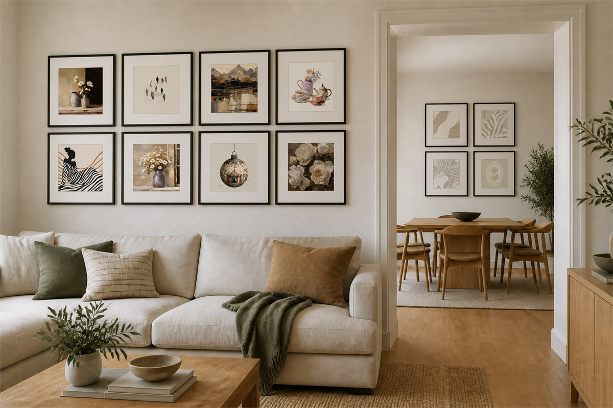
Then check whether they’re too alike. Neighbouring walls, or walls seen together, easily turn into copy-paste without meaning to. To tell whether they’re echoing each other or just repeating, compare five things in turn: image, subject, main colour, frame, and layout. Keep one or two the same and vary the rest, and they usually read as related — like family. If nearly all five match, either make them a deliberate set (on purpose) or change a few of them. There’s no hard rule that “an element can appear at most N times” — what matters is how much is the same, not how many times. What specifically suits each room is a separate guide; here we only care whether the content works as you move from one wall to the next.
Ask yourself these at each wall (the walk-through checklist)
Here’s the whole thing as one checklist. Starting at the front door, run through it for each wall — and at every spot where you see several walls at once:
| Ask at each wall | Looks right when… | Watch for | Fix first |
|---|---|---|---|
| Is every wall roughed in? | Every chosen wall has a Wall, a name, and a rough plan | Only the living room is done and bought; later walls just bend around frames you already own | Pause buying; get a first version on every wall |
| Where does the eye land first? | One clear focal point; the wall beside it doesn’t compete; art pulls back where there’s a fireplace or a view | Two walls seen together are both big, both dark, both busy — the eye doesn’t know where to go | Shrink the art on one, lighten its colour, use fewer frames, or swap in calmer content |
| Are several spots in a row too busy, or too quiet? | Eye-catching, moderate and quiet take turns; there’s a breather between the loud walls | Several walls in a row are all big, dark and dense; or it’s all small and pale with nothing memorable | Adjust the group size, colour contrast, frame count, and the empty space around them |
| Does the content suit how it’s seen there? | Reads on a quick walk-by; rewards a closer look when you sit or stand near it | Something that needs a close read sits on a fast route; a very personal photo greets you at the door by accident | Move it or swap the candidate; per-room content is its own guide |
| Echo, or copy-paste? | One or two of image, subject, main colour, frame and layout match; the rest varies | All five are nearly identical, and it isn’t a deliberate set | Keep one or two shared traits; change the image, size, layout or colour on the rest |
| Did the good stuff all land up front? | The most important spots carry weight; the rest each have a plan | The living room took every big piece and most of the budget; later rooms get leftover fillers | Re-decide which walls lead, then set a buying order; some walls can stay quiet |
| Is the budget workable? | Each wall’s total is clear; with test copies deleted, the sum stays under budget and splits into clean batches | Test copies double-count; the first batch eats the whole budget; frames locked in before the art is chosen | Delete the rejected copies, total wall by wall, buy the most certain, highest-impact pieces first |
You don’t need a perfect score in one pass — the point is to walk the whole home on screen before you buy anything and catch the obviously awkward spots.
Eye-catching, moderate and quiet aren’t fixed size tiers or an automatic score. Judge them by four concrete things — how big the piece or group is, how strong its colour contrast is, how many frames and how densely they’re packed, and how attention-grabbing the image itself is — and only ever compare walls within the same home.
Use cross-wall copy to skip repetitive setup — and to compare
After the walk-through, you’ll have a pile of small changes to try back and forth between walls. This is where copying across walls saves a lot of repeat work.
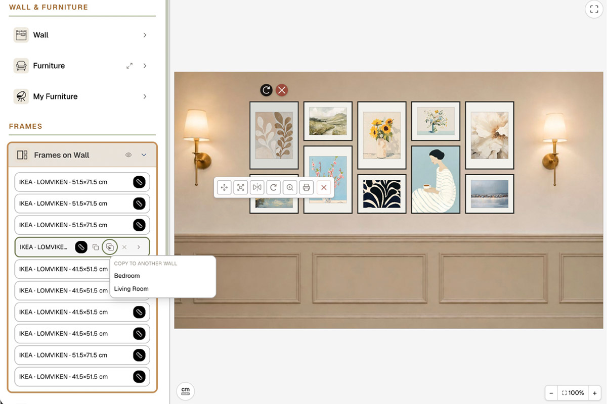
When you don’t have art yet: tune one frame’s size and colour on a wall, then use Copy to another wall to send that one frame to the next wall and swap in a different image — that’s the fastest way to see whether the same frame suits another room, and to set a shared trait like “one frame style” across the home. When you do have art, or a product you’re considering: copy the same piece onto another candidate wall, compare where it fits best, and delete the version you don’t keep.
One boundary to be clear about, so there’s no confusion: Copy to another wall is a Plus / Pro feature (once you’re signed in), and it copies a single frame (with its image and price) — not a whole wall or a whole gallery wall in one click. If you want to save a few frames you’ve tuned and reuse them anywhere later, that’s My Frame Library (Pro), which stores your Custom Frames templates.
Finalize the home, budget, and buy in batches
Once everything looks right on screen, the last step: finalize, price it, and buy in batches.
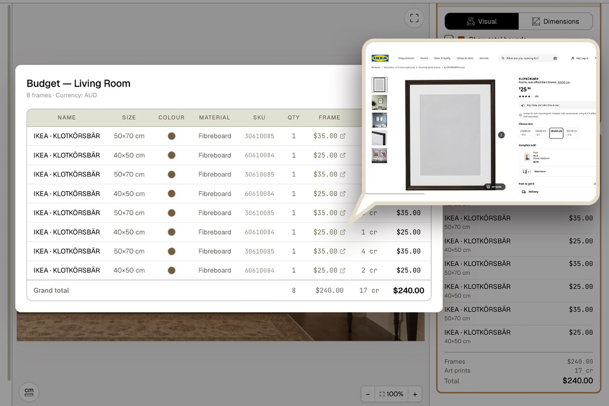
Drop the final artwork into each wall, then delete the test copies you used to try positions — this matters, because the copies affect the budget. In HangPlanner: each wall has its own Wall Budget that totals that wall in real time. Note it’s per wall and doesn’t automatically add the whole home together, so the home total is something you add up by hand from each wall (after deleting the rejected copies, so test positions aren’t double-counted).
With a home total, you can buy in batches: get the most certain, highest-impact walls first (usually the first-glance entry and the living-room focal point), and leave the uncertain ones for later — so you don’t spend the whole budget on the first room and scrape by on the rest. For the standard frame sizes and what size print to buy, see standard picture frame sizes.
To get a partner or a designer to sign off, use Share wall to share a wall to view or edit together. That’s per wall too — you share one at a time, not one link that shows the whole home project; share as many walls as you need, separately.