Dining Room Gallery Wall with IKEA Frames
A lot of people sit down to eat, stare at the dining wall wondering “what should I hang here,” and jump straight to picking art. But the real first step for a dining room gallery wall isn’t picking art — it’s working out which wall you’ve got. A dining room actually has two completely different walls, with two different playbooks.
One is above a sideboard / buffet: a cabinet sits below and the art hangs above it — the same logic as above a sofa in the living room: anchor to the furniture, and make the arrangement about two-thirds of the cabinet’s width. The other is a full open wall: the table sits in front of the wall, but there’s no cabinet underneath, so the constraint goes back to the whole wall and you can go big — a focal layout (one large piece centered, smaller ones radiating symmetrically), or a full-wall symmetrical.
The short answer: work out which wall first. Above a sideboard → anchor to the cabinet: make the arrangement about 2/3 of the cabinet width, sit the bottom edge 6–10 inches (15–25 cm) above the cabinet top, and use bottom-aligned / symmetrical / grid. A full open wall → make a statement scaled to the wall: focal (one large piece centered, smaller ones radiating), full-wall symmetrical, or grid. Plus two things unique to a dining room: it’s a room you look at sitting down, so hang a touch lower than the standing 57-inch rule; and many homes have an open-plan kitchen opening onto the dining area, so the stretch near the cooktop needs a little thought about position and material (everyday cooking throws off little airborne grease — mostly you’re guarding against steam and heat).
This guide covers: which wall you have, how to size and lay out each one, how high to hang in a dining room, and how to handle a wall next to an open kitchen.
The lazy default
First, which wall → A: above a sideboard / buffet (a cabinet below) or B: a full open wall (table in front, no cabinet below). This decides everything after.
Wall A, above a sideboard → anchor to the cabinet: about 2/3 of the cabinet width, centered on the cabinet, with the bottom row 6–10 inches (15–25 cm) above the cabinet top. Layout: bottom-aligned (echoes the cabinet’s top line, best when frame heights vary), symmetrical, or grid.
Wall B, open wall → make a statement scaled to the wall: focal (one large piece as the room’s hero + smaller ones radiating symmetrically), full-wall symmetrical, or grid (multiple rows when the wall is tall enough). High freedom; size to the wall, not the furniture.
How high → a dining room is looked at sitting down, so the visual center can sit a little below the standing 57 inches (150 cm). Wall A: the gap above the cabinet already sets it; Wall B: put the arrangement’s center at a comfortable seated sightline.
Position / material → with an open-plan kitchen opening onto the dining area, keep art out of the cooktop / sink splash zone (everyday grease is light; you’re mostly guarding steam and heat). IKEA frames use a plastic front (not glass) — won’t shatter, wipes clean, a plus next to a kitchen.
Frames → same series, same colour is easiest. RÖDALM has the most sizes and colours to mix; LOMVIKEN (aluminium) has the sleekest thin edge.
Themes → food, still life, botanical, and warm tones suit a dining room — but layout is independent of theme; set the wall and sizes first, then pick the art.
First: work out which wall you’ve got
The most common misfire in a dining room gallery wall isn’t picking the wrong art — it’s using the wrong reference: treating a full open wall as an “above the sideboard” wall (the art shrinks into a small cluster, floating in mid-air), or the reverse, forcing a full-wall statement above a sideboard (bumping the objects on top, crowding it). To avoid it, ask yourself one question: is there a cabinet directly below, in line with the art?
There are only two answers — each with a real example to compare against:
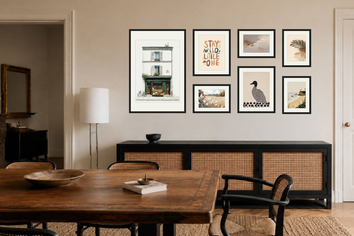
A · Above a sideboard / buffet — a sideboard / console sits directly below the art. Here you anchor to the cabinet (the same as above a sofa), and the arrangement width follows the cabinet’s width — about 2/3 of it.
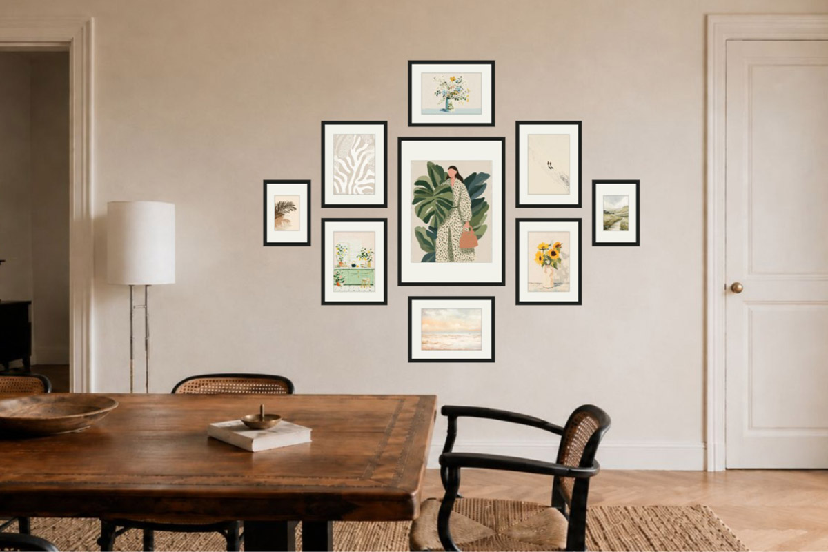
B · A full open wall — the table sits in front of the wall, but there’s no cabinet underneath (as if you were hanging on an empty wall). Here you anchor to the wall itself, size to the whole wall, and make a statement — freedom is highest.
Once you know which, each wall has its own playbook — covered in the next two sections. (This is also what makes a dining room different from a hallway or a sofa: one dining room can have both — an open wall along the length of the table, and a sideboard off to the side — so do A and B separately, one for each.)
Second: above a sideboard (Wall A — anchor to the cabinet, not the floor)
If a sideboard sits directly below the art (like the first A example: an arrangement sitting squarely above the cabinet, reading as one with it), this wall works almost exactly like above a sofa in the living room: anchor to the furniture, not the floor.
How wide: measure by the cabinet, not the wall. Make the arrangement span about 2/3 of the sideboard’s width, centered on the cabinet. Filling the full cabinet width looks cramped with no breathing room; covering less than half looks unfinished. Measure the cabinet, multiply by 2/3, and that’s your target width.
How high: skip the 57-inch (150 cm) centering rule — that’s for an empty wall with nothing below, anchored to the floor. Above a sideboard there’s a cabinet below, so switch the anchor to the cabinet top: leave the bottom edge of the lowest row 6–10 inches (15–25 cm) above the cabinet top, so the art “sits” on the cabinet’s shoulders and reads as one with it. Scale the gap to the cabinet — tighter for a small cabinet or narrow wall, wider for a big one.
Pick a layout: a sideboard is a horizontal piece with a flat top, and three layouts suit it best —
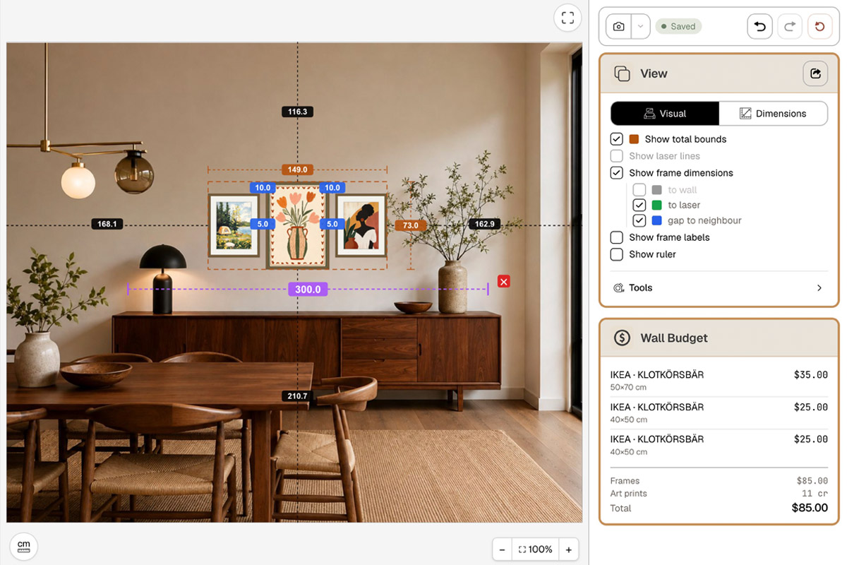
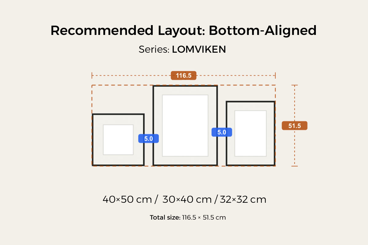
- Bottom-aligned: the frames’ bottom edges form one line that echoes the cabinet’s top line, with tops free at different heights — relaxed but steady, and best when your frames vary in size. One detail: that shared bottom line floats 6–10 inches above the cabinet top, not flush with it; if the cabinet holds a lamp, a vase, or a leaning print, raise the bottom line to clear the tallest object and leave it room. HangPlanner’s ready-made bottom-aligned preset uses LOMVIKEN 40×50 / 30×40 / 32×32 cm in mixed sizes aligned along the bottom, about 116.5 × 51.5 cm overall — LOMVIKEN is a thin aluminium edge, sleek and light. Full method in the Bottom-Aligned Gallery Wall guide.
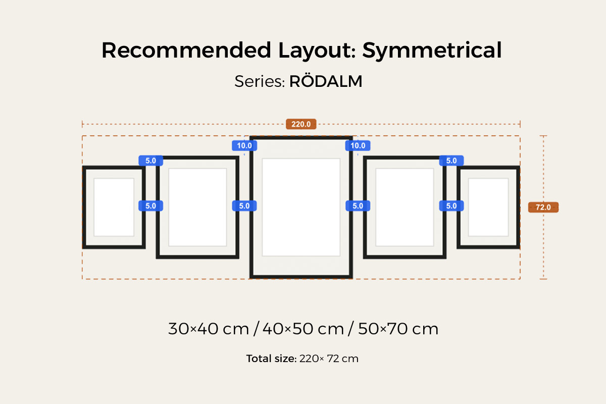
- Symmetrical: mirrored left-right with the large frame centered — upright and grand, the best match for a dining room’s sense of occasion. The ready-made symmetrical preset uses RÖDALM 30×40 / 40×50 / 50×70 cm mirrored with the large frame centered, about 220 × 72 cm overall. Full method in the Symmetrical Gallery Wall guide.
- Grid: equal frames, equal gaps, in a tidy block — minimal and orderly. Easiest when all your frames are one size (a grid reads taller with multiple rows, so it’s more at home on the open wall — see the next section). Full method in the Grid Gallery Wall guide.
No need to count frames yourself — pick a layout, use its ready-made preset in HangPlanner, hit Insert and go.
Third: a full open wall (Wall B — make a statement scaled to the wall)
If the table just sits in front of the wall and there’s no cabinet underneath, the wall is effectively an empty wall — no big furniture pinning your composition, so freedom is highest. Don’t shrink the art into a small cluster in the middle; size it to the whole wall and make a statement.
The two best for an open wall are focal and grid:
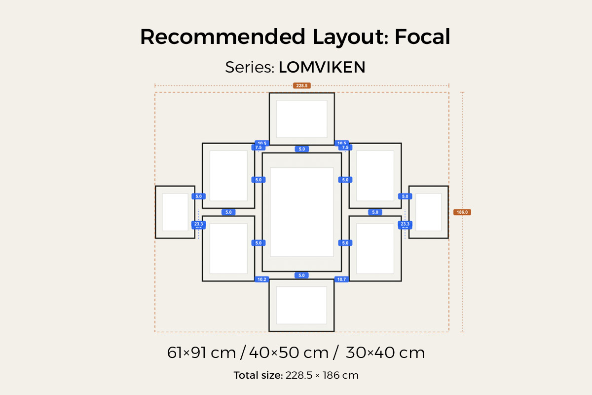
- Focal: one large piece centered as the room’s hero, with a few smaller ones radiating symmetrically around it. A dining room takes to this especially well — the big center piece naturally becomes “the room’s hero” (food, still life, botanical, or a figure all work), and you look straight up at it from your seat. The first B example above is exactly this: one large piece centered, eight smaller ones radiating symmetrically. HangPlanner’s ready-made focal preset uses LOMVIKEN, one 61×91 cm centered with 40×50 cm and 30×40 cm frames radiating around it — nine frames in all, about 228.5 × 186 cm overall — a big statement that fills a whole wall. Full method in the Focal Gallery Wall guide.
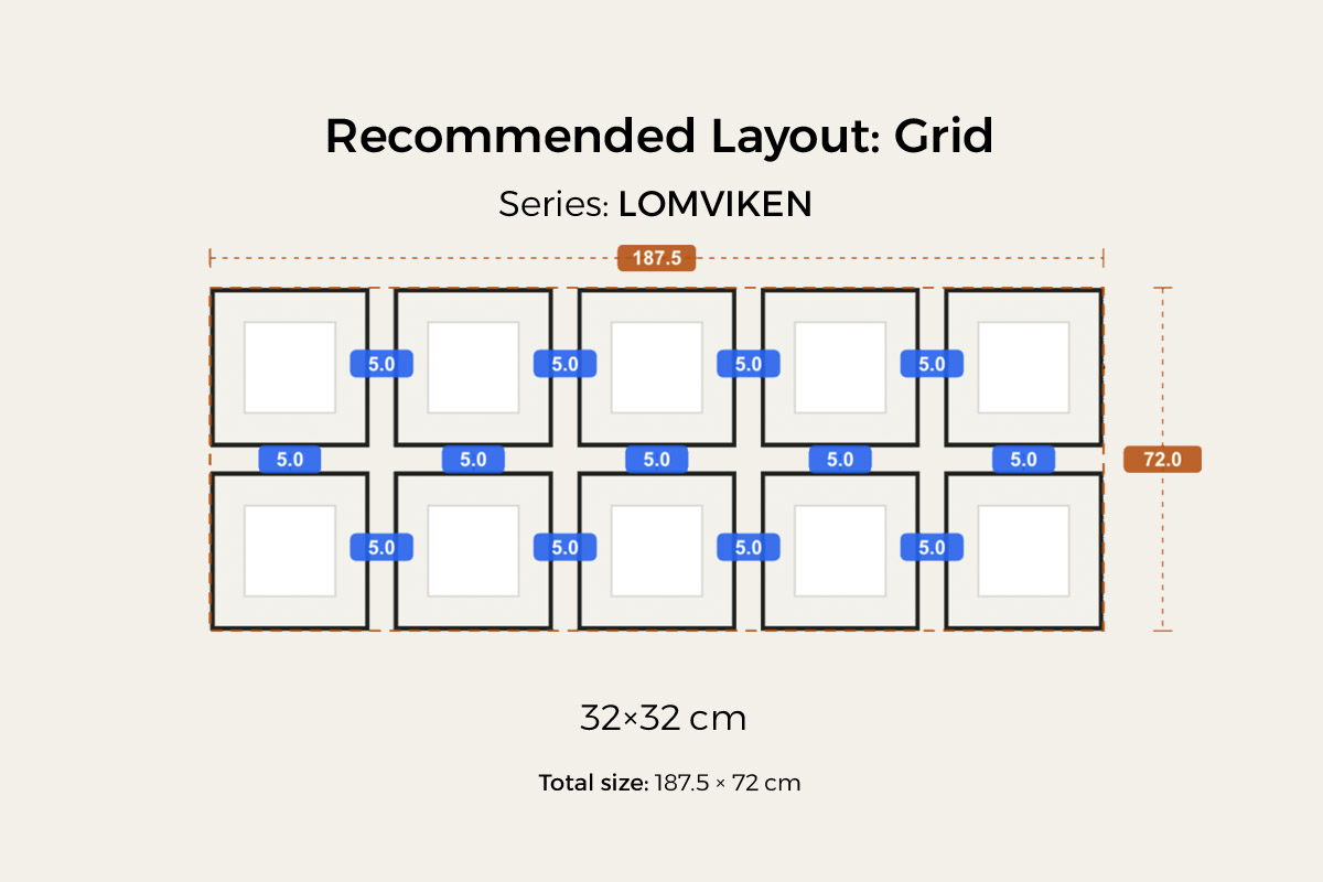
- Grid: equal frames, equal gaps, in a tidy block — minimal, modern, the most orderly. The advantage of an open wall is that it’s tall enough to run multiple rows (2×3, 3×3), unlike the shallow band above a sideboard that only fits a row or two — so if you really want a grid, the open wall is its home. The ready-made grid preset uses LOMVIKEN 32×32 cm, ten squares in a 2×5 with even 5 cm gaps, about 187.5 × 72 cm overall. Easiest when your frames are one size. Full method in the Grid Gallery Wall guide.
A more formal left-right symmetrical works too — take Wall A’s RÖDALM symmetrical preset (large frame centered, mirrored) and scale it up to the whole open wall.
Size to the wall, not the furniture: since there’s no cabinet setting the width, how big the arrangement should be depends on how big the wall is — the goal is to sit squarely across the middle of the wall with even breathing room around it, not to shrink into a small cluster in the center. The frame count and sizes come from the preset, ready to go.
One more practical point: a dining wall often has doors / doorframes on both sides (to the kitchen, to the living room). Focal and symmetrical layouts — tidy, centered, with a clear outline — echo the vertical lines of the doorframes and read cleaner than a ragged free-form edge, which walls with lots of doors especially like. (The first B example above shows it: a focal centered, with a door on each side.)
Fourth: how high — a dining room is looked at sitting down
Dining rooms have one quirk nowhere else has: you look at them sitting down. The audience for a living-room or hallway wall is mostly standing or moving, but a dining room is different — most of the time you’re seated at the table looking at it. So the visual center can sit a little below the standing 57-inch (150 cm) rule, lined up with a comfortable seated sightline, so you look straight up at it without craning.
In practice:
- Wall A, above a sideboard: never mind 57 inches — you’ve already anchored to the cabinet top (bottom edge 6–10 inches above it), and once that gap is set the height is right.
- Wall B, a full open wall: put the arrangement’s visual center (the center of the whole bounding box, not each frame individually) at a seated sightline. 57 inches (150 cm) is the museum average eye height — use it as a starting point, and because a dining room is looked at sitting down, nudge it down a touch rather than clinging to a fixed number.
One line to remember: if there’s a cabinet, anchor to the cabinet; if not, aim for the seated viewer’s sightline. Neither dining wall just copies the 57-inch empty-wall centering rule.
Fifth: right next to an open kitchen? Mind the position and the material
Everyday home cooking throws off little airborne grease, and most dining walls don’t really need to worry about getting “smoked.” What is worth watching is a different thing: many homes are open-plan, with the kitchen opening straight onto the dining area, so steam, heat, and a little airborne grease from the cooktop still drift to the adjacent wall. Two easy principles:
Keep art out of the space right above the cooktop / sink. That small patch is where steam, heat, and grease concentrate, and art there gets dirty faster and takes more heat and moisture. When you make a statement on an open wall, keep the art to the stretch of dining wall away from the cooktop.
IKEA’s plastic front is actually a plus here. IKEA frames use a plastic front, not glass — a downside in other rooms (it scratches), but a better fit in an open-plan space that gets splashed and knocked: light, won’t shatter, safer with kids, and a smudge wipes clean with a damp cloth (don’t scrub hard — the plastic scratches). Choose a matte print over a high-gloss one — it hides marks better and won’t bounce the light from the dining pendant.
If you fry a lot at high heat and throw off more grease, this is worth more attention; if you mostly bake or boil, it’s basically nothing to worry about.
A word on what to hang
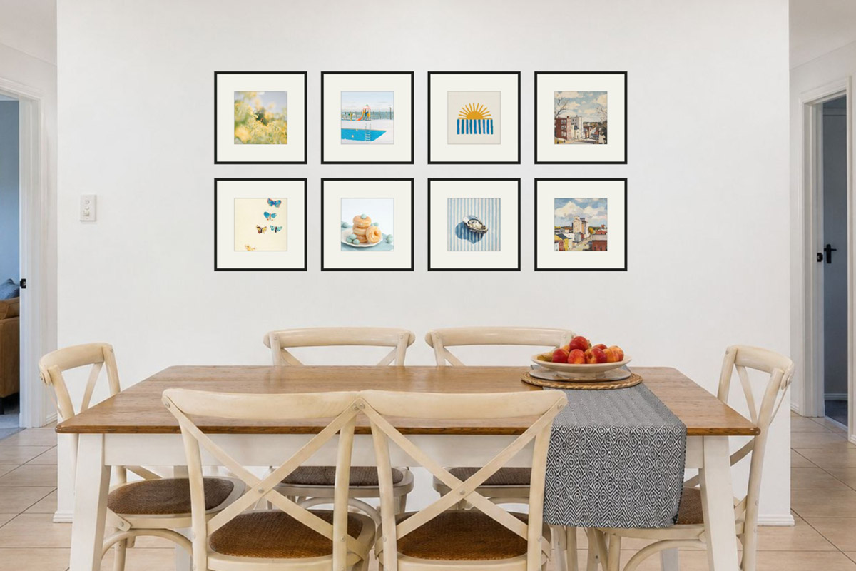
Layout and size are the skeleton; the content is the flesh — and a dining room has a few naturally fitting themes: food photography, still life (fruit, tableware, wine), botanical, coastal, and warm-toned abstracts or landscapes. The open wall above is an example: mix food, coastal, botanical, and still-life pieces in warm tones into one group and the whole wall takes on that “eat, gather, slow down” dining feel — the big center piece in a focal layout is especially compelling with these as the hero.
But keep the order in mind: layout is independent of theme. Set your wall, anchor, size, and layout first by which wall you have, then pick the art to fill the frames — not the other way around, falling for one piece and forcing a wall around it.
Before you buy, hang a version in HangPlanner
A dining wall isn’t very forgiving: hang too high above a sideboard and it disconnects from the cabinet; make the open-wall arrangement too small and it shrinks into a cluster, or off-center and it bumps a doorframe — and once it’s drilled, re-patching and repainting is a chore. The safer move is to lay out a version in HangPlanner at your dining room’s real dimensions first:
- Set your wall dimensions, or upload a real photo of the dining wall and calibrate the scale against a known width — the sideboard, a door, or the table.
- Work out which wall: for Wall A above a sideboard, mark the cabinet’s width and top height and note its center axis; for Wall B open wall, mark the whole wall’s extent and the doors on each side.
- Drag in the matching layout preset — bottom-aligned / symmetrical / grid for Wall A, focal / symmetrical / grid for Wall B.
- For Wall A, set the overall width to 2/3 of the cabinet and line the center axis up with the cabinet; for Wall B, spread it to the wall’s size and sit it squarely across the middle.
- Switch to Dimensions to see the overall size and every gap: for Wall A, check it straight against “bottom edge 6–10 inches above the cabinet top”; for Wall B, put the arrangement’s visual center at a comfortable seated height.
- Compare a few layouts and sizes to see which one holds the wall best.
- Open Wall Budget to compare the cost of different combinations.
On screen you can see which version “sits” on the cabinet and which one holds the open wall — far cheaper than drilling the wrong holes and re-patching and repainting.