
Art Above the Bed with IKEA Frames
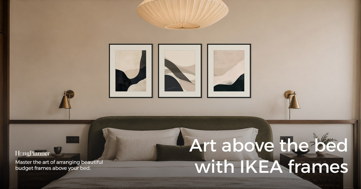
Most people approach the wall above the bed by trying to “build a gallery wall” — crowding a whole patch of small frames over the headboard. But the space above a bed is exactly where you should subtract, for two reasons.
First, headboards are usually tall — commonly around 1.1 m or more — and once you add the height of the bed itself, what’s left on the wall is only a shallow band. A dense grid of small frames won’t fit, and it looks heavy.
Second, this art isn’t really for the person lying in bed. Once you lie down, the art is behind and above your head — you can’t see it. The people who actually see it are those opening the door and standing in the room. So it should read clean at a glance from the doorway, not reward close inspection with fussy detail.
On top of that, it hangs directly above someone sleeping all night, so safety isn’t optional. Put those three together and the conclusion is clear: for art above the bed, go with a single piece, a triptych, or a simple bottom-aligned row — not a dense gallery wall. This guide covers which to pick, how big, how high, how to hang it safely, and what colours to choose.
The lazy default
Layout → go with a single piece (lowest decision cost, most timeless), a triptych (order without complexity), or a simple bottom-aligned row (the bottom edge echoing the headboard line); don’t build a dense gallery wall above the bed — the space is narrow and it’s less safe.
Size → a single piece is about half the bed’s width (two-thirds at most for a bolder look — no larger); a triptych, three frames in a row, spans about two-thirds of the bed’s width, centered on the middle of the bed.
Height → skip the 57-inch centering rule. Sit the bottom edge 6–10 inches (15–25 cm) above the top of the headboard; with no headboard, 8–12 inches (20–30 cm) above the mattress. Leave plenty of room to the ceiling above — don’t push the art up toward it.
Safety → directly overhead, use mechanical fixings only (screws into a stud / rated wall anchors / weight-rated hooks), not adhesive strips alone; use two hooks for a large frame; keep heavy glass frames off the wall directly above the pillows.
Colour → go calming, not stimulating: low contrast, soft tones (black-and-white photography / botanical / coastal / soft abstract) — the opposite of the attention-grabbing wall in your living room.
First: which to pick — single, triptych, or a simple bottom-aligned row
For the bed’s narrow, shallow band, the three steadiest options all share one thing: few frames, simple structure.
| The feeling you want | Choose this | Why it fits above a bed |
|---|---|---|
| Simplest, most timeless, grand | Single piece | One large landscape-format piece centered over the headboard — lowest decision cost, hardest to get wrong |
| Order without complexity | Triptych | Three equal frames in a row fill the band over the headboard neatly — more layered than a single, still not busy |
| Some variety without looking scattered | Simple bottom-aligned | A few frames with their bottom edges on one line that echoes the horizontal line of the headboard top; tops sit free — relaxed but steady |
Why not a dense gallery wall? The space above a bed is already narrow. Crowd in a patch of small frames and, first, they won’t spread out — it looks cramped; second, every extra frame overhead is one more thing that can fall; third, too much detail reads as clutter from the doorway. If you want a little more, stop at one of these “simple small arrangements” above — don’t push toward a densely packed wall.
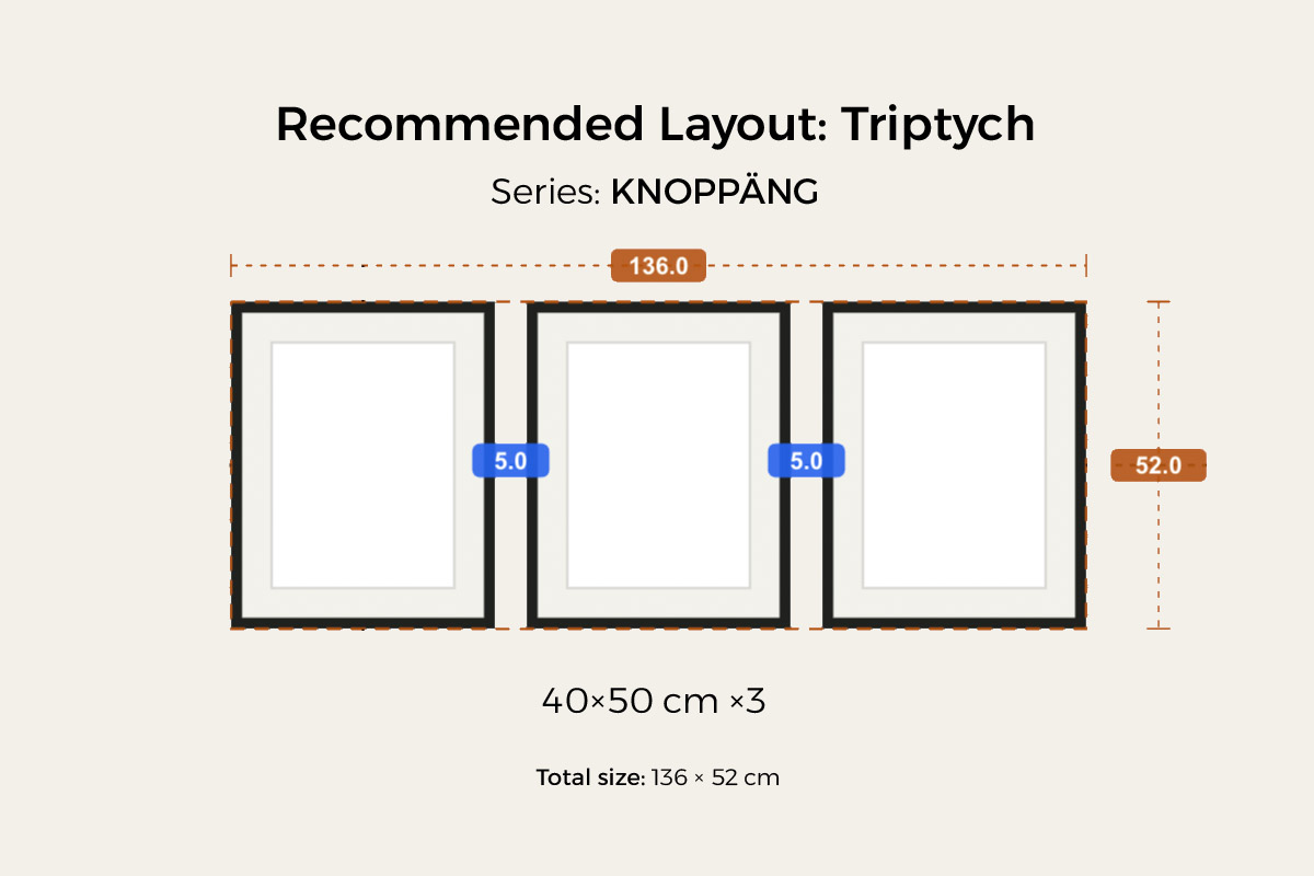
A triptych is the option most worth considering after a single piece — orderly, uncomplicated, and you don’t have to count frames or work out sizes yourself. HangPlanner’s ready-made triptych preset uses three LOMVIKEN 40×50 cm portrait frames evenly spaced (5 cm gaps), 136 × 52 cm overall — LOMVIKEN is a slim aluminium edge, sleek and light for above a bed. Full method in the Triptych Gallery Wall guide.
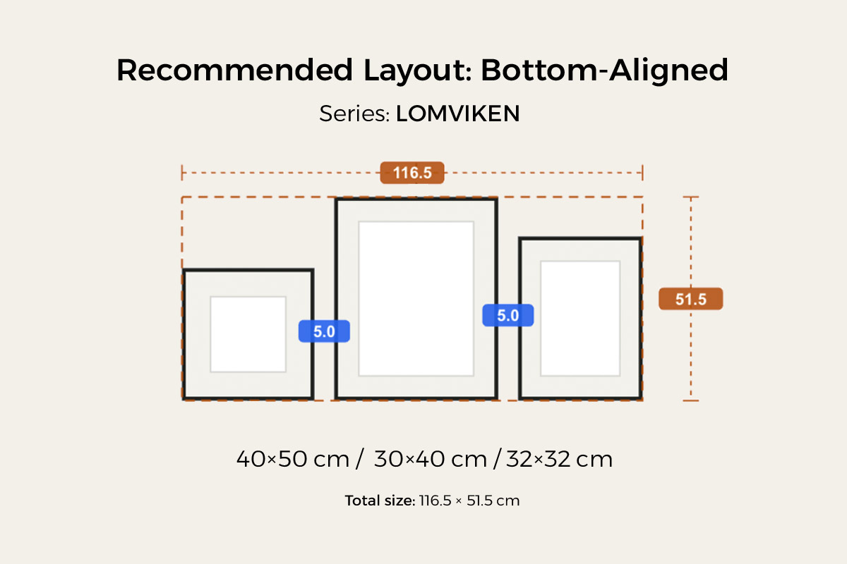
For something a little more relaxed, use a simple bottom-aligned row: a few frames with their bottom edges on one line and the tops free, that bottom line echoing the horizontal top of the headboard — variety without looking scattered. The key is to keep the count low and the structure simple — the bed’s narrow band can’t carry multiple crowded rows. HangPlanner’s bottom-aligned small-wall preset uses LOMVIKEN 40×50 / 30×40 / 32×32 cm — three mixed sizes aligned along the bottom, 116.5 × 51.5 cm overall — a good fit for a small wall like the one over a bed. Full method in the Bottom-Aligned Gallery Wall guide.
Second: how big — anchor to the bed, not the wall
Don’t size the art off the wall — size it off the bed.
- Single piece: about half the bed’s width is enough. You can go up to two-thirds for a bolder look, but no larger — the space above a bed is a shallow band, and one over-wide piece crowds the bedside lamps and feels heavy.
- Triptych / simple bottom-aligned: the overall width is about two-thirds of the bed’s width, centered on the middle of the bed (the headboard).
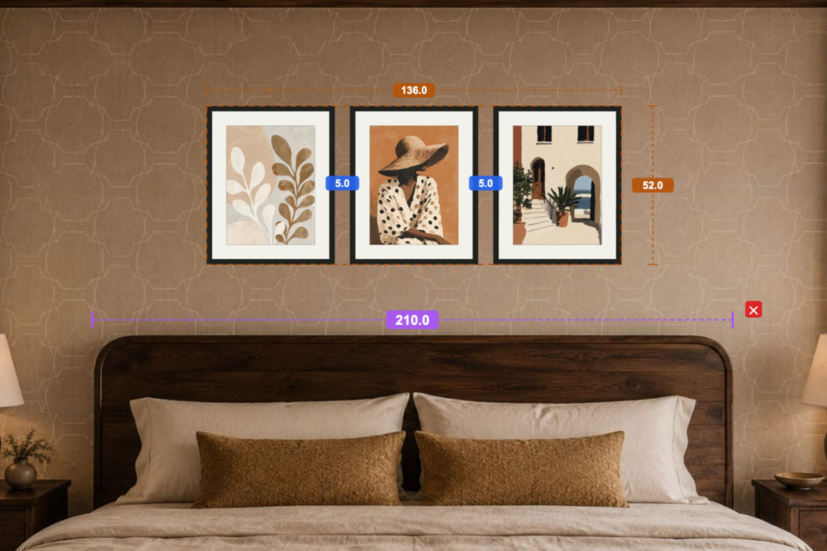
How to use it: measure the bed’s width, then multiply by the ratio. In the image below, the triptych is 136 cm overall, hung above a bed about 210 cm wide — right at two-thirds of the bed’s width and centered on its axis, so the whole thing sits squarely on the headboard with breathing room at each end. Remember the order: decide “how big” first, then work backward to what to buy — not the other way around.
Third: how high — anchor to the headboard, skip the 57-inch rule
You’ll find a 57-inch (150 cm) hanging rule everywhere: put the visual center of the art at 57 inches off the floor. That rule is for art on an empty wall, anchored to the floor and eye level. With a bed and headboard below, the anchor should switch to the headboard, not the floor — otherwise the art tends to float too high and disconnect from the bed.
The right move is to switch the anchor:
- With a headboard: sit the art’s bottom edge 6–10 inches (15–25 cm) above the top of the headboard, so the art “sits” on the headboard’s shoulders and reads as one piece with the bed.
- With no headboard: the bottom edge goes 8–12 inches (20–30 cm) above the top of the mattress.
- Room above: because the headboard is tall and the art already lands in the upper-middle of the wall, leave plenty of breathing room between the top edge and the ceiling / cornice (usually more than the gap below it to the headboard). Don’t push the art up toward the ceiling to fill space — too close overhead looks cramped.
One line to remember: when there’s furniture, anchor to the furniture, not the floor. A bed, a sofa, a console — the same rule.
Fourth: safety — someone is sleeping directly below
This is the step that’s unique to the bed, and the one you can’t skip. Remember that someone lies directly below this art all night.
Use mechanical fixings only — not adhesive strips. Screws into a stud, rated wall anchors, and weight-rated hooks are what hold. Removable adhesive strips fail over time with humidity, temperature swings, and the ageing of latex or textured paint — too risky directly overhead.
Use two hooks for a large frame. Two points spread the weight and stop the frame from slowly tilting or working loose.
Keep it light directly overhead. For the spot right above the pillows, favour light frames, acrylic glazing, or no glass at all; leave genuinely heavy glass frames for the living room, not over the bed.
(Note: Australia is a low earthquake-risk region overall, so this isn’t about “earthquake-proofing” — it’s the basic discipline every home should follow: fix it reliably for the long term and keep it from working loose and falling.)
Fifth: colour — calming, not stimulating
The colour logic above a bed is the opposite of the living room. That living-room wall can be high-saturation, high-contrast, attention-grabbing; the bed is the slowest-paced spot in your day — the last thing you see before sleep and the first when you wake — so its colours should be low-contrast and softly graded, to help you wind down.
Directions that work well: black-and-white photography (monochrome reads the most refined and is the least disruptive to sleep), botanical (greens are naturally relaxing), coastal (blue, sand, and beige tones — quiet and airy, and a great fit for Australian bedrooms), and soft abstract (low-saturation shapes and colour fields, non-representational, nothing to keep your mind turning at bedtime). Avoid high-saturation clashes, strong event-driven imagery, and dense text posters — a plus in the living room, a distraction over the bed.
Before you buy, hang a version in HangPlanner
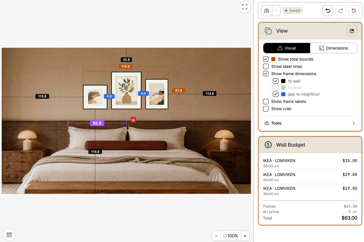
The wall above a bed has little room for error — drill and find the art is off-center, too big, or out of step with the bed, and fixing it is a hassle. The steadier approach is to lay out a version in HangPlanner first, against your own bed width and headboard height:
- Set your wall dimensions, or upload a real photo of the headboard wall and calibrate the scale against the bed (a known width).
- Place the bed (or mark its width and the height of the headboard top) and note its center axis.
- Drag in a single piece, a triptych, or a simple bottom-aligned preset.
- Set a single to about half the bed’s width, or a triptych / bottom-aligned arrangement to about two-thirds, with the axis centered on the bed.
- Switch to Dimensions to check whether the bottom edge sits 6–10 inches above the headboard top and whether there’s enough room to the ceiling above.
- Open Wall Budget to compare the cost of different sizes and series.
On screen you can see which version “sits” on the headboard and which one floats or overwhelms — far cheaper than drilling the wrong holes and re-patching and repainting.