Gallery Wall Above a Sofa with IKEA Frames
The sofa is the anchor of a living room, and the empty wall above it is just about the most classic stage a gallery wall can have. It’s also the easiest to get wrong. Hang it too small and the whole arrangement floats, unable to hold down the sofa; hang it too high and the gallery wall disconnects from the sofa, splitting the wall in two. Neither is a matter of taste — both come down to two numbers you can actually measure.
The short answer: make the arrangement span two-thirds to three-quarters of the sofa’s width, and sit the bottom edge of the lowest row 6–10 inches (15–25 cm) above the top of the sofa back. How many frames and which layout? That follows the layout you pick — several work above a sofa, and the last section walks you through choosing.
Here’s where a lot of guides go wrong: don’t apply the 57-inch (150 cm) centering rule above a sofa. That rule sets the height for art on an empty wall, anchored to the floor and average eye level. The moment a sofa sits below, the anchor should switch to the sofa itself — so the gallery wall reads as growing out of the sofa, not hovering at some height unrelated to it. Section two covers this counter-intuitive hanging height in detail.
This guide answers three things: how wide the arrangement should be, how high (and why not to use 57 inches), and which layout to choose above a sofa.
The lazy default
Above a sofa → make the arrangement two-thirds to three-quarters of the sofa width (more natural than matching the sofa exactly), and line the gallery wall’s center axis up with the middle of the sofa.
Height → skip the 57-inch centering rule. Leave a gap between the bottom edge of the lowest frames and the top of the sofa back. 6–10 inches (15–25 cm) is the starting point — adjust it to the size of the sofa: narrower for a small sofa, wider for a big one, so the arrangement and the sofa read as one piece.
Layout → the safest above a sofa are symmetrical and center-aligned (the sofa is left-right symmetrical, so these read the most “right”); for something simple and low-commitment, a triptych; to echo the sofa back, bottom-aligned; for a tidy outer rectangle, outer-aligned. No need to count frames yourself — use the ready-made preset for your chosen layout in HangPlanner.
Frames → same series, same colour is easiest; buy matching pairs for mirrored positions. RÖDALM has the most sizes and colours to mix; LOMVIKEN (aluminium) has the sleekest thin edge.
First: how wide should it be
Start with this ratio: the arrangement should span two-thirds to three-quarters of the sofa’s width. Wider isn’t better, and matching the sofa exactly isn’t the goal — filling the sofa’s full width edge to edge looks cramped, with no breathing room, while covering less than half looks like the wall isn’t finished and the art is too small. The two-thirds to three-quarters range holds down a big piece of furniture while still leaving air at both ends.
How to use it: measure the sofa’s width first (arm to arm, outer edge to outer edge), then multiply by 2/3 and 3/4 to get the width range the arrangement should hit. For a 200 cm (about 79 in) three-seater, an arrangement of roughly 133–150 cm (about 52–59 in) wide is right. That “arrangement width” runs from the left edge of the leftmost frame to the right edge of the rightmost one, counting the frames and the gaps between them.
This ratio also points you toward the number of frames: a bigger target width means larger frames or a few more of them; a smaller target means fewer frames or smaller ones. But exactly how many, and how big each one is, depends on the layout you pick — which is what section three is for. For now, just remember: decide “how wide the whole thing should be” first, then work backward to what to buy — not the other way around.
Second: how high should it be (skip the 57-inch rule)
This is the thing most people get wrong above a sofa, and the one most worth getting straight.
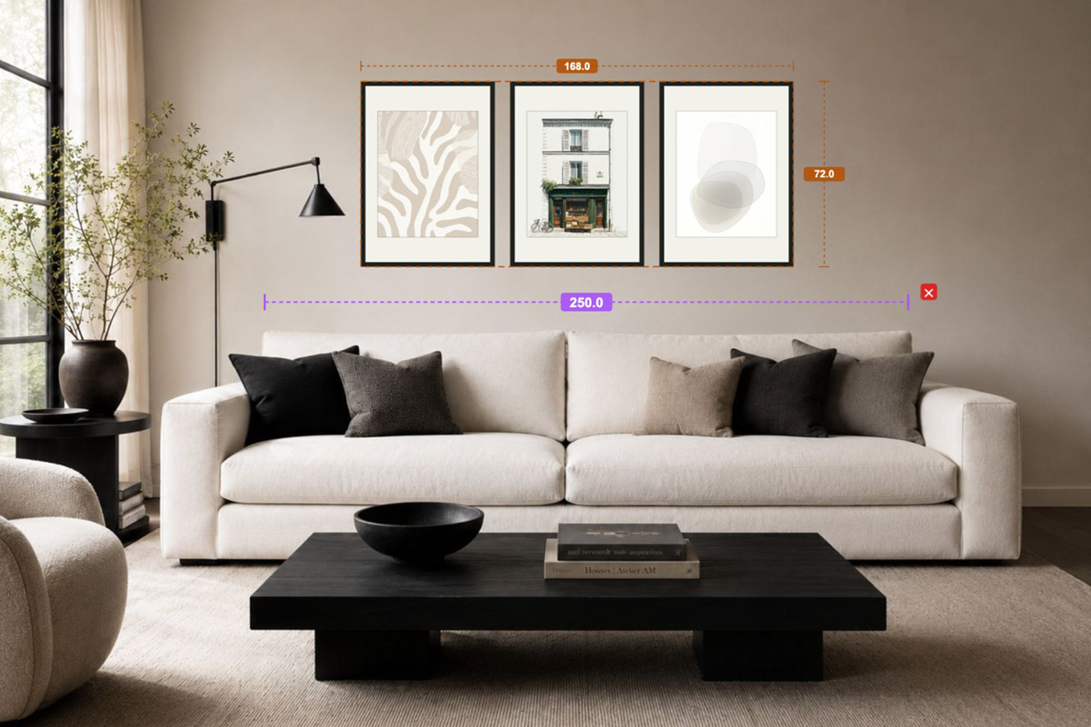
You’ll find a 57-inch (150 cm) hanging rule everywhere: put the visual center of the art at 57 inches off the floor, because that’s the average eye level museums and galleries use. The rule itself is fine — but it’s for setting the height of art on an empty wall, anchored to the floor. Above a sofa the situation is completely different: there’s already a big, prominent piece of furniture below, and the eye automatically uses the sofa as its reference, not the floor. Force the 57-inch rule and the gallery wall often ends up too far above the sofa, floating in mid-air, split off from it.
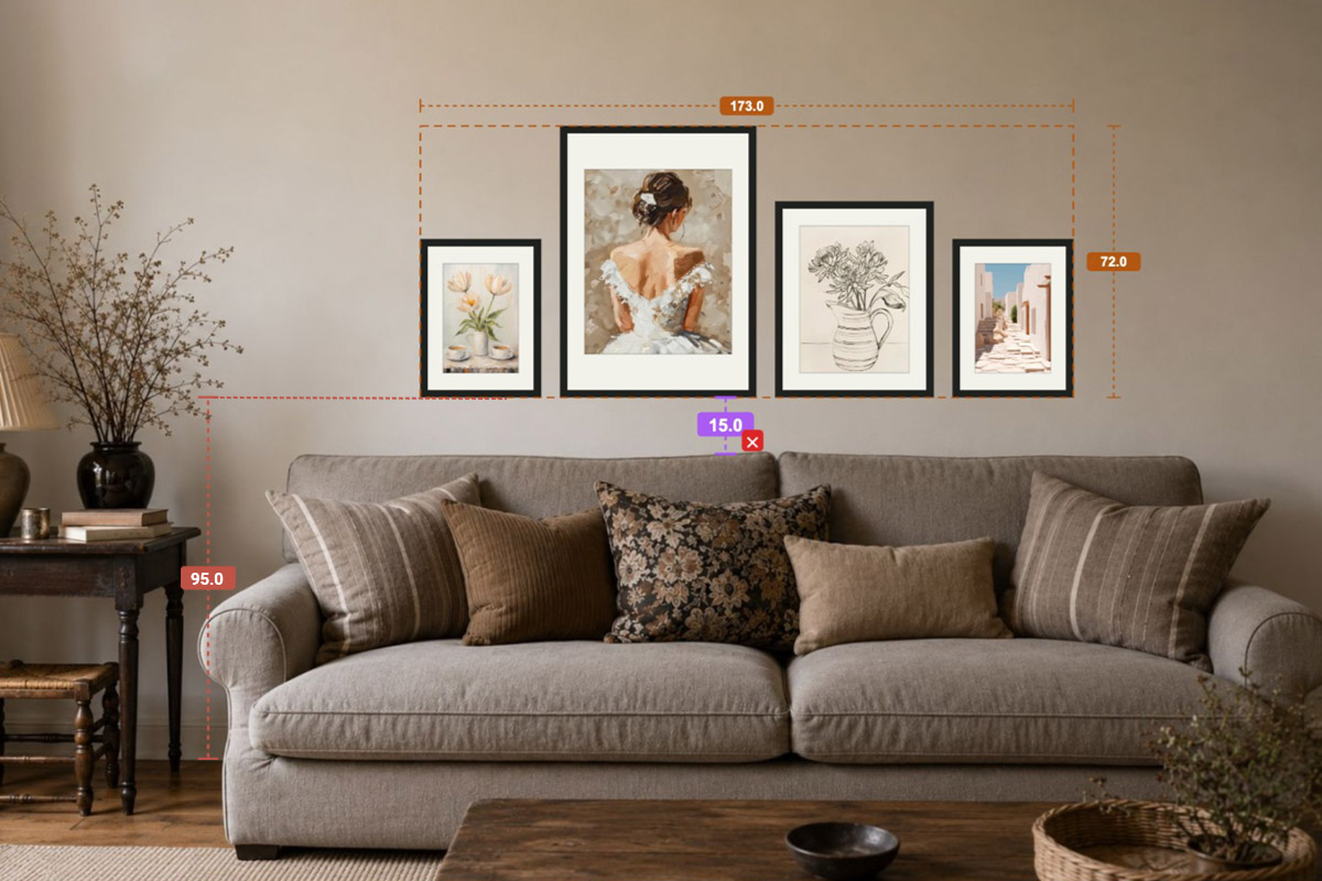
The right move above a sofa is to switch the anchor: leave a gap between the bottom edge of the lowest frames and the top of the sofa back. A useful starting point is 6–10 inches (15–25 cm) — but don’t treat it as a fixed number. The gap should scale with the size of the sofa: for a small sofa or a narrow wall, keep it tight (closer to 6 inches) so the arrangement doesn’t drift or feel disconnected; for a large sofa, large art, or a room with high ceilings, leave it wider (10 inches or more) so the proportions read well from across the room. The same 15 cm gap looks too far above a small sofa and too tight above a big one — so judge by the sofa’s size rather than memorising one fixed figure.
One more assumption worth correcting: don’t set the height for “someone sitting on the sofa looking up.” A person sitting on the sofa is directly below and slightly in front of the gallery wall and can’t see the art straight above their own head anyway. The real audience for this wall is people standing, and people looking across the room or in from the doorway. So the goal isn’t to serve a seated sightline — it’s to make the arrangement and the sofa read as one piece, not disconnected: an even gap, the arrangement sitting squarely above the sofa, with the proportions looking best from a few steps back.
One line to remember: when there’s furniture, anchor to the furniture, not the floor. The 57-inch rule is for empty walls with nothing below; for a sofa, a console, a headboard — anywhere a big piece of furniture sits underneath — swap it for “a gap above the furniture that scales with the furniture’s size.”
Third: which layout to choose above a sofa
Width and height settle the frames; the layout settles what it looks like. The layouts that flatter a sofa most all share one thing: they echo the sofa’s centered, left-right symmetrical axis. A sofa is a naturally symmetrical piece of furniture (centered, with matching arms), so the more “square-on” the layout, the steadier it looks above it.
The layouts below all suit a sofa. Pick one by the feeling you want; take the frame count from its ready-made preset in HangPlanner rather than forcing a number yourself:
| The feeling you want | Choose this layout | Why it fits a sofa |
|---|---|---|
| Most upright, steady, grand | Symmetrical | The sofa is left-right symmetrical; a mirrored wall lands “right” |
| Tidy but with hierarchy, balanced top and bottom | Center-aligned | One horizontal midline runs through every frame’s center — very steady across a sofa |
| Simple, low-commitment | Triptych | Three frames in a row — the easiest sofa-above starter |
| Bottom echoing the sofa, tops free | Bottom-aligned | The bottom edge forms one line that echoes the sofa back; tops vary freely |
| Tidy outer frame, free inside | Outer-aligned | The outer edges form a rectangle — spans wide and holds the sofa down |
(Grid and focal aren’t recommended above a sofa. A grid needs multiple rows filling all four edges, and the space above a sofa is a wide, shallow band — several rows crammed in look cramped. A focal layout radiates outward and reads as a cluster, better suited to a large open wall; dropped into the band above a sofa, its radiating smaller pieces tend to bump the ceiling or the sofa. Save both for a squarer, larger full wall.)
The two safest defaults are symmetrical and center-aligned — both hug the sofa’s axis of symmetry and are nearly foolproof. If you want easy and grand, choose between these two.
Below are the four most practical sofa-above layouts, in order — each with a one-line reason it fits, then its ready-made preset in HangPlanner, with the frame count, sizes, and series already set so you can hit Insert and go. You don’t have to count frames yourself. (The center-aligned guide and preset are coming soon.)
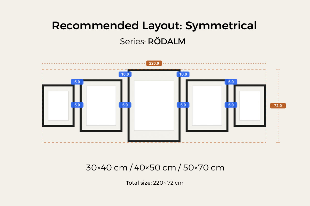
Symmetrical
The most classic choice above a sofa. The sofa is centered and symmetrical, so a gallery wall mirroring that axis lands “right” the moment it goes up — upright, grand, and the hardest to get wrong. Choose it when you want a safe bet. Full method in the Symmetrical Gallery Wall guide.
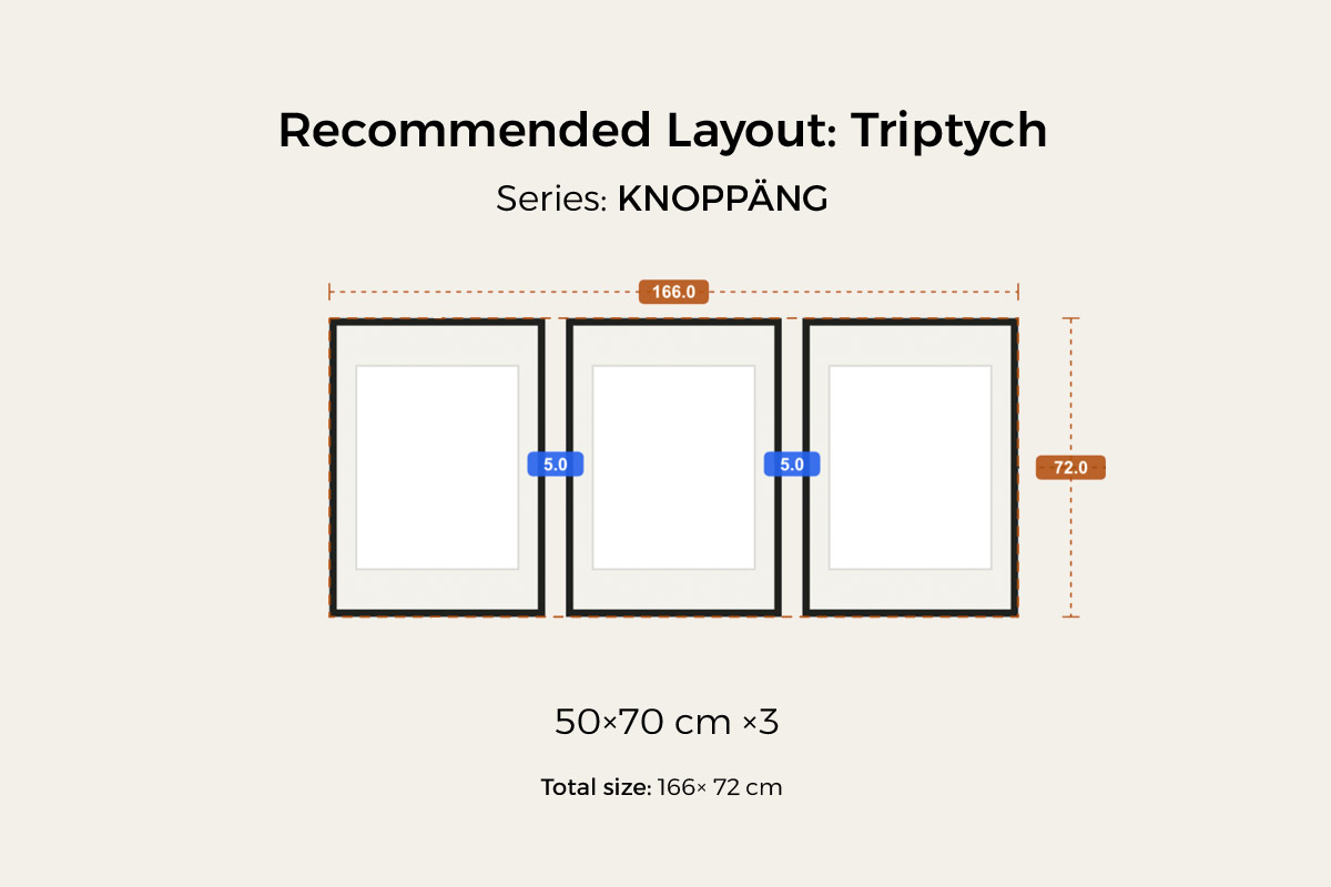
Triptych
The most foolproof starter. Three equal frames evenly spaced in a row — the lowest decision cost, simple and clean above a sofa, and the least likely to go wrong for a first gallery wall. Full method in the Triptych Gallery Wall guide.
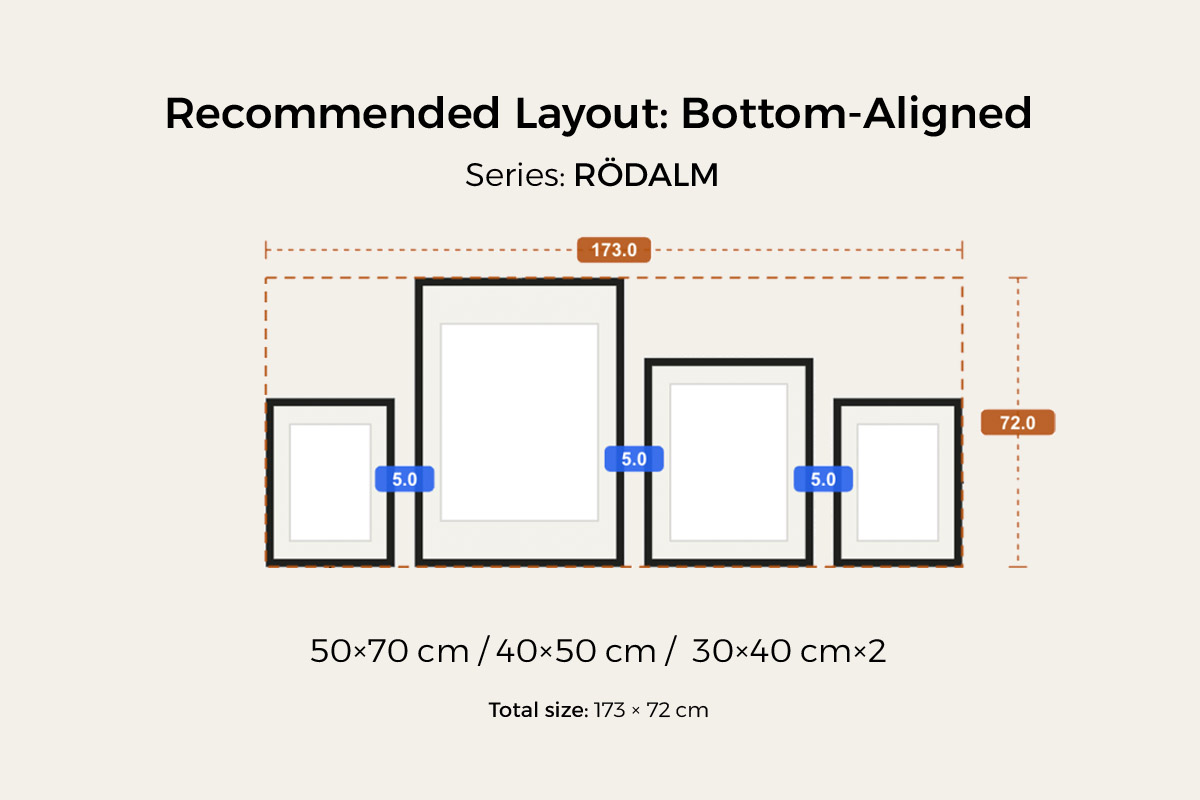
Bottom-aligned
The bottom edges form one horizontal line while the tops sit free at different heights — echoing the horizontal line of the sofa back, relaxed but steady. Choose it when you want some rhythm: less rigid than a grid, but still not scattered. Full method in the Bottom-Aligned Gallery Wall guide.
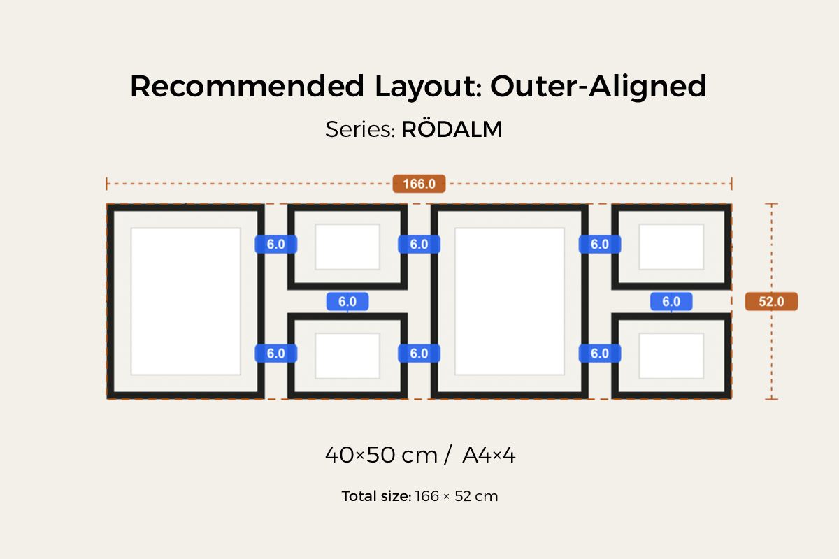
Outer-aligned
The four outer edges line up into a clean rectangle while the sizes inside stay free. You get a grid-like, tidy outline without having to buy identical frames — it spans wide and holds the sofa down firmly. Full method in the Outer-Aligned Gallery Wall guide.
Two more things to watch above a sofa
Don’t let the gaps get too wide. Leave 2–3 inches (5–7 cm) between frames, measured edge to edge. Too tight (under 1.5 in) reads dense and forced; too wide (over 4 in) reads sparse and unsure. For a multi-frame arrangement above a sofa, 2 inches is the safest default. (See gallery wall spacing.)
Align to the sofa, not to the wall. This is the point unique to a sofa — and the one most often missed: if the sofa isn’t centered on the wall (one side against a window or door, or placed off-center on purpose), the gallery wall’s center axis should follow the sofa, not the wall’s geometric center. The eye reads the sofa and the art above it as one group — align the axis to the sofa and the arrangement grows out of it; insist on centering it on the wall and the gallery wall ends up offset from the sofa, looking awkward. Fix the sofa’s center axis first, then mirror the arrangement around it.
Before you buy, hang a version in HangPlanner
The hard part above a sofa isn’t “picturing something nice” — it’s landing those two numbers on your own wall: how wide is two-thirds to three-quarters of this sofa? Where exactly does 6–10 inches above the back put the bottom edge? What happens if you swap the layout or the sizes? Taping paper onto the wall usually takes three or four rounds, twenty minutes each, and still isn’t precise.
In HangPlanner, none of that is on you to calculate:
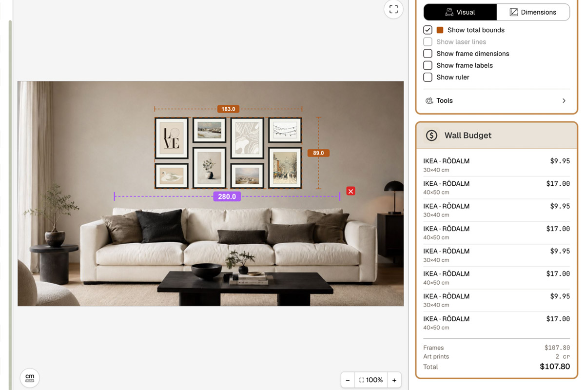
- Set your wall dimensions, or upload a real photo of the sofa wall and calibrate the scale against the sofa (a known width).
- Place the sofa (or mark its width and back height) and note its center axis.
- Drag in a ready layout preset — symmetrical, triptych, bottom-aligned, and outer-aligned are all there — or drop in frames yourself.
- Line the arrangement’s center axis up with the middle of the sofa, and set the overall width to two-thirds to three-quarters of the sofa width.
- Switch to Dimensions to see the overall width and height, every gap, and the distance from the bottom edge to the sofa back — check it straight against 6–10 inches.
- Compare a few layouts and sizes to see which one holds the sofa down best.
- Open Wall Budget to compare the cost of different combinations.
On screen you can see which version grows out of the sofa and which one floats — far cheaper than drilling the wrong holes and re-patching and repainting. Don’t even want to design a layout from scratch? Start from a ready-made sofa-above arrangement in gallery wall frames.