Botanical Gallery Wall with IKEA Frames
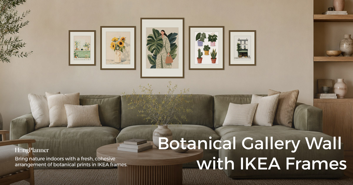
Botanical is just about the safest theme a gallery wall can have — a whole wall of leaves and flowers is quiet, easy to live with, and drops the temperature of a room a notch. That low bar is also why it goes wrong: plenty of people grab a pile of plant prints and hang them up, only to end up with something that reads like scattered stickers, or hung in the wrong place — like a steamy bathroom, where the paper warps within weeks. Neither problem is solved by “picking good art.”
The short answer: a botanical wall looks right when you get two things right. First, look at which kind of plant art you have — a matched set should stay unified (same frames, evenly sized, in a triptych or a symmetrical layout), while a mix of unrelated plant prints is held together by their shared plant subject and a similar natural palette. Second, hang it in a room where you settle in and take the whole wall in from a few steps back — a living room, a bedroom, a bathroom — and leave the hallway to family photos. How many frames and which layout follows the layout you pick; the last section walks you through it in HangPlanner.
Here’s a myth worth breaking: the usual gallery-wall advice says “mix it up, don’t be too neat” — but botanical is the exception. Plant art is inherently “set content” — a numbered botanical chart, a single illustrator’s leaf series, a group of pressed specimens — and its whole appeal comes from repetition and calm. So of all themes, botanical is the one that most rewards staying unified rather than deliberately eclectic. That said, if what you own is a scattered handful of plant prints, there’s no need to cull them for the sake of matching — the first section shows how their shared subject and palette pull them together.
This guide answers three things: how to arrange the plant art you have, which room to hang it in (and whether the bathroom works), and which layout to choose.
The lazy default
Which art → a matched set / same-style series → unify: same frames, evenly sized, in a triptych or symmetrical layout, quiet and cohesive. A scattered mix of plant prints → don’t force it into a matching set; let their shared plant subject and similar palette hold the wall together, and a looser arrangement works fine too. Both are right — go by what you already own.
Room → botanical is “view-from-a-distance, relaxing” content, best where you settle in: the living-room sofa wall, above the bed, the bathroom. Skip hallways and stairs — that walk-past route suits close-up family photos better.
Bathroom → split it first: a powder room / half-bath with no shower is safest (all the greenery, none of the steam); a main bathroom with a shower is the risky one — paper prints warp in the humidity, so hang away from direct spray and treat the print as replaceable. (IKEA fronts are plastic, not glass — light and shatter-proof, but not moisture-proof.)
Frames → same series, same colour is easiest; don’t mix series. RÖDALM has the most sizes and colours; LOMVIKEN (aluminium) has the sleekest thin edge; plant art sits well in light wood or white frames. No need to count frames yourself — use the ready-made preset for your chosen layout in HangPlanner.
First: which kind of plant art you have
Before you plan a botanical wall, settle one thing: is what you have a matched series, or a scattered handful? That decides whether you unify or let a shared subject and palette do the work — both look good, but the method differs.
A matched set / same-style series → unify. A lot of plant art is sold in sets to begin with: a numbered botanical chart, one illustrator’s leaf series, a group of pressed specimens. The charm of this kind of art is exactly the repetition — the same composition logic, the same background tone, one piece next to the next. So let the frames follow that same energy: same series, same colour, sizes as even as you can, laid out as a triptych or symmetrical, quiet and controlled — a wall that reads at a glance as “a set someone chose with care.” This is not the moment to mix frame styles and sizes “for variety”; that just scatters the very neatness that makes plant art work.
A scattered mix of plant prints → let the shared subject and palette hold it. If what you have is a tropical leaf here, a dried flower there, a watercolour bloom and an old botanical chart mixed in — different sizes, styles, and eras — there’s no need to cull anything for the sake of matching. The plant theme itself is the glue: whether the prints are green leaves, the beige of dried flowers, or the soft washes of watercolour florals, they all belong to the same natural subject and mostly share a gentle palette — and that common subject and tone is enough to pull them into one family so they don’t look messy hung together. Here you can relax into a looser, uneven arrangement; just keep the boldest few spread apart so the palette stays roughly even across the wall.
Neither is better than the other: for something neat and quiet, unify a matched set; for something relaxed and lived-in, let a scattered mix cohere through its shared subject and tone. Work out which one you are first, and choosing a room and a layout gets easy.
Second: which room to hang it in (and can it go in the bathroom)
Plant art is “view-from-a-distance, relaxing” content — you don’t step up close to “read” a leaf (the opposite of family photos, which you approach to make out faces and moments); you take the whole wall in as a quiet patch of nature, a relaxing texture. So its home is a room where you stop, settle, and see the whole thing from a few steps back.
The living room (especially the sofa wall) — the steadiest stage. The wall above the sofa is a view-from-a-distance spot you mostly see from across the room, and a quiet plant wall here cools and relaxes the space. (How wide and how high the arrangement should be has its own guide on hanging above a sofa — the method is the same for a botanical theme: anchor to the sofa, don’t cling to the centering rule.)
The bedroom (above the bed) — maximum calm. Bedrooms want softness, and gentle plants in a natural palette above the bed soothe better than high-contrast, high-stimulation art. Anchor to the bed above the headboard, and don’t hang it too full or too heavy.
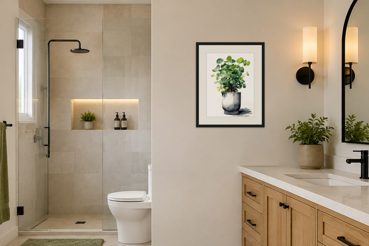
The bathroom — plants plus a spa feel are the best fit, but split it by which bathroom first. Bringing plants into the bathroom is the picture most people want, and there’s nothing wrong with the instinct — it just depends on which bathroom:
- A powder room / half-bath with no shower is safest: no steam, no lingering humidity, so paper prints hold up, and you keep both the natural feel and the sense of calm.
- A main bathroom you shower in daily needs care: shower steam and long-term humidity make paper warp and fade. If you do want it, hang away from the wall the shower sprays directly (on the side farthest from the shower, with good ventilation), and treat the print as a “replace it when it wears out” consumable rather than something you’d hate to lose. Worth repeating: an IKEA frame’s front is plastic, not glass (light, shatter-proof, kid-safe), but it’s not moisture-proof — don’t count on the frame to keep the damp out.
A space to be careful with: hallways and stairs. Not that you can’t — it’s just low return. A hallway is a walk-past, close-up route that suits family photos you can pick out one by one; drop view-from-a-distance, take-it-in-as-a-whole plant art into a narrow passage and its best side never gets to show. Leave the hallway to family photos and let the plants live in the living room, bedroom, and bathroom — everyone in their right place.
Third: which layout to choose
Once you know your art and your room, all that’s left is what it looks like. Here’s a way to think about it, not a hard rule: botanical is set content, so the neater the layout, the better it suits it; a matched set shines in a triptych or symmetrical layout, and a scattered mix that wants a looser look leans on its shared subject and palette to cohere.
Don’t count frames or sizes yourself — pick a layout and use its ready-made preset in HangPlanner.
Triptych · easiest for a matched set
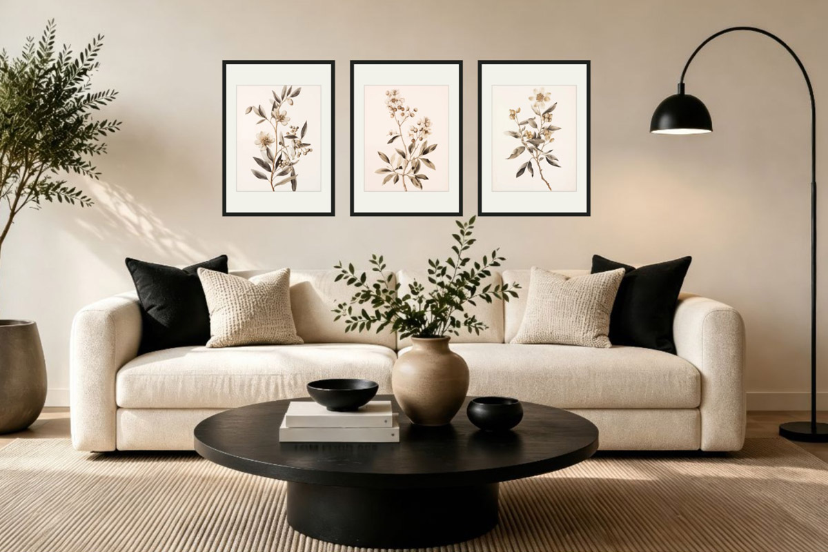
Three equal frames evenly spaced in a row — the lowest-decision-cost starter. A set of three botanical prints, or one large image split into three, suits it best; a row of leaf studies is about the most recognisable botanical-wall look there is, and it’s the hardest to get wrong for a first try. Full method in the Triptych Gallery Wall guide.
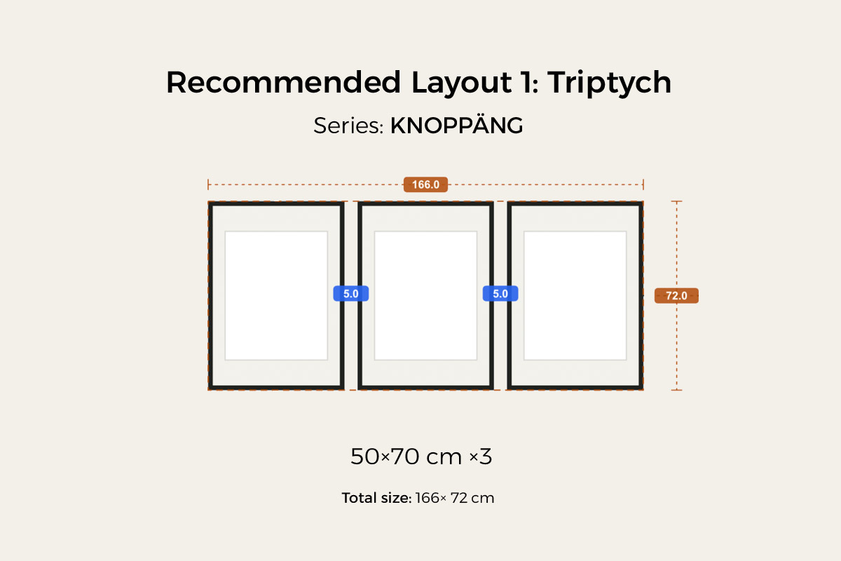
This is a ready-made triptych preset in HangPlanner: three KNOPPÄNG 50×70 cm portrait frames evenly spaced, 5 cm between frames, about 166 × 72 cm (about 65 × 28 in) overall — the count, sizes, and spacing are all set, so you hit Insert and go, no counting required. Hung in a real living room, it looks like this.
Symmetrical · for something upright and grand
A mirrored, centered layout — upright and steady, and especially “right” above a naturally symmetrical piece of furniture like a sofa, a headboard, or a sideboard. A matched set in a symmetrical layout reads most like a single piece of art on the wall. Full method in the Symmetrical Gallery Wall guide.
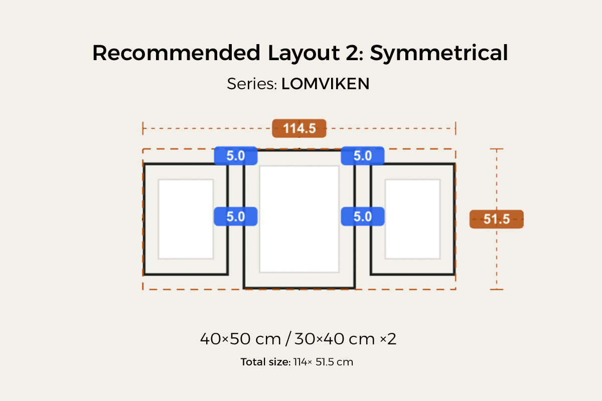
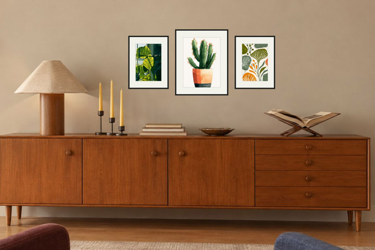
This symmetrical preset uses LOMVIKEN (aluminium, thin edge): a 40×50 cm in the center with a 30×40 cm mirrored on each side, 5 cm between frames, about 114 × 51.5 cm (about 45 × 20 in) overall. The large-center, smaller-sides mirror is the most “upright,” and it sits especially steadily above flat-topped furniture. Landed in a real space — over a sideboard, say — it looks like this.
A scattered mix: outer-aligned, or a loose arrangement held by subject and palette
If you have plant prints of different sizes and still want a bit of order, try outer-aligned: the four outer edges line up into a clean rectangle while the sizes inside stay free — a tidy outline with a free interior (full method in the Outer-Aligned Gallery Wall guide). Want it more relaxed? Go with an uneven, loose arrangement — and remember that here the shared subject and palette are your anchor: as long as the tones stay roughly even across the wall, it reads loose but not scattered.
Three more things to watch
Don’t let the gaps get too wide. Leave 2–3 inches (5–7 cm) between frames, measured edge to edge. Too tight (under 1.5 in) reads messy; too wide (over 4 in) reads sparse. (See gallery wall spacing.)
Don’t mix series — let the art do the varying. Keep a set of frames consistent in material and colour so the wall stays quiet; let the variation come from the plant art itself — its depth and detail — rather than from mixing frame styles. RÖDALM has the most sizes and colours to mix; LOMVIKEN (aluminium) has the sleekest thin edge; plant art looks natural in light wood and crisp in white, and you can find each series’ sizes in the IKEA picture frame size guide. Set the height by the space: above furniture like a sofa or bed, anchor to the furniture and leave a gap above its top edge rather than using the 57-inch centering rule; on an empty wall (a small stretch in the bathroom, a corner of an entryway) center the whole arrangement on standing eye level (57 inches / 150 cm as an average starting point, nudged to the household’s height).
In the bathroom, let both placement and materials give way to the damp. As above: a powder room or half-bath is safest; in a main bathroom, hang away from direct spray on a well-ventilated side and treat the print as a consumable. Don’t hang anything you’d hate to lose in a humid bathroom.
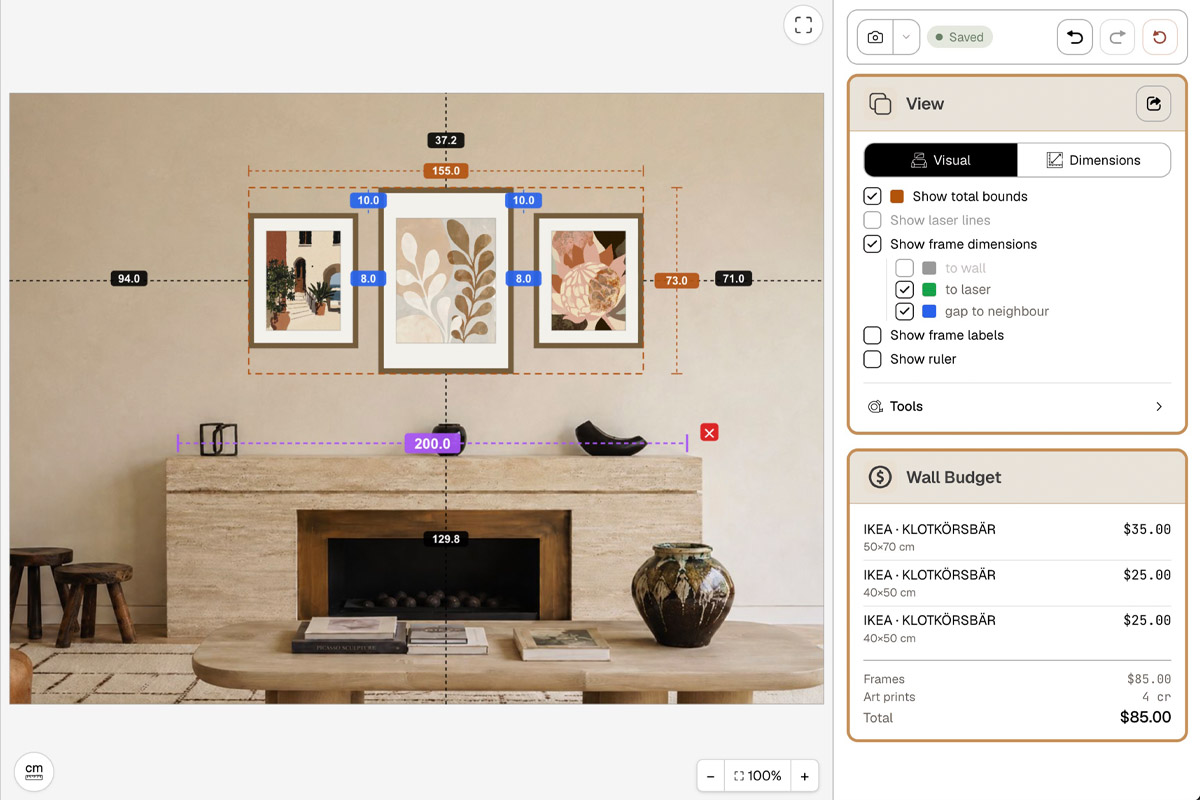
Before you buy, hang a version in HangPlanner
The hard part of a plant wall isn’t “picturing something nice” — it’s landing the overall size and arrangement on your own wall: how big should a matched set in a triptych be to hold this wall down? How do you space a scattered few so the tones stay even? What happens if you swap the layout? Taping paper to the wall usually takes three or four rounds, and still isn’t precise.
In HangPlanner:
- Set your wall dimensions, or upload a real photo of the wall to calibrate the scale.
- Load your plant prints into My Images and drop them straight into the frames to preview — check whether the tones sit evenly across the wall.
- Drag in a ready layout preset — triptych, symmetrical, and outer-aligned are all there — or drop in frames yourself.
- For a matched set, even everything up and align it; for a scattered mix, spread the boldest few apart to keep the palette even.
- Switch to Dimensions to see the overall size and every gap, and check the spacing against 2–3 inches.
- Compare a few layouts and sizes to see which one suits this wall.
- Open Wall Budget to compare the cost of different combinations.
On screen you can see which version hangs together and which one scatters — far cheaper than drilling the wrong holes and re-patching and repainting. Don’t even want to design a layout from scratch? Start from a ready-made arrangement in gallery wall frames and swap in your plant prints.